
Ssense. White gallery wall with editorial serifs.
- Commerce
- Light theme
- 7 colors
- 4 typefaces
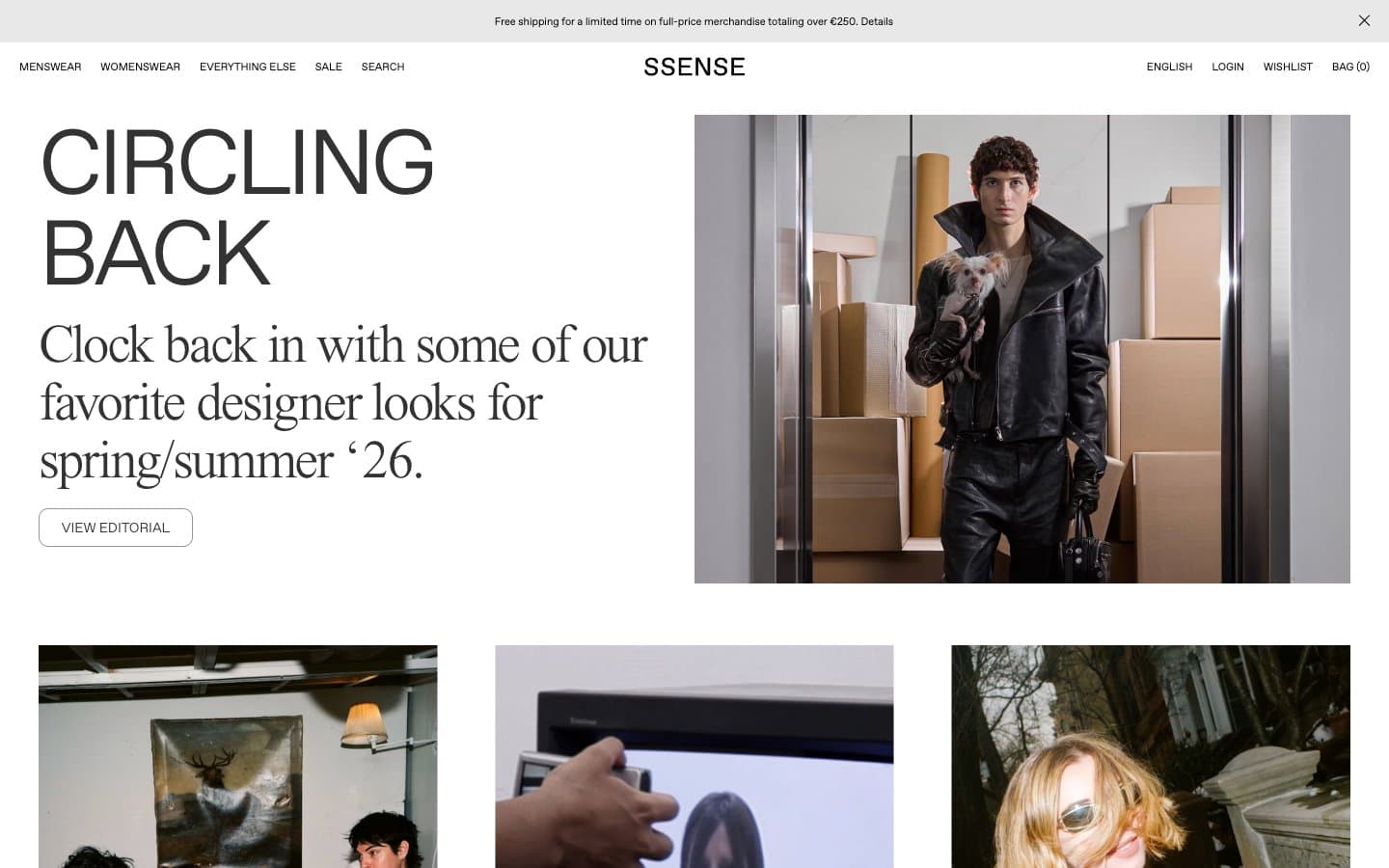
SSENSE operates as a digital fashion editorial: pristine white canvas, razor-thin sans-serif navigation, and oversized serif headlines that behave like magazine cover titles rather than web UI. The visual system is deliberately monochrome — no accent colors, no filled CTAs, no decorative gradients — letting editorial photography and typography do all the expressive work. Hierarchy is achieved through extreme scale contrast (95px display down to 11px meta labels) and tight negative letter-spacing on serif faces that pulls letterforms into elegant, compressed shapes. Components are minimal and ghost-like: outlined buttons, hairline borders, near-invisible dividers. The site reads less like a store and more like a curated print publication that happens to sell things.
Ssense design system

Neutrals7
Primary text, navigation links, logo wordmark, footer links, SVG icon strokes — the anchor color of the entire system
Body text and headings — slightly softer than pure black for long-form editorial readability at large sizes
Muted helper text, list items, tertiary metadata, subdued navigation states
Hairline borders, dividers, inactive UI separators, secondary meta labels
Alternative surface tint, subtle alternating bands, ghost button hover backgrounds
Page canvas background, subtle section differentiation, footer surface — barely warmer than pure white
Card surfaces, hero background, product tiles, elevated content panels
Try a pairing
Pick any two colors from the palette to check whether text stays readable on top.
Aa
Paper on Obsidian
21.00 : 1 contrast
- Body textPasses AA 4.5
- Large textPasses AA 3
- StrictPasses AAA 7
More DESIGN.md files. Same web, different personalities.

High Protein
Commerce
Hopper
Commerce
2.AG
Commerce
A-WARE
Commerce
AATHER
Commerce
Abel
Commerce
Acme Cups New Zealand
Commerce
Acne Studios
Commerce
Adam Lippes
Commerce
Adanola
Commerce
Advene
Commerce
Aevi Wellness
Commerce


