
Sonos. Gallery wall of warm light.
- Commerce
- Light theme
- 9 colors
- 1 typeface
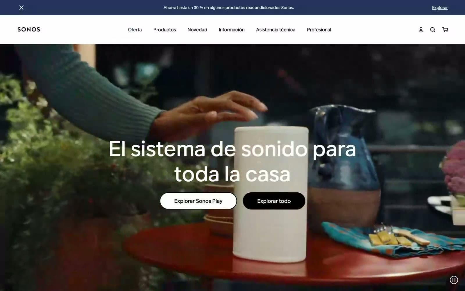
Sonos operates in a deliberate visual void — pure achromatic black, white, and gray with zero chromatic accent. The interface is a frame for photography rather than a canvas of color; lifestyle imagery of people in warm-lit spaces does every emotional job that a brand color would normally carry. Typography is the only voice: aktiv-grotesk at dramatic scale, with display sizes reaching 96px and tight 1.0 line-height creating poster-like headlines that float over full-bleed photography. Components are reduced to their silhouettes — pill-shaped buttons (80px radius), minimal navigation, generous breathing room — letting product photography and large type carry the entire identity. The result is a luxury-electronics aesthetic where restraint signals premium, not austerity.
Sonos design system

Neutrals9
Dark supporting neutral for text, icons, and strong contrast. Do not promote it to the primary CTA color
Dark surface panels, secondary dark fill, text on light cards
Supporting neutral for secondary UI, dividers, and muted labels. Do not promote it to the primary CTA color
Muted secondary text, icon strokes on light surfaces, metadata labels
Button hover borders, outline stroke, subtle elevation shadow base
Visible borders, dividers between sections or card edges
Hairline borders, subtle separators, box-shadow tint on cards
Dominant page canvas, section backgrounds, elevated surface wash
Light supporting surface for subtle backgrounds and section separation. Do not promote it to the primary CTA color
Try a pairing
Pick any two colors from the palette to check whether text stays readable on top.
Aa
Paper White on Obsidian
21.00 : 1 contrast
- Body textPasses AA 4.5
- Large textPasses AA 3
- StrictPasses AAA 7
More DESIGN.md files. Same web, different personalities.

High Protein
Commerce
Hopper
Commerce
2.AG
Commerce
A-WARE
Commerce
AATHER
Commerce
Abel
Commerce
Acme Cups New Zealand
Commerce
Acne Studios
Commerce
Adam Lippes
Commerce
Adanola
Commerce
Advene
Commerce
Aevi Wellness
Commerce


