
Sneak in Peace. Editorial gallery behind frosted glass.
- Commerce
- Light theme
- 9 colors
- 2 typefaces
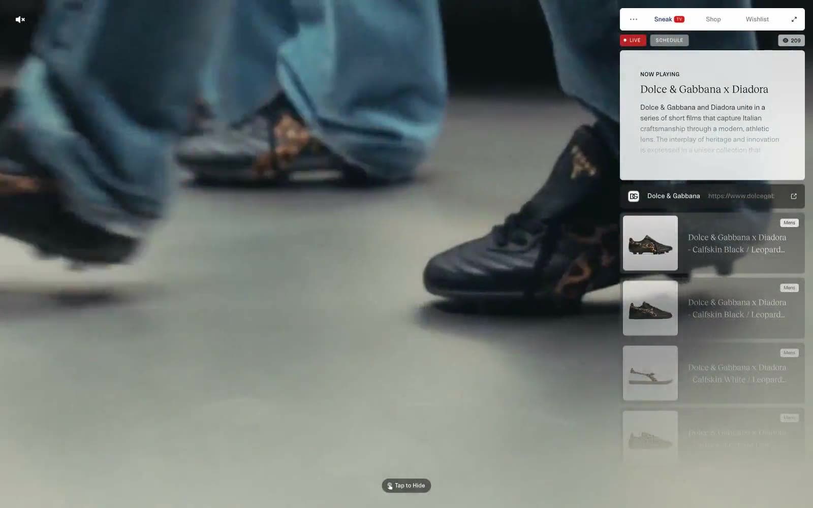
Sneak in Peace operates as a floating editorial vitrine: a full-bleed fashion film runs behind a translucent white panel that carries every interactive surface. The system is aggressively monochrome — 99% of pixels live in a narrow band between white, warm off-white, and two workhorse grays (#3d3d3d and #000000). Color is rationed like ink: one vivid red reserved exclusively for live-status punctuation, one deep navy (#142161) that surfaces only as a link border, and nothing else. Typography splits sharply between a utilitarian grotesque (NTNeuss) at 8–14px with generous tracking — creating a label/UI vocabulary — and a single editorial serif (RecklessNeue) used at 16–21px for narrative titles. Components are compact, 6px-cornered, almost flat, and float over the media rather than block it. The dominant gesture is restraint: the camera does the talking, the UI whispers.
Sneak in Peace design system

Brand1
Outlined-action border and link underline — the only chromatic stroke in the system, indicating navigation or interactive text
Accent1
Red action color for filled buttons, selected navigation states, and focused conversion moments
Neutrals7
Primary text, icon strokes, high-contrast borders — the strongest voice in the system, used sparingly on headlines and glyphs
Default text, dividers, input and card borders — the workhorse gray carrying the entire UI structure
Active tab/segmented control background — the only gray used as a filled surface to indicate selected state
Subdued body text and secondary borders — the whisper layer beneath Charcoal
Disabled or resting-state button fills — surfaces that should recede
Warm off-white used for badge fills and subtle surface lifts — gives a paper-like warmth against the cool grays
Page and panel backgrounds, card surfaces, icon fills, image borders — the base canvas and the glass-panel fill
Try a pairing
Pick any two colors from the palette to check whether text stays readable on top.
Aa
Paper White on Liberty Navy
14.79 : 1 contrast
- Body textPasses AA 4.5
- Large textPasses AA 3
- StrictPasses AAA 7
More DESIGN.md files. Same web, different personalities.

High Protein
Commerce
Hopper
Commerce
2.AG
Commerce
A-WARE
Commerce
AATHER
Commerce
Abel
Commerce
Acme Cups New Zealand
Commerce
Acne Studios
Commerce
Adam Lippes
Commerce
Adanola
Commerce
Advene
Commerce
Aevi Wellness
Commerce


