
Sigmaphoto. A hushed white room where the only color that matters is the one that asks you to act.
- Commerce
- Light theme
- 7 colors
- 6 typefaces
Sigma's site reads like a museum exhibition catalog for precision optical instruments — entirely weight-400 typography, vast whitespace, and a single vivid cobalt-blue accent that punctuates an otherwise purely monochrome experience. Product photography dominates at near-full-bleed scale, shot against dark studio gradients that let matte-black lens bodies dissolve into shadow and re-emerge as sculptural objects. The editorial restraint — centered serif headlines, tiny all-caps section labels, text-only CTAs — signals confidence through quietness, with the single blue button (#0048ff) functioning as the only raised voice in an otherwise whispered conversation. Sharp corners, no shadows, no gradients, no decorative motion: every screen is a frame around a piece of glass and metal.
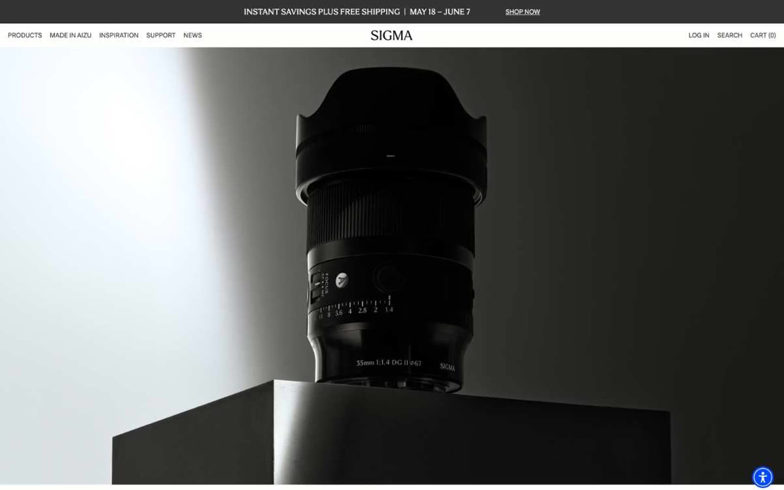
Sigmaphoto design system

Brand1
Primary action fill — the only chromatic color in the system, reserved for CTA buttons and live action moments
Neutrals6
Icon strokes, input borders, and hard-edge accents where maximum contrast is required
Primary text, dominant borders, nav links — the workhorse dark that replaces pure black everywhere a softer edge is wanted
Muted helper text, secondary borders, disabled states — quieter than Slate Ink by two stops
Tertiary borders and inactive icon strokes — the quietest neutral, used only when Ash is still too loud
Secondary surface — a barely-warm cream that lifts cards off pure white without introducing visible color
Neutral form states, badge text, and quiet UI feedback where color should stay understated. Do not promote it to the primary CTA color
Try a pairing
Pick any two colors from the palette to check whether text stays readable on top.
Aa
Pure White on Cobalt Signal
6.23 : 1 contrast
- Body textPasses AA 4.5
- Large textPasses AA 3
- StrictFails AAA 7
More DESIGN.md files. Same web, different personalities.

High Protein
Commerce
Hopper
Commerce
2.AG
Commerce
A-WARE
Commerce
AATHER
Commerce
Abel
Commerce
Acme Cups New Zealand
Commerce
Acne Studios
Commerce
Adam Lippes
Commerce
Adanola
Commerce
Advene
Commerce
Aevi Wellness
Commerce


