
Shupatto. Museum vitrine on white marble.
- Commerce
- Light theme
- 5 colors
- 5 typefaces
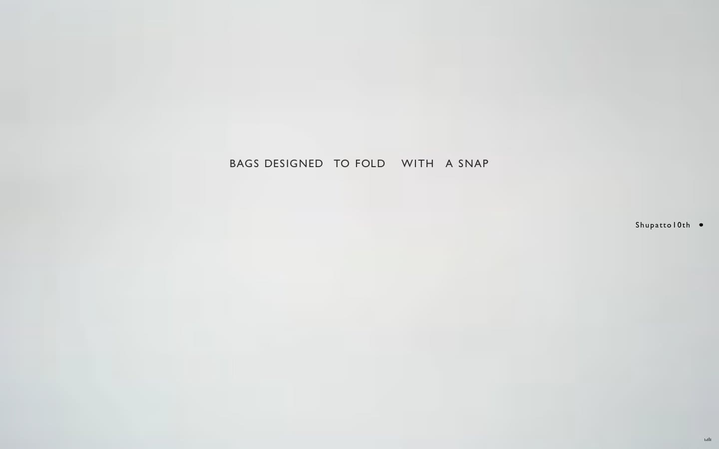
Shupatto's digital presence operates like a quiet museum vitrine for a single physical product. The visual system is almost entirely achromatic — a canvas of white interrupted by hairline charcoal lines, generous negative space, and minuscule typography that whispers rather than shouts. Everything is set in uppercase with dramatically wide letter-spacing, transforming even body copy into editorial display text. The only chromatic note is a soft periwinkle blue that functions less as a brand color and more as a faint pressure point — a tag, a selected state, a small badge. The interface is a study in restraint: no shadows, no gradients, no rounded corners beyond 3px, no decorative imagery competing with the product. Line work and typographic rhythm do all the work.
Shupatto design system

Accent1
Sole chromatic accent — selected nav state, badge fills, a rare pressure point in an otherwise colorless system
Neutrals4
Strongest text and most emphatic borders, logo dots, footer marks
Primary text, hairline borders, structural lines — the dominant neutral carrying all interface weight
Muted helper text, secondary borders, dimmed metadata
Page canvas, card surfaces, nav backgrounds — the unbroken white field everything floats on
Try a pairing
Pick any two colors from the palette to check whether text stays readable on top.
Aa
Ink on Periwinkle
6.50 : 1 contrast
- Body textPasses AA 4.5
- Large textPasses AA 3
- StrictFails AAA 7
More DESIGN.md files. Same web, different personalities.

High Protein
Commerce
Hopper
Commerce
2.AG
Commerce
A-WARE
Commerce
AATHER
Commerce
Abel
Commerce
Acme Cups New Zealand
Commerce
Acne Studios
Commerce
Adam Lippes
Commerce
Adanola
Commerce
Advene
Commerce
Aevi Wellness
Commerce


