
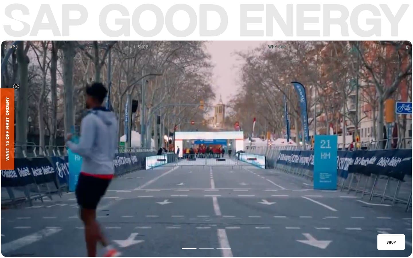
SAPGOODENERGY. Marathon finish line in a cleanroom.
- Commerce
- Light theme
- 8 colors
- 3 typefaces
SAP Good Energy operates on a brutalist split personality: a full-bleed race-day video hero crashes into a clinical white product stage where a single silver packet floats alone in negative space. The palette is essentially monochrome — warm white canvas, near-black ink, and one vivid orange that appears only as functional punctuation (a vertical side tab, isolated CTA fills). Typography pairs a compressed neo-grotesque display face with aggressive negative tracking for headlines against a precise utility sans for body and navigation copy, both set tight and never shouting. Components are almost invisible — the product IS the hero on white screens, the race atmosphere IS the hero above the fold, and almost everything in between is empty air with hairline rules.
SAPGOODENERGY design system

Brand1
Side tab accent, occasional filled action — a single warm orange against clinical white acts as the only chromatic signal in an otherwise achromatic system, reading as urgency without aggression
Neutrals7
Primary text, filled CTA buttons, strongest borders — the hard stop in a system that otherwise lives in warm grays
Dominant text color, card and nav borders, icon strokes — softer than pure black for sustained reading while still reading as ink
Muted helper text, secondary headings, subdued borders
Quiet dividers, decorative heading borders
Card surfaces, soft fills, decorative icon backgrounds — the step between canvas and card
Page canvas, the slightly warm white that makes the product photograph read as clinical rather than sterile
Card surfaces, button fills, highlighted text — the cleanest tone, used where maximum contrast against graphite is needed
Try a pairing
Pick any two colors from the palette to check whether text stays readable on top.
Aa
Ink Black on Fuel Orange
8.01 : 1 contrast
- Body textPasses AA 4.5
- Large textPasses AA 3
- StrictPasses AAA 7
More DESIGN.md files. Same web, different personalities.

High Protein
Commerce
Hopper
Commerce
2.AG
Commerce
A-WARE
Commerce
AATHER
Commerce
Abel
Commerce
Acme Cups New Zealand
Commerce
Acne Studios
Commerce
Adam Lippes
Commerce
Adanola
Commerce
Advene
Commerce
Aevi Wellness
Commerce


