
Sandland Sleep. Warm cream sleep journal with deep navy nights.
- Commerce
- Light theme
- 11 colors
- 3 typefaces
Sandland Sleep uses a warm cream canvas as its foundation, creating a soft, restful atmosphere that reads like a linen-wrapped pharmacy rather than a cold e-commerce site. Deep navy (#1a365d) provides the nighttime counterpart — anchoring the hero gradient and dark data cards as moments of cool, clinical authority that contrast the otherwise warm palette. A single vivid yellow (#fae467) serves as the sole chromatic punctuation for primary actions, badges, and data highlights, making every CTA feel switched on against the muted surroundings. Typography stays restrained and even, with a custom sans (Sandland-550) at moderate weights and tight tracking on display sizes, letting generous spacing and soft 10-20px radii carry the calm. Components are pill-shaped and rounded, shadows are whisper-soft (0.1 opacity), and the overall feel is a sleep journal: warm paper, navy ink, one highlighter.
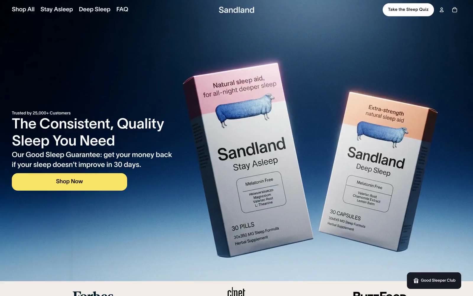
Sandland Sleep design system

Brand2
Hero gradient base, dark data cards, icon strokes — the cool nocturnal counterpoint to the warm cream canvas, signals science and trust at the deepest end of the palette
Primary CTA fill, bestseller badges, data-highlight accents — the only vivid chromatic in the system, warm and optimistic like morning light, used sparingly so every action glows
Neutrals9
Primary text, dominant heading color, primary borders — the typographic anchor across all surfaces
Deep surface fill for dark accent cards, alternative button backgrounds — nearly black with a slight cool cast, sits between midnight navy and true black
Body text, subtle border accents — softer than pure black for extended reading
Secondary text, list borders, muted link underlines — the mid-gray that carries all supporting copy
Input borders, disabled button text and borders — the warm-leaning gray for form and inactive states
Hairline dividers, image borders, section separators — neutral-cool gray for structural lines
Page canvas, default section background — the dominant warm neutral that sets the entire sleep-warmth tone of the site
Secondary card surfaces, subtle elevation layer — warmer than pure white, used when cards need to nest within cream sections without disappearing
Card surfaces, product photography backgrounds, nav backgrounds — pure white creates lift against the cream canvas
Try a pairing
Pick any two colors from the palette to check whether text stays readable on top.
Aa
Paper White on Midnight Navy
12.14 : 1 contrast
- Body textPasses AA 4.5
- Large textPasses AA 3
- StrictPasses AAA 7
More DESIGN.md files. Same web, different personalities.

High Protein
Commerce
Hopper
Commerce
2.AG
Commerce
A-WARE
Commerce
AATHER
Commerce
Abel
Commerce
Acme Cups New Zealand
Commerce
Acne Studios
Commerce
Adam Lippes
Commerce
Adanola
Commerce
Advene
Commerce
Aevi Wellness
Commerce


