
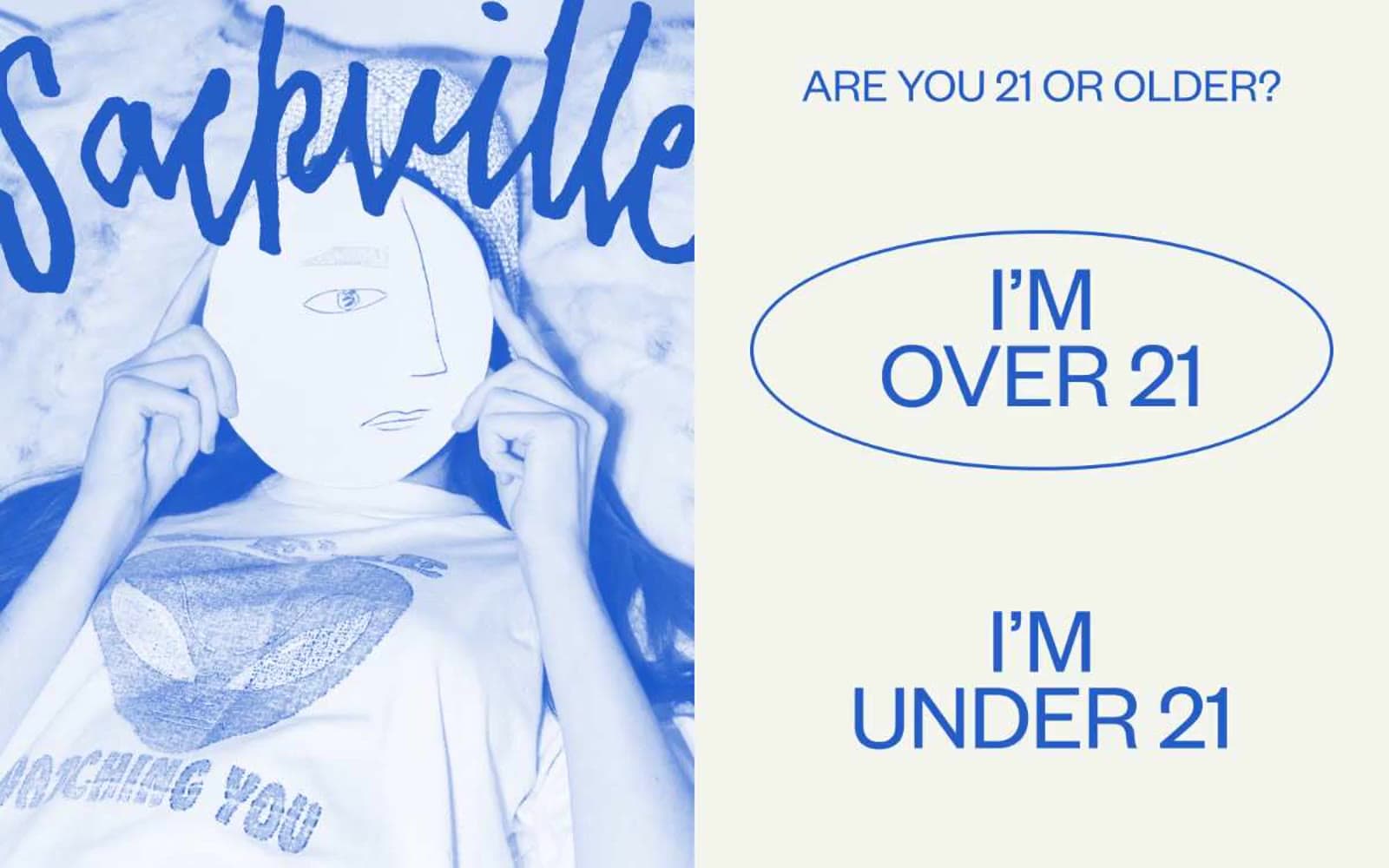
Sackville & Co.. A hand-inked editorial spread where the illustration is the hero and the UI is just typeset text on warm paper.
- Commerce
- Light theme
- 13 colors
- 3 typefaces
Sackville & Co. reads like an editorial risograph zine pressed onto cream paper: a hand-inked cobalt-blue illustration anchors one half, while the other half breathes as off-white canvas with tight grotesque type and a single oversized oval outlined in blue. The system is intentionally print-coded — flat color, no gradients, no shadows, no filled buttons — and uses a saturated secondary palette (peach, fire-red, marigold, terracotta) as tonal accents in artwork and borders rather than as functional UI fills. Typography carries all the hierarchy: Founders Grotesk at weight 400 with aggressive negative line-heights (0.80–0.90) on display sizes creates the masthead pressure of a magazine cover, while TimesNow SemiLight provides editorial serif contrast for select headings. Everything feels hand-set: thin outlines, generous whitespace, no elevation, no rounded cards — just confident ink on warm paper.
Sackville & Co. design system

Brand1
Primary brand color — illustrated duotone wash, outlined action borders, interactive text — saturated blue against cream creates the risograph-print signature
Accent6
Secondary illustration accent, decorative borders, warm tonal fill — the cheek-pink of risograph layering
Outlined action borders, emphasis strokes, error-like accent — used as editorial red rather than as a functional error state
Deep red-orange accent for borders and fills — the warmest ink in the riso palette
Deep red accent — used sparingly in illustration washes and emphasis borders
Yellow accent fill, spot-color highlights, decorative emphasis — the third riso plate
Warm brown accent for body and heading borders — the earthiest ink in the editorial palette
Neutrals6
Icon fills, maximum-contrast borders, nav accent
Primary text, borders, dividers, icon strokes — the near-black ink that anchors every screen
Display heading text — slightly lifted from press black for softer masthead weight
Muted helper text, hairline borders, secondary metadata
Page canvas, card surfaces — the warm off-white that makes every ink color feel like print
Alternate surface wash, subtle section differentiation from the cream canvas
Try a pairing
Pick any two colors from the palette to check whether text stays readable on top.
Aa
Bone White on Cobalt Ink
5.74 : 1 contrast
- Body textPasses AA 4.5
- Large textPasses AA 3
- StrictFails AAA 7
More DESIGN.md files. Same web, different personalities.

High Protein
Commerce
Hopper
Commerce
2.AG
Commerce
A-WARE
Commerce
AATHER
Commerce
Abel
Commerce
Acme Cups New Zealand
Commerce
Acne Studios
Commerce
Adam Lippes
Commerce
Adanola
Commerce
Advene
Commerce
Aevi Wellness
Commerce


