
Roberta's Pizza. A checkered tablecloth lit by neon red signage, where every screen is a poster.
- Commerce
- Light theme
- 5 colors
- 2 typefaces
Roberta's runs on a near-monochromatic system anchored by white canvas and charcoal type, with vivid red deployed as a single loud punctuation color for primary actions, social-proof walls, and signature brand moments. The type system pairs a quirky tracked-out sans (Offset TM) for body, UI labels, and most controls with a condensed display face (Borensa) that takes over at 80–120px for headlines that shout from full-bleed sections. Layouts are unapologetically full-bleed: a video hero, a red 'Get Social' wall, a centered text-and-CTA stack — with content rhythm set by generous vertical breathing room and a decorative vocabulary of checkered borders, star bands, polaroid frames, and hand-drawn skull and pizza-slice iconography borrowed from Italian-American diner signage and zine culture. Buttons sit flat without elevation on the filled state; the only shadow in the system is a hard, 4px-offset drop on secondary links, deliberately retro rather than soft-modern.
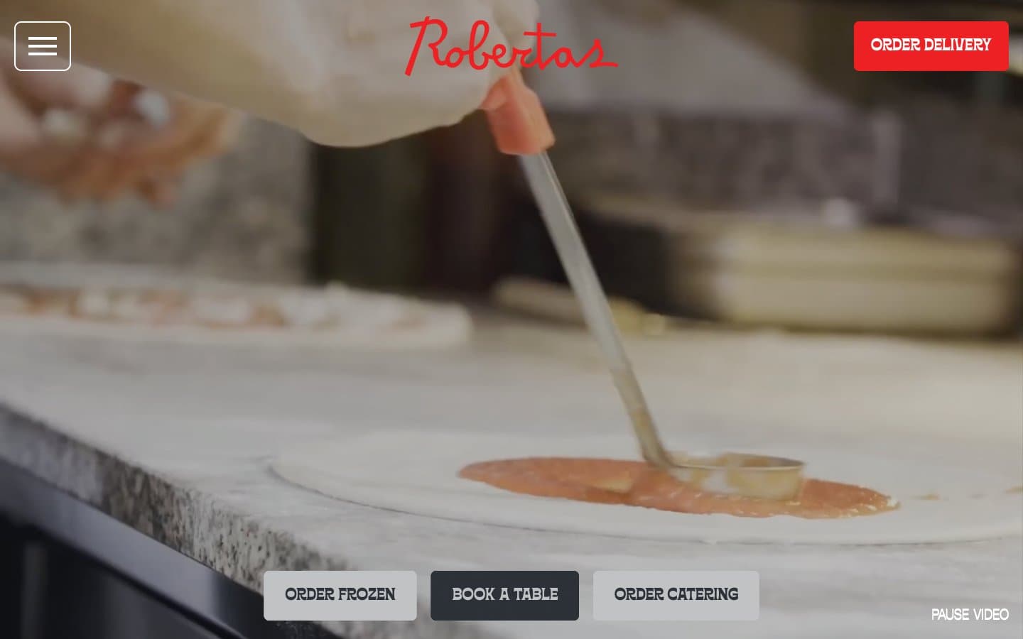
Roberta's Pizza design system

Brand1
Primary filled CTAs, full-bleed social section background, logo wordmark, and any place the brand must shout — vivid red against white and charcoal creates urgency and warmth without aggression
Neutrals4
Input field borders and the deepest surface accent — used sparingly for the hardest possible contrast point on form elements
Primary text, body copy, dark CTA fill, hairline borders, icon strokes, image borders — the structural neutral that carries 90% of the interface
Supporting neutral for secondary UI, dividers, and muted labels.
Page canvas, card surfaces, text on dark backgrounds, button text, badge backgrounds — the dominant neutral that gives the system its airy, poster-like feel
Try a pairing
Pick any two colors from the palette to check whether text stays readable on top.
Aa
Pure Black on Roberta Red
4.83 : 1 contrast
- Body textPasses AA 4.5
- Large textPasses AA 3
- StrictFails AAA 7
More DESIGN.md files. Same web, different personalities.

High Protein
Commerce
Hopper
Commerce
2.AG
Commerce
A-WARE
Commerce
AATHER
Commerce
Abel
Commerce
Acme Cups New Zealand
Commerce
Acne Studios
Commerce
Adam Lippes
Commerce
Adanola
Commerce
Advene
Commerce
Aevi Wellness
Commerce


