
Rivian. Electric monolith on a concrete gallery wall.
- Commerce
- Light theme
- 14 colors
- 4 typefaces
Rivian presents its vehicles as monumental objects in a clean architectural gallery: white concrete canvases, full-bleed cinematic photography, and one signature Solar Yellow accent that electrifies the otherwise monochrome system. Typography does the heavy lifting — a custom Adventure typeface at near-black weights paired with Liga at 360px for product monograms makes each vehicle feel branded and indivisible. Components are minimal and confident: pill-shaped controls, hairline borders, flat surfaces, and generous negative space that lets photography breathe. Color is rationed to the single yellow CTA and a few paint-swatch accents; everything else is graphite, concrete, and white. The system rejects decoration in favor of scale, restraint, and theatrical product presentation.
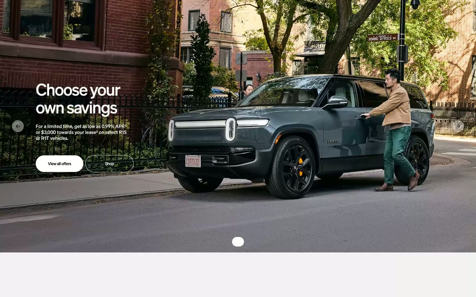
Rivian design system

Brand1
Yellow supporting accent for decorative details and low-frequency emphasis. Do not promote it to the primary CTA color
Accent3
Orange supporting accent for decorative details and low-frequency emphasis. Do not promote it to the primary CTA color
Secondary accent for vehicle color options and category tags
Secondary accent for vehicle color options and informational highlights
Neutrals10
High-contrast text, icon fills, and the heaviest display headings where maximum weight is needed
Dark supporting neutral for text, icons, and strong contrast. Do not promote it to the primary CTA color
Input field backgrounds and dark UI surfaces — slightly lighter than Graphite to read as surface rather than text
Secondary nav text, subdued icon fills, inactive labels
Cool-tinted shadow base and atmospheric wash — the only chromatic neutral, gives elevation a slightly overcast feel
Muted helper text and tertiary metadata
Mid-gray surface and shadow base for elevated cards and subtle depth
Light supporting surface for subtle backgrounds and section separation. Do not promote it to the primary CTA color
Alternate page background for content sections — warmer than pure white, breaks the canvas rhythm
Page canvas, card surface, reversed text on dark fills
Try a pairing
Pick any two colors from the palette to check whether text stays readable on top.
Aa
Pure Black on Solar Yellow
11.15 : 1 contrast
- Body textPasses AA 4.5
- Large textPasses AA 3
- StrictPasses AAA 7
More DESIGN.md files. Same web, different personalities.

High Protein
Commerce
Hopper
Commerce
2.AG
Commerce
A-WARE
Commerce
AATHER
Commerce
Abel
Commerce
Acme Cups New Zealand
Commerce
Acne Studios
Commerce
Adam Lippes
Commerce
Adanola
Commerce
Advene
Commerce
Aevi Wellness
Commerce


