
Relieve Furniture. A grounded, organic palette where a single deep forest-teal holds the structure and chartreuse sparks punctuate the silence.
- Commerce
- Light theme
- 15 colors
- 1 typeface
Relieve Furniture uses a warm-stone canvas with a single deep forest-teal structural color and bright chartreuse sparks of sustainability energy. The visual language is grounded and organic: borders carry brand weight more than fills, the typeface is a whisper-thin neo-grotesque (Planar, weights 200-400), and surfaces are stacked as warm stone → mist → pure white. A vivid violet provides secondary energy for the asset calculator card and link accents. Components feel light and architectural — thin teal strokes, 8px radii, soft shadows used sparingly, and a 9999px pill for sustainability badges. Color appears as punctuation (lime badges, violet link underlines, teal borders) rather than as a painted backdrop; the page reads as an editorial product on limestone rather than a marketing surface.
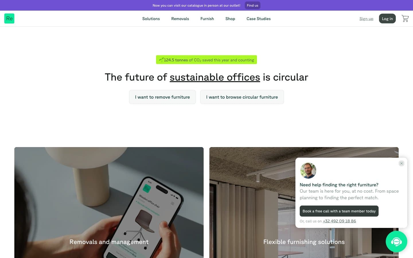
Relieve Furniture design system

Brand3
Primary brand color — carries borders, navigation strokes, heading underlines, card edges, and structural outlines. This teal defines the design more than any fill color; surfaces stay warm and neutral while the Forest Ink draws the architecture
Vivid violet accent — link underlines, secondary call-out card backgrounds (asset calculator), heading emphasis, and selective section highlights. Acts as a counterpoint to Forest Ink, used when a block needs energy without the sustainability context of lime
Pressed iris for button backgrounds or filled actions where a chromatic state is needed without warmth — denser than Iris, used as the active/filled counterpart of the violet family
Accent4
Tinted violet for softer card washes or large surface blocks that need chromatic presence without the saturation of Iris
Green wash for highlight backgrounds, decorative bands, and soft emphasis behind content
Vivid mint for the rare filled chromatic button or interactive state — used when a CTA needs to feel switched on without being violet
Mid-green for body text emphasis and border details that need botanical warmth without the full weight of Forest Ink
Neutrals8
Icon fills and absolute-contrast accents — the cart icon, logo mark, and any element that must read as a sharp silhouette against the warm canvas
Primary text and strongest heading color — near-black with a barely-perceptible green undertone that aligns it with the Forest Ink palette rather than reading as neutral gray
High-contrast neutral action fill for primary buttons on light surfaces.
Body text and nav links at reduced hierarchy, plus nav borders — a middle gray-green for content that needs to be readable but not assertive
Muted helper text, secondary body copy, and low-priority labels — a desaturated sage that keeps the neutral family botanically tinted
Page canvas, primary section backgrounds, and the dominant neutral surface — this warm limestone tone gives the site its grounded, tactile character and sets off both the teal structure and lime accents
Card surfaces and button fills that need to lift off the stone canvas without becoming bright white — a cool, slightly desaturated light gray for quieter elevated layers
Highest surface — chat widget, product cards, nav bar background, button borders. Reserved for surfaces that need to read as paper or screen-white against the stone canvas
Try a pairing
Pick any two colors from the palette to check whether text stays readable on top.
Aa
Pure on Forest Ink
12.80 : 1 contrast
- Body textPasses AA 4.5
- Large textPasses AA 3
- StrictPasses AAA 7
More DESIGN.md files. Same web, different personalities.

High Protein
Commerce
Hopper
Commerce
2.AG
Commerce
A-WARE
Commerce
AATHER
Commerce
Abel
Commerce
Acme Cups New Zealand
Commerce
Acne Studios
Commerce
Adam Lippes
Commerce
Adanola
Commerce
Advene
Commerce
Aevi Wellness
Commerce


