
Redbrick Coffee. Scarlet ink editorial on butcher paper.
- Commerce
- Light theme
- 5 colors
- 4 typefaces
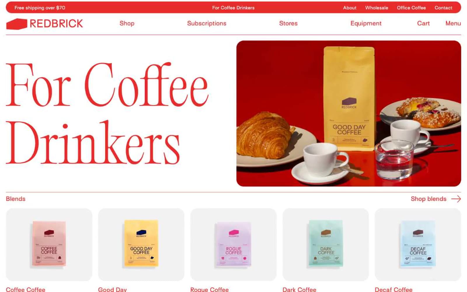
Redbrick is an editorial coffee storefront printed in scarlet ink on warm white pages. The system is defined by a single aggressive red (#e82c2a) that saturates every interactive surface — logo, nav text, section labels, borders, arrows, and the announcement bar — while the page canvas stays creamy white and cards sit on soft #f2f2f2 surfaces. Display headlines are a weight-300 didone-adjacent serif (Editorial Old) at extraordinary sizes (100–150px) with near-1.0 line-height, letting the letterforms breathe without bold weight. Body and UI copy use a humanist sans (Surt) with consistent positive tracking, giving even short labels a printed, typeset quality. Photography is overhead lifestyle — wooden tables, open books, espresso machines, hands cradling cups — warm and editorial rather than glossy e-commerce. Layout alternates half-width image and text blocks, anchored by tiny uppercase section labels and right-aligned arrow links that behave like magazine running heads.
Redbrick Coffee design system

Brand1
Red accent for outlined action borders, linked labels, and lightweight interactive emphasis. Do not promote it to the primary CTA color
Neutrals4
Dark anchor for footer, inverse panels, and the few dark-on-light UI elements that need more weight than Press Black provides
Primary body and paragraph text, hero supporting text, and darkest surface accents where deeper contrast than white-on-red is needed
Product card surface and elevated panels, one subtle step below the white canvas to separate scrolled content blocks
Page canvas, image backgrounds, nav fill, and card surface base — the warm white that makes Brick Red feel printed rather than digital
Try a pairing
Pick any two colors from the palette to check whether text stays readable on top.
Aa
#111111 on Brick Red
4.34 : 1 contrast
- Body textFails AA 4.5
- Large textPasses AA 3
- StrictFails AAA 7
More DESIGN.md files. Same web, different personalities.

High Protein
Commerce
Hopper
Commerce
2.AG
Commerce
A-WARE
Commerce
AATHER
Commerce
Abel
Commerce
Acme Cups New Zealand
Commerce
Acne Studios
Commerce
Adam Lippes
Commerce
Adanola
Commerce
Advene
Commerce
Aevi Wellness
Commerce


