
Rains INT. Nordic rain catalog on fog-gray paper.
- Commerce
- Light theme
- 8 colors
- 2 typefaces
Rains operates in a near-monochromatic Scandinavian editorial register: a warm off-white canvas (not clinical white), a single charcoal accent for interactive surfaces, and photography that does all the emotional work. The defining signature is typographic scale — headlines reach 200+ pixels and sit directly over full-bleed product photography, with line-heights compressed to ~0.9 so massive type locks into tight visual bands. UI chrome is deliberately spare: pill buttons, hairline borders, no shadows, no gradients, no color. The single chromatic moment is a pale butter-cream hero text (#fffb85) that breaks the grayscale without breaking the quiet. Every screen should feel like a printed fashion catalog: generous breathing room, product-first imagery, and type that whispers and shouts in the same family.
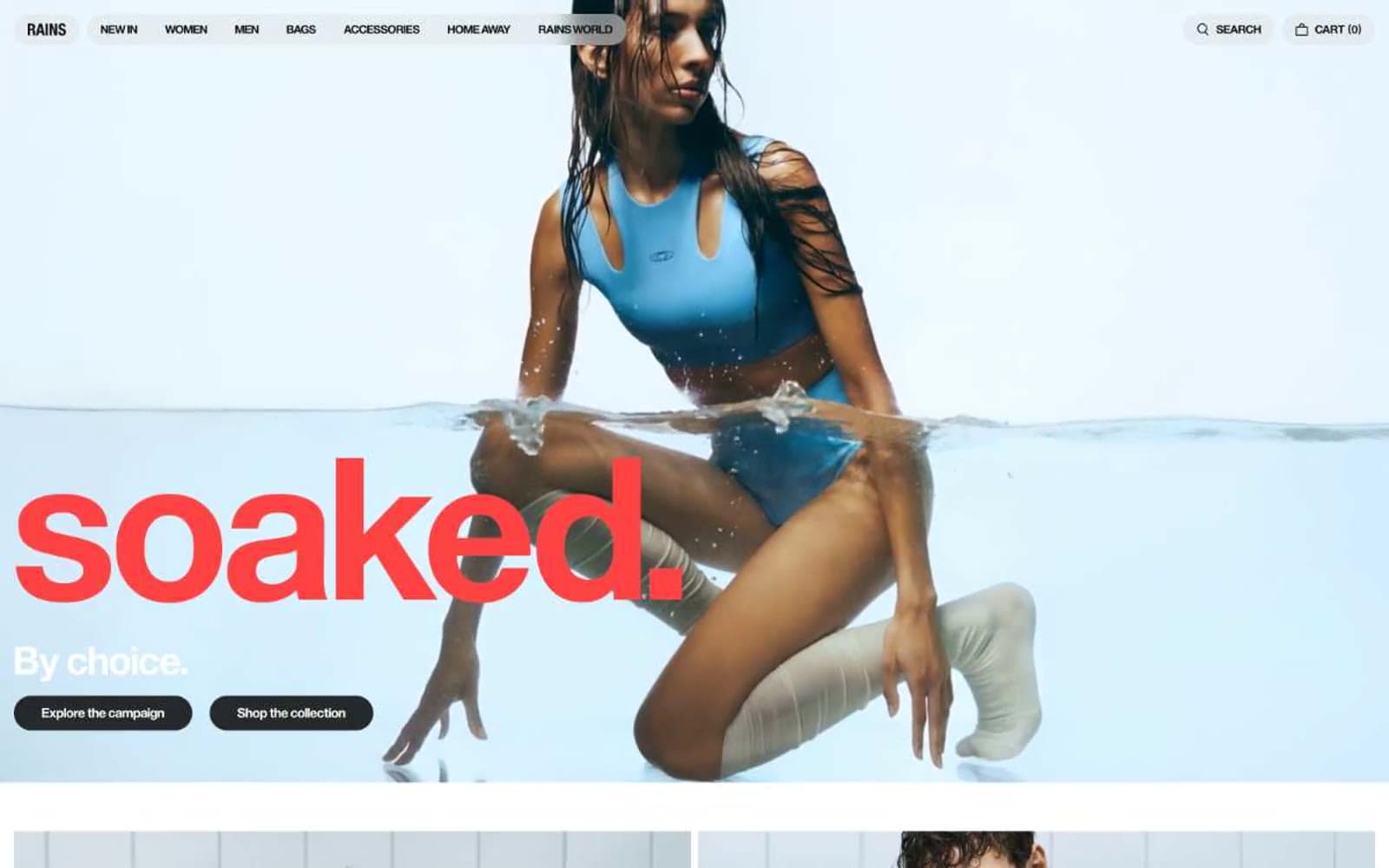
Rains INT design system

Brand1
Hero display text accent — the single chromatic voice on the page, used only on oversized seasonal headlines over photography
Neutrals7
Pure black for SVG icon fills and the occasional hard edge — functional, not brand
Primary text, nav links, body copy, icon strokes — near-black with a barely-warm bias (never pure #000)
Filled button background, active states, inverted UI surfaces — warm-tinted dark, never pure black
Secondary button fill, subtle dark UI accents
Muted helper text, tertiary metadata, inactive nav items
Page canvas, card surfaces, divider hairlines — the warm light gray that IS the page background
Card surfaces over the gray canvas, text on dark buttons, product image backgrounds
Try a pairing
Pick any two colors from the palette to check whether text stays readable on top.
Aa
Black on Butter Cream
19.39 : 1 contrast
- Body textPasses AA 4.5
- Large textPasses AA 3
- StrictPasses AAA 7
More DESIGN.md files. Same web, different personalities.

High Protein
Commerce
Hopper
Commerce
2.AG
Commerce
A-WARE
Commerce
AATHER
Commerce
Abel
Commerce
Acme Cups New Zealand
Commerce
Acne Studios
Commerce
Adam Lippes
Commerce
Adanola
Commerce
Advene
Commerce
Aevi Wellness
Commerce


