
Raad Cycling. Ink and ivory gallery runway.
- Commerce
- Light theme
- 5 colors
- 3 typefaces
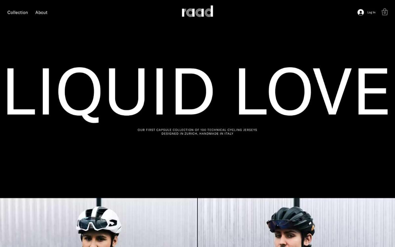
Raad Cycling operates as a monochrome editorial gallery where cycling apparel is presented as wearable sculpture. The entire visual system is built on the tension between pure black and pure white — no chromatic accent, no decorative gradient, no warm undertone. Typography carries all the personality: a single geometric sans-serif rendered at extreme scale for headlines (filling nearly the full viewport width) and shrunken to whisper-thin captions for product labels. Photography is treated as gallery art — full-bleed, tightly cropped, no rounded corners, no drop shadows, no decorative framing. The aesthetic borrows from high-fashion lookbooks and contemporary art catalogues, not from sports retail. Every surface is either ink or ivory. Every interaction is a hairline border, never a filled button. The result is a brand that feels curated, expensive, and silent — the product must do the talking.
Raad Cycling design system

Neutrals5
Primary canvas for dark sections, product photography backgrounds, all body text on light surfaces, divider lines, and the dominant border color throughout the system
Dark borders and separators for elevated surfaces and inverted UI. Do not promote it to the primary CTA color
Secondary border tone for subtle UI structure, divider lines between content blocks, and depth separation on otherwise flat surfaces
Muted helper text, secondary metadata, and the only step down in the type hierarchy where pure black would feel too heavy — the softest voice in the system
Primary canvas for light sections, text on dark backgrounds, ghost-button fills and borders, the base surface against which all product photography is staged
Try a pairing
Pick any two colors from the palette to check whether text stays readable on top.
Aa
Ivory White on Ink Black
21.00 : 1 contrast
- Body textPasses AA 4.5
- Large textPasses AA 3
- StrictPasses AAA 7
More DESIGN.md files. Same web, different personalities.

High Protein
Commerce
Hopper
Commerce
2.AG
Commerce
A-WARE
Commerce
AATHER
Commerce
Abel
Commerce
Acme Cups New Zealand
Commerce
Acne Studios
Commerce
Adam Lippes
Commerce
Adanola
Commerce
Advene
Commerce
Aevi Wellness
Commerce


