
Postevand. Editorial gallery on bone paper.
- Commerce
- Light theme
- 5 colors
- 2 typefaces
Postevand operates as an editorial gallery on bone paper — a completely achromatic environment where the product IS the color. Every interface element reduces to black, white, and a single warm off-white (#f0f1ef), creating a Scandinavian exhibition aesthetic where photography and oversized typography carry all the visual weight. The system is aggressively minimal: hairline black rules divide the canvas into grid cells, buttons are black rectangles that feel like printed labels, and there are zero decorative gradients or chromatic accents. Typography is the only expressive tool — a single sans-serif (Nimbus Sans) speaks in whisper-weight headlines and tight tracking, with the brand wordmark scaled to fill the viewport. Components are skeletal: ghost inputs, black filled buttons that double as text, and cards that are just rectangles on the bone-colored surface.
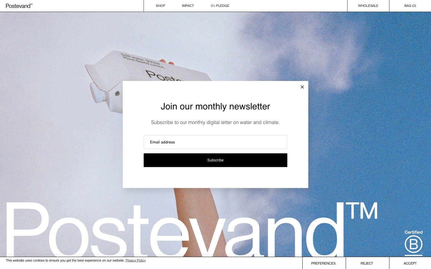
Postevand design system

Neutrals5
Primary text, hairline borders, filled button backgrounds, navigation rules — the structural line weight of the entire system
Secondary borders, subdued text — used when pure black is too heavy for hairline elements
Input field borders, dividers, placeholder affordance — the lightest structural gray in the stack
Card surfaces, secondary canvas tone — gives the white-on-white system a warm paper-like quality rather than sterile digital white
Page canvas, input fills, modal surfaces, inverted text on black buttons
Try a pairing
Pick any two colors from the palette to check whether text stays readable on top.
Aa
Paper White on Ink Black
21.00 : 1 contrast
- Body textPasses AA 4.5
- Large textPasses AA 3
- StrictPasses AAA 7
More DESIGN.md files. Same web, different personalities.

High Protein
Commerce
Hopper
Commerce
2.AG
Commerce
A-WARE
Commerce
AATHER
Commerce
Abel
Commerce
Acme Cups New Zealand
Commerce
Acne Studios
Commerce
Adam Lippes
Commerce
Adanola
Commerce
Advene
Commerce
Aevi Wellness
Commerce


