
Peggy. The only color comes from the work on the walls.
- Commerce
- Light theme
- 6 colors
- 3 typefaces
Peggy operates as a curated white-cube gallery translated to the web: an entirely monochrome interface that treats color as something the artwork supplies, not the chrome. The page is anchored by Reckless, a contemporary serif used at whisper weight (300) for display and regular weight (400) for mid-tier headings — this single typographic decision is what separates Peggy from the sea of geometric-sans art marketplaces. Inter handles all UI chrome at 12-16px, Monument Grotesk micro-caps label the footer's category architecture. Surfaces are flat and almost invisible: #f4f4f4 canvas, #ffffff cards, hairline #f4f4f4 borders, with one dark surface (#141414) reserved for the app-download notification strip and the primary CTA. There is no brand color, no gradient, no decorative elevation — the system earns its atmosphere through generous negative space, squareness (no rounded corners except pill-masked photography), and the trust that real art and real type are enough.
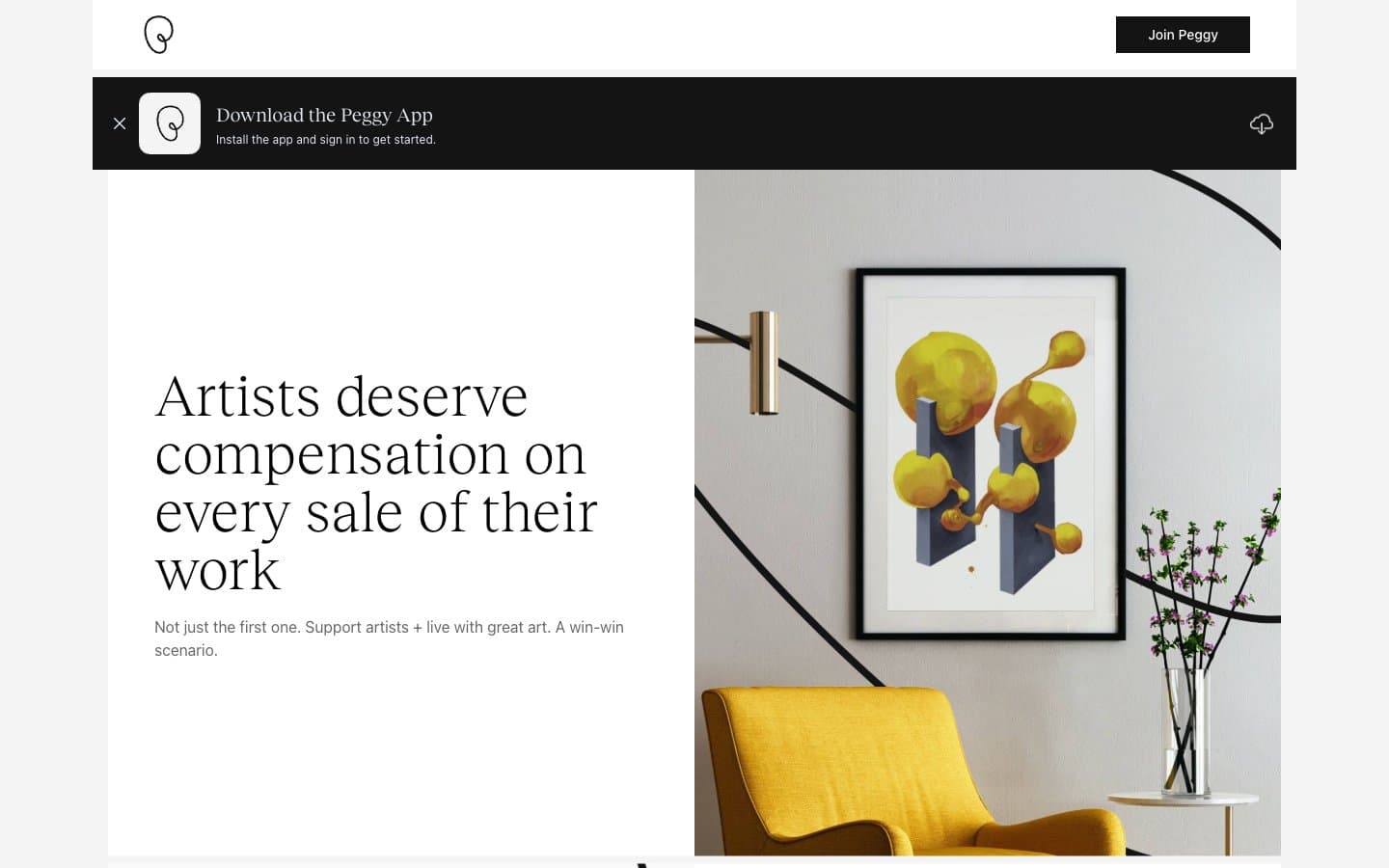
Peggy design system

Neutrals6
Primary text, logo, nav labels, body copy — the strongest type color, never used as a surface
High-contrast neutral action fill for primary buttons on light surfaces.
Secondary/muted text — helper copy, metadata in transaction cards, footer body, link at rest
Muted accents, icon fills at rest, secondary surface tint, subtle dividers where Canvas Mist is too light
Page background; also functions as the universal hairline border (borderColor 572 occurrences across every context) — the system draws structure with the canvas color itself
Card surfaces, input fields, button text on dark fills, nav surface over dark strips
Try a pairing
Pick any two colors from the palette to check whether text stays readable on top.
Aa
Gallery White on Ink Black
21.00 : 1 contrast
- Body textPasses AA 4.5
- Large textPasses AA 3
- StrictPasses AAA 7
More DESIGN.md files. Same web, different personalities.

High Protein
Commerce
Hopper
Commerce
2.AG
Commerce
A-WARE
Commerce
AATHER
Commerce
Abel
Commerce
Acme Cups New Zealand
Commerce
Acne Studios
Commerce
Adam Lippes
Commerce
Adanola
Commerce
Advene
Commerce
Aevi Wellness
Commerce


