
Palmer. The interface is the wall, the objects are the art.
- Commerce
- Light theme
- 5 colors
- 1 typeface
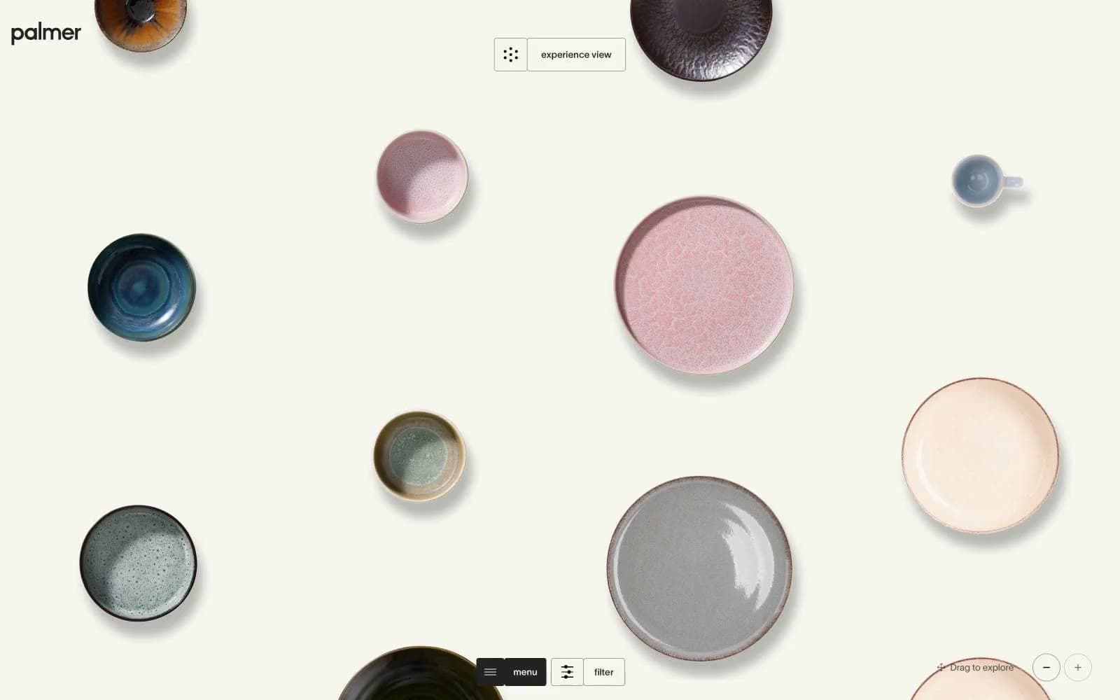
Palmer treats dinnerware like a museum exhibit on a warm cream canvas (#f5f6ee). The interface dissolves — no shadows, no chrome, no saturated accents — so hand-glazed ceramics become the only color in the room. Typography runs tight: TWK Lausanne at near-mono weights (300–500) with aggressive negative tracking that pulls letters together, including an enormous 120px display tier that functions more as editorial statement than UI label. Interactive elements are reduced to hairline borders and pill-shaped toggles, sitting at the edges of the viewport to leave the center completely uninterrupted. Everything below the fold assumes the same gallery logic: small text, thin rules, generous space between objects.
Palmer design system

Neutrals5
Reserved for the rare filled element (active nav background, weight anchors) — used sparingly so Ink remains the default voice
Primary text, hairline borders, card outlines, icon strokes — the entire structural skeleton runs through this one near-black
Muted secondary borders and low-priority text — used when Ink would be too heavy for a structural divider
Page canvas and base surface — a warm off-white that flatters glazed ceramics more than pure white would
Product image backgrounds, occasional inverse surface when a card needs to sit forward of the cream canvas
Try a pairing
Pick any two colors from the palette to check whether text stays readable on top.
Aa
Bone on Lampblack
21.00 : 1 contrast
- Body textPasses AA 4.5
- Large textPasses AA 3
- StrictPasses AAA 7
More DESIGN.md files. Same web, different personalities.

High Protein
Commerce
Hopper
Commerce
2.AG
Commerce
A-WARE
Commerce
AATHER
Commerce
Abel
Commerce
Acme Cups New Zealand
Commerce
Acne Studios
Commerce
Adam Lippes
Commerce
Adanola
Commerce
Advene
Commerce
Aevi Wellness
Commerce


