
ORYZO AI. Darkroom product editorial.
- Design tools
- Dark theme
- 7 colors
- 2 typefaces
The ORYZO visual system treats a single product object like a museum artifact: full-bleed warm-dark canvas, cream typography floating in generous negative space, and zero UI chrome competing with the form. Every text element is uppercase at weight 500, with the sole exception of body copy at 29px/400 which is the system's only conversational voice. A single vivid orange appears only for credit lines and the studio link — never for buttons or CTAs — earning its rarity. The layout alternates between two modes: photographic hero (the product in context with tools and materials) and void-mode reveal (the product isolated on warm dark), connected by hairline dashed dividers and pill-shaped controls.
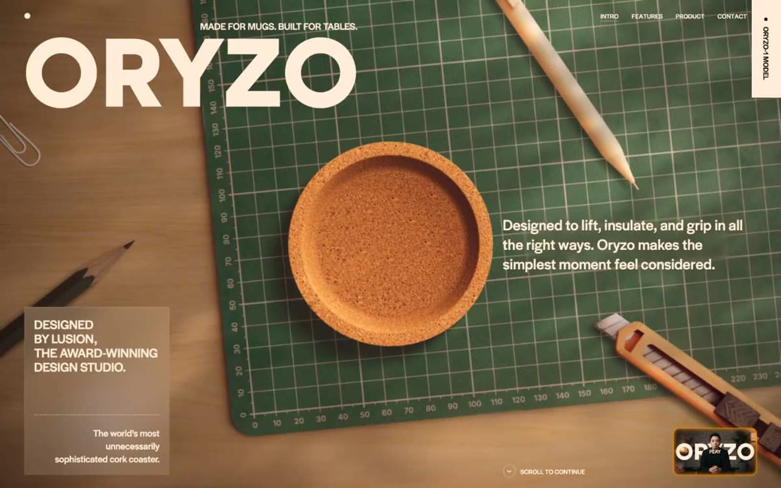
ORYZO AI design system

Accent1
Orange text accent for links, tags, and emphasized short phrases.
Neutrals6
SVG icon fills and decorative vector elements only — never used as a background or text color
Page canvas and deepest background — warm near-black, not pure black. The void behind every product reveal
Elevated surface and filled button background — the one chromatic step above the canvas, used for the single solid CTA
Hairline dividers, dashed section separators, subtle container borders — warmer than the canvas by one step
Mid-tone warm gray for secondary dividers and muted structural elements — the bridge between Bark and Cream
Light text on dark surfaces, inverse labels, and high-contrast captions.
Try a pairing
Pick any two colors from the palette to check whether text stays readable on top.
Aa
Pure Black on Ember Accent
5.19 : 1 contrast
- Body textPasses AA 4.5
- Large textPasses AA 3
- StrictFails AAA 7
More DESIGN.md files. Same web, different personalities.
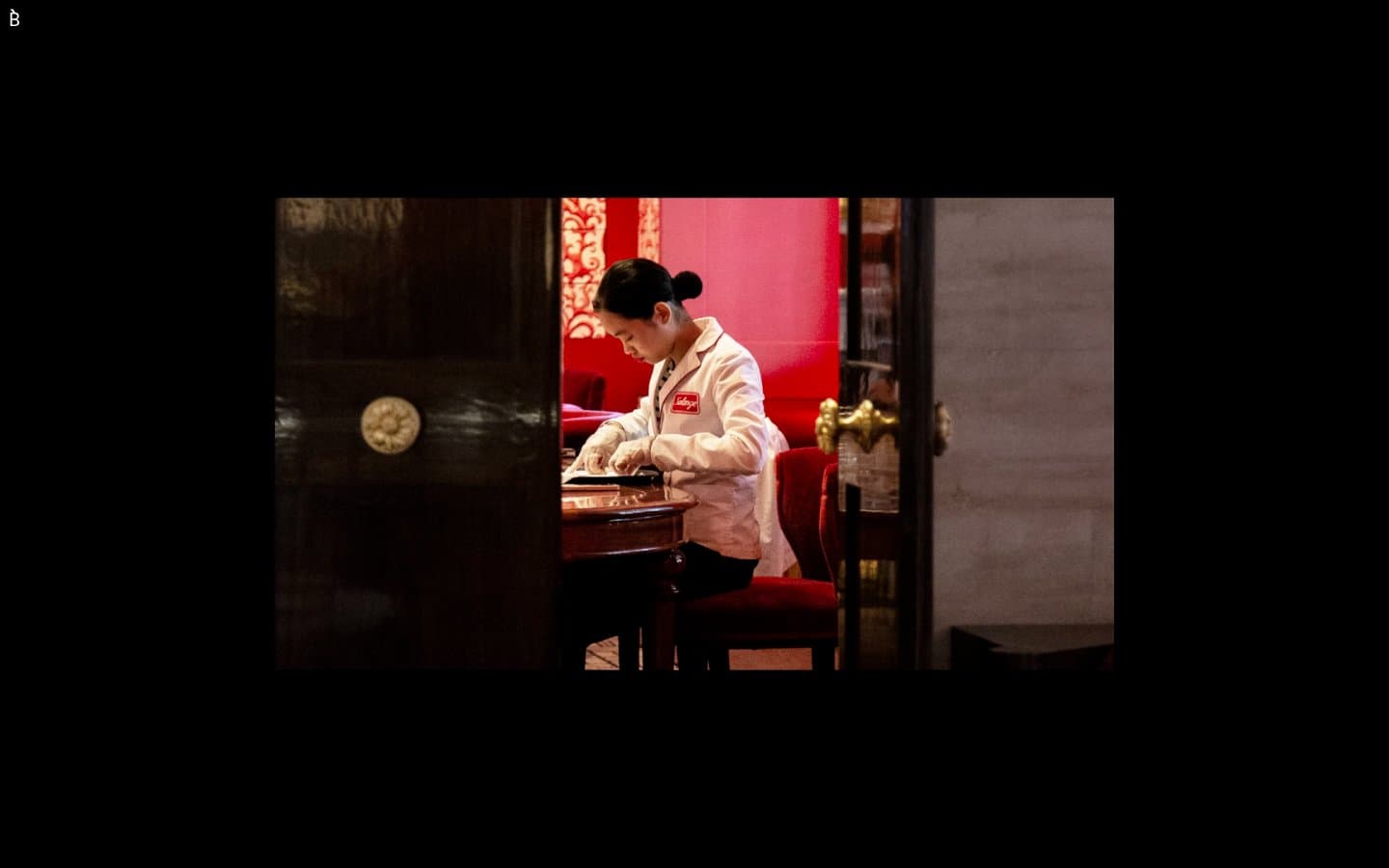
Bibliothèque
Design tools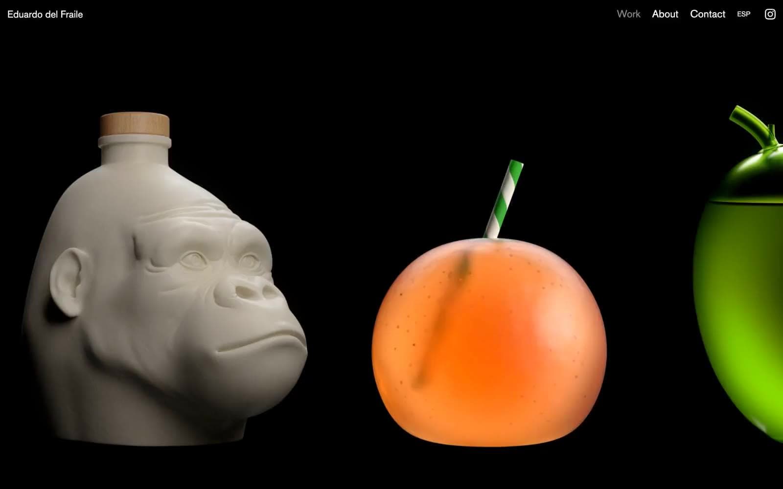
Eduardo del Fraile
Design tools
Endlesstools
Design tools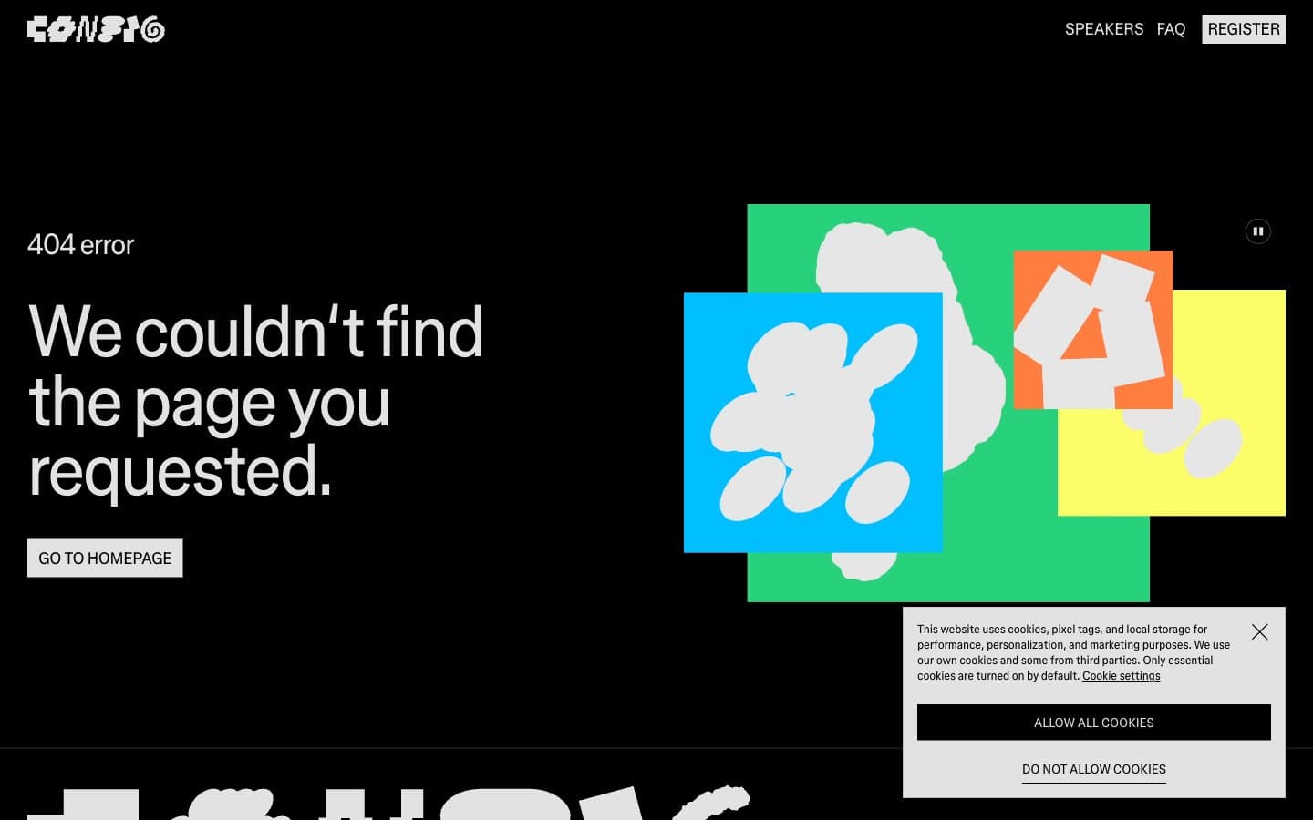
Figma Config
Design tools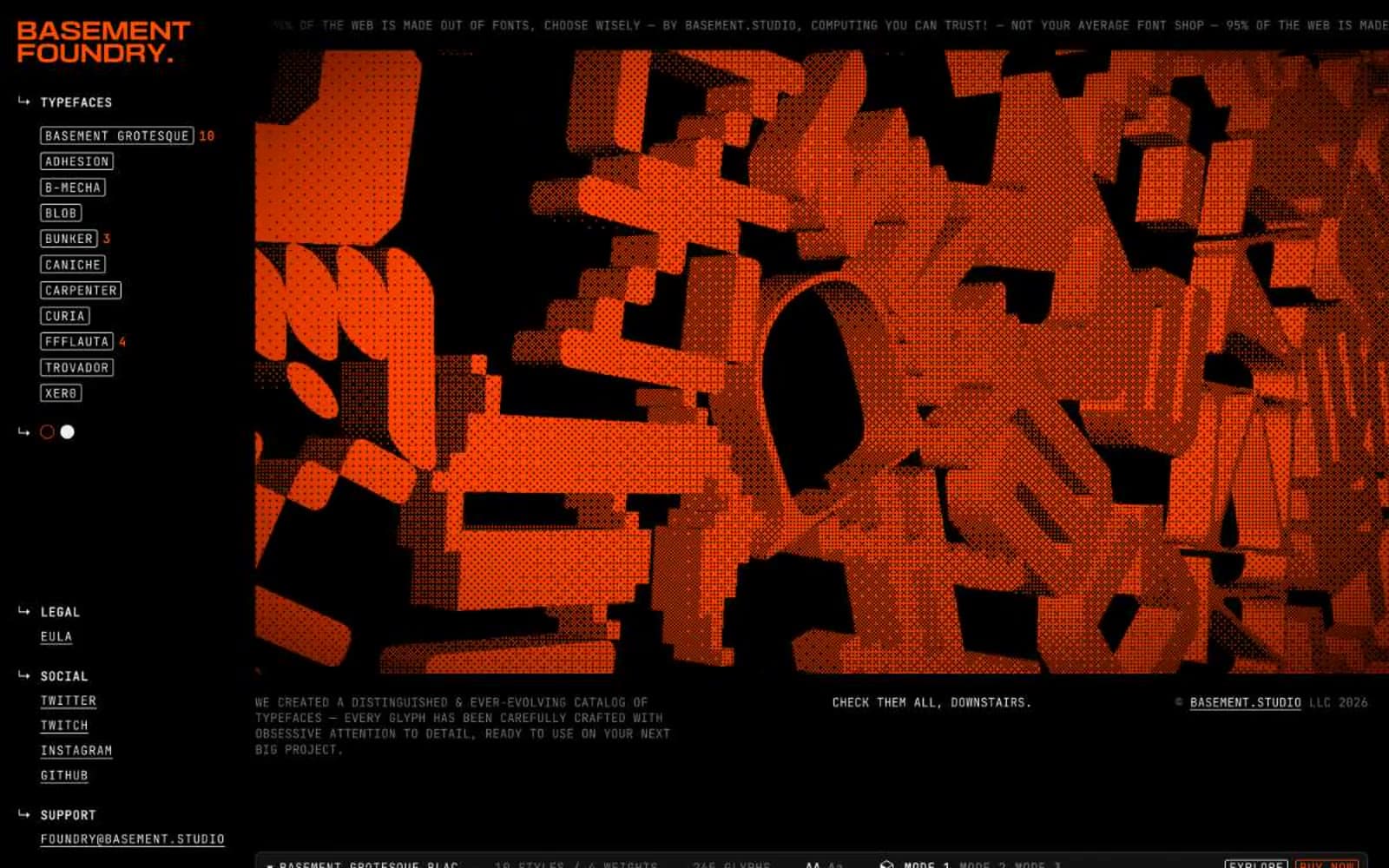
Foundry
Design tools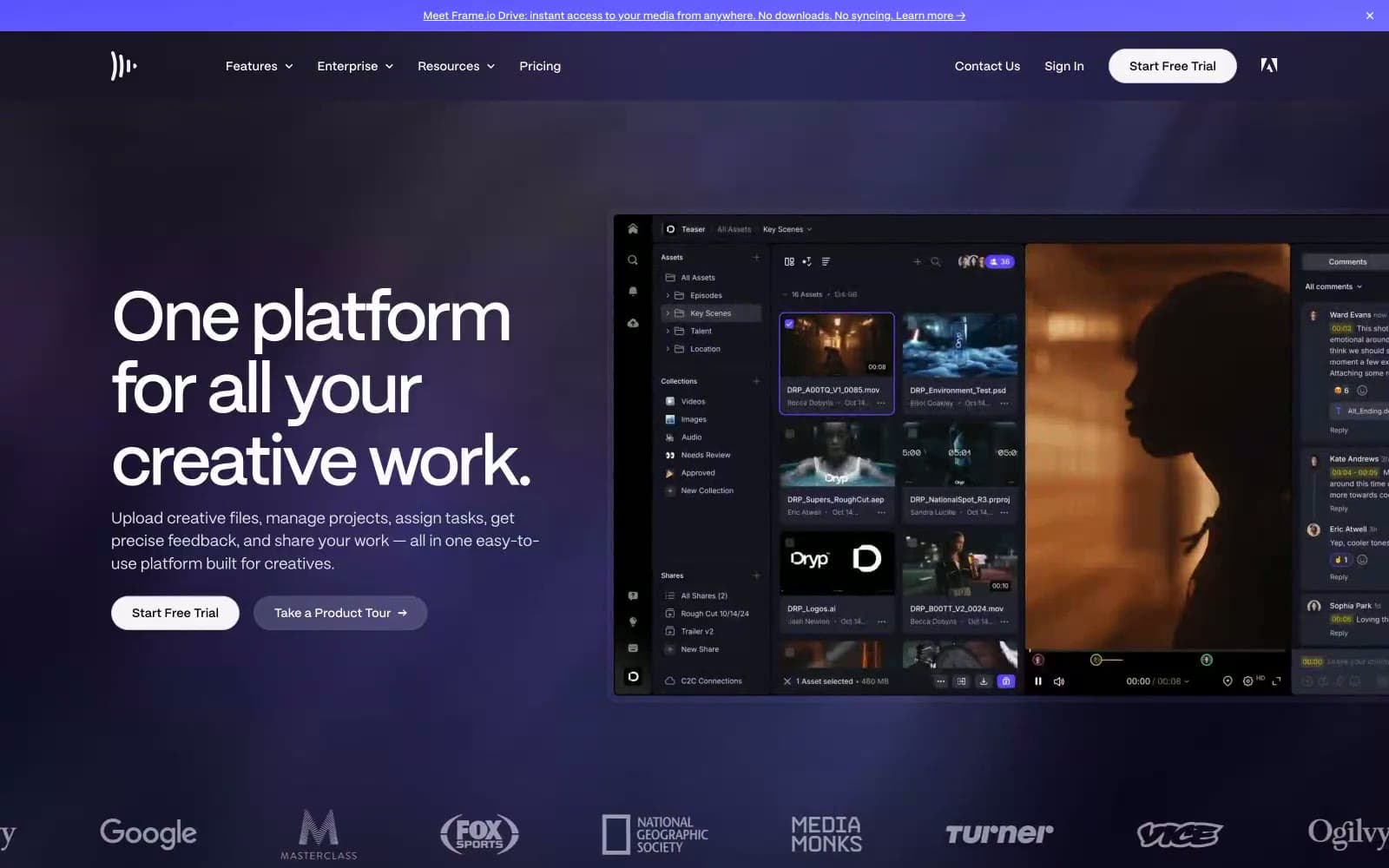
Frame.io
Design tools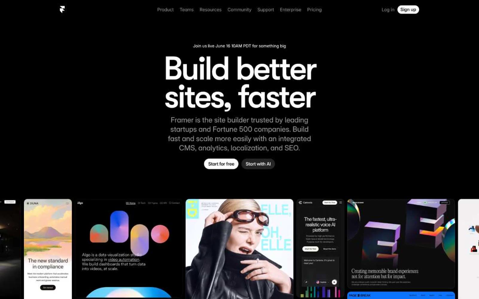
Framer
Design tools
Gt-planar
Design tools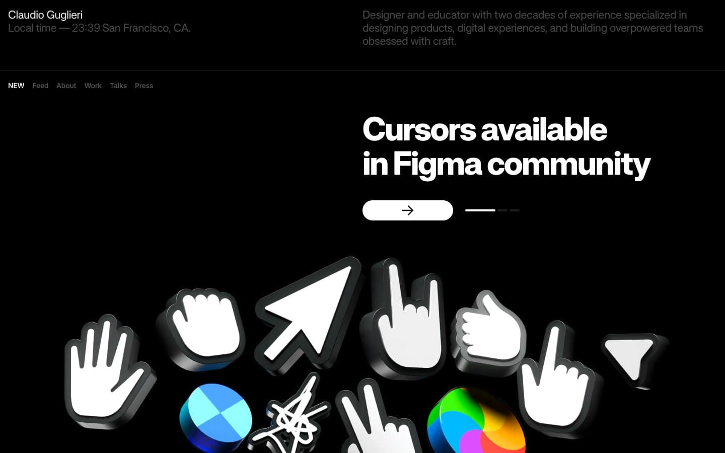
Guglieri
Design tools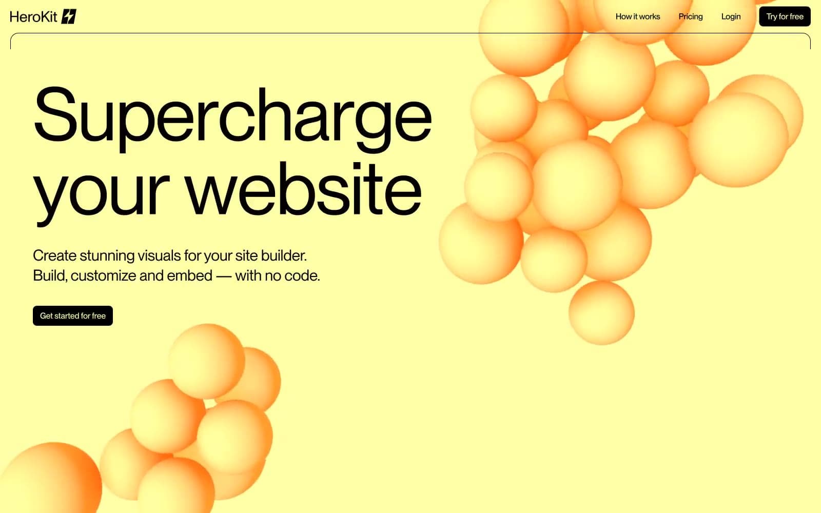
HeroKit
Design tools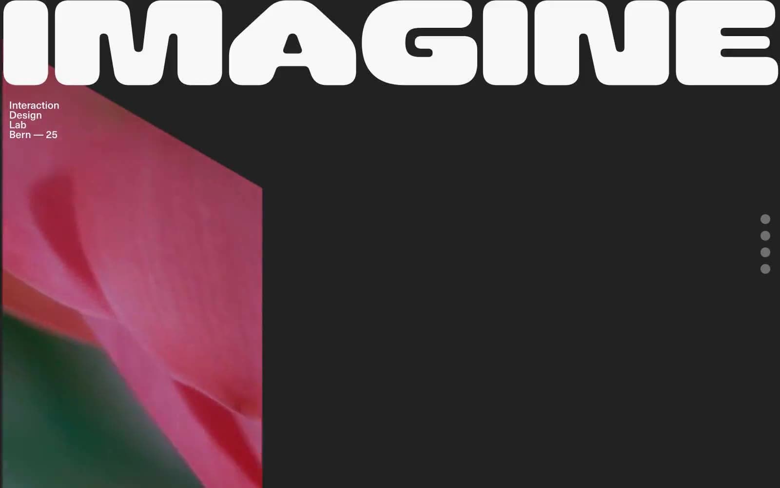
Iad-lab
Design tools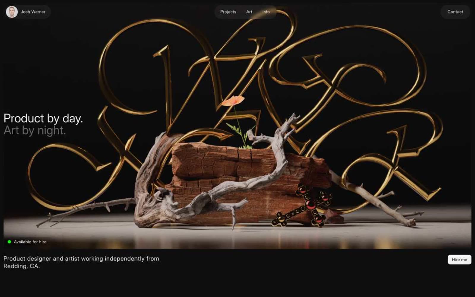
Josh Warner
Design tools


