
OLIPOP. A soda fountain menu printed on warm paper.
- Commerce
- Light theme
- 15 colors
- 3 typefaces
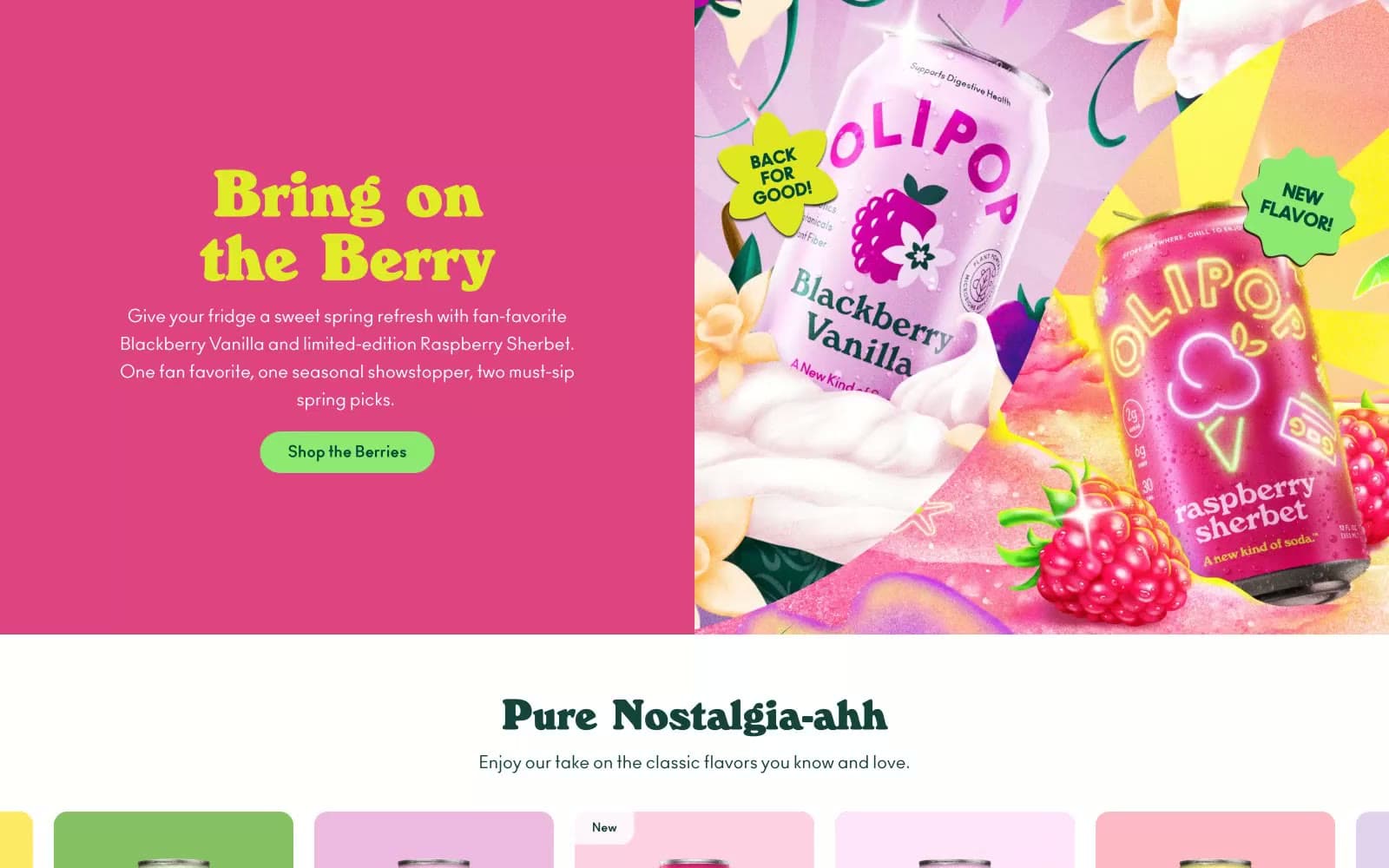
OLIPOP is a sun-faded apothecary meets soda fountain: warm cream canvases, one authoritative forest-teal that anchors every header, button, and brand mark, and a carousel of pastel-flavored product cards that read like candy shelf labels from a 1950s general store. Typography does most of the storytelling — a high-contrast retro display serif (WindsorEF) at weight 800 shouts from headlines, while a clean modern sans (Ano) handles everything else with workmanlike quietness. The system lives in the gap between vintage warmth and modern e-commerce utility: pill-shaped buttons, soft 16px-radius cards, and zero shadows except a single faint glow on the primary call-to-action. Color is rationed carefully — most of the page is cream and forest teal, with chromatic energy reserved for product cards, a single wine-red accent, and a bright teal secondary action.
OLIPOP design system

Brand2
Teal supporting accent for decorative details and low-frequency emphasis. Do not promote it to the primary CTA color
Teal supporting accent for decorative details and low-frequency emphasis. Do not promote it to the primary CTA color
Accent8
Red supporting accent for decorative details and low-frequency emphasis.
Teal supporting accent for decorative details and low-frequency emphasis. Do not promote it to the primary CTA color
Red supporting accent for decorative details and low-frequency emphasis. Use as a supporting accent, not as a status color
Product card background — Banana Cream flavor
Product card background — Watermelon Lime flavor
Product card background — Crisp Apple flavor
Product card background — Classic Grape flavor
Product card background — Vintage Cola flavor
Neutrals5
Body text, link text, secondary icons — softer than pure black to stay in harmony with the warm cream canvas
Hero panel background, soft section washes — a desaturated mint that recedes so forest-teal text can lead
Dividers, subtle borders — barely-there structural lines
Page canvas, section backgrounds — the off-white that every surface sits on, slightly warm so type never feels clinical
Card surfaces on cream sections, button text on forest-teal fills, input fields — the only true white in the system
Try a pairing
Pick any two colors from the palette to check whether text stays readable on top.
Aa
Pure White on Forest Ink
11.05 : 1 contrast
- Body textPasses AA 4.5
- Large textPasses AA 3
- StrictPasses AAA 7
More DESIGN.md files. Same web, different personalities.

High Protein
Commerce
Hopper
Commerce
2.AG
Commerce
A-WARE
Commerce
AATHER
Commerce
Abel
Commerce
Acme Cups New Zealand
Commerce
Acne Studios
Commerce
Adam Lippes
Commerce
Adanola
Commerce
Advene
Commerce
Aevi Wellness
Commerce


