
OhDada. Editorial gallery wall.
- Commerce
- Light theme
- 4 colors
- 2 typefaces
OhDada operates on a gallery-catalog visual language: two quiet, chalky neutrals (warm cream and lavender-gray) alternate as full-bleed section canvases, and a single saturated saddle brown does all the typographic and structural work. The signature typographic move pairs GrandSlang-Roman at weight 100 — an ultra-thin display serif — with Neue Haas Grotesk, so the brand name whispers in calligraphic hairline strokes while supporting text sits in crisp, engineered grotesque. This is a low-density, image-forward layout where the product photography (kinetic sculptures in primary blues and browns against white walls) provides all the color the UI refuses to use. The interface is minimal to the point of editorial restraint: thin hairline borders, almost no shadows, no gradients, and components that feel like printed catalog plates rather than software surfaces.
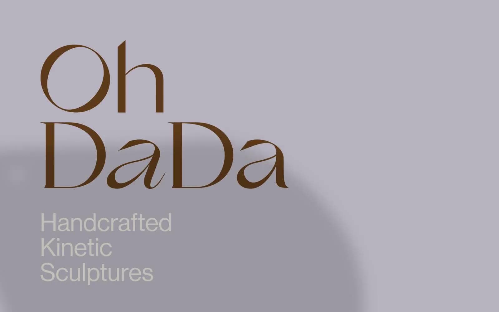
OhDada design system

Brand1
All headings, body copy, link text, and hairline borders — the only chromatic voice in the system, used as a drawn-with-ink accent against the pale neutrals; Outlined and ghost interactive borders; links and navigation controls carry a 1px brown stroke rather than a filled background, keeping the surface quiet
Neutrals3
Decorative SVG fills only; never used for UI text or surface elements
Alternate section background and hero canvas; introduces a cool, chalky counterpoint to the warm cream without breaking the achromatic discipline
Primary page canvas and secondary section background; the warm off-white that makes brown type and sculpture photography feel curated rather than clinical
Try a pairing
Pick any two colors from the palette to check whether text stays readable on top.
Aa
Chalk Cream on Saddle Brown
7.69 : 1 contrast
- Body textPasses AA 4.5
- Large textPasses AA 3
- StrictPasses AAA 7
More DESIGN.md files. Same web, different personalities.

High Protein
Commerce
Hopper
Commerce
2.AG
Commerce
A-WARE
Commerce
AATHER
Commerce
Abel
Commerce
Acme Cups New Zealand
Commerce
Acne Studios
Commerce
Adam Lippes
Commerce
Adanola
Commerce
Advene
Commerce
Aevi Wellness
Commerce


