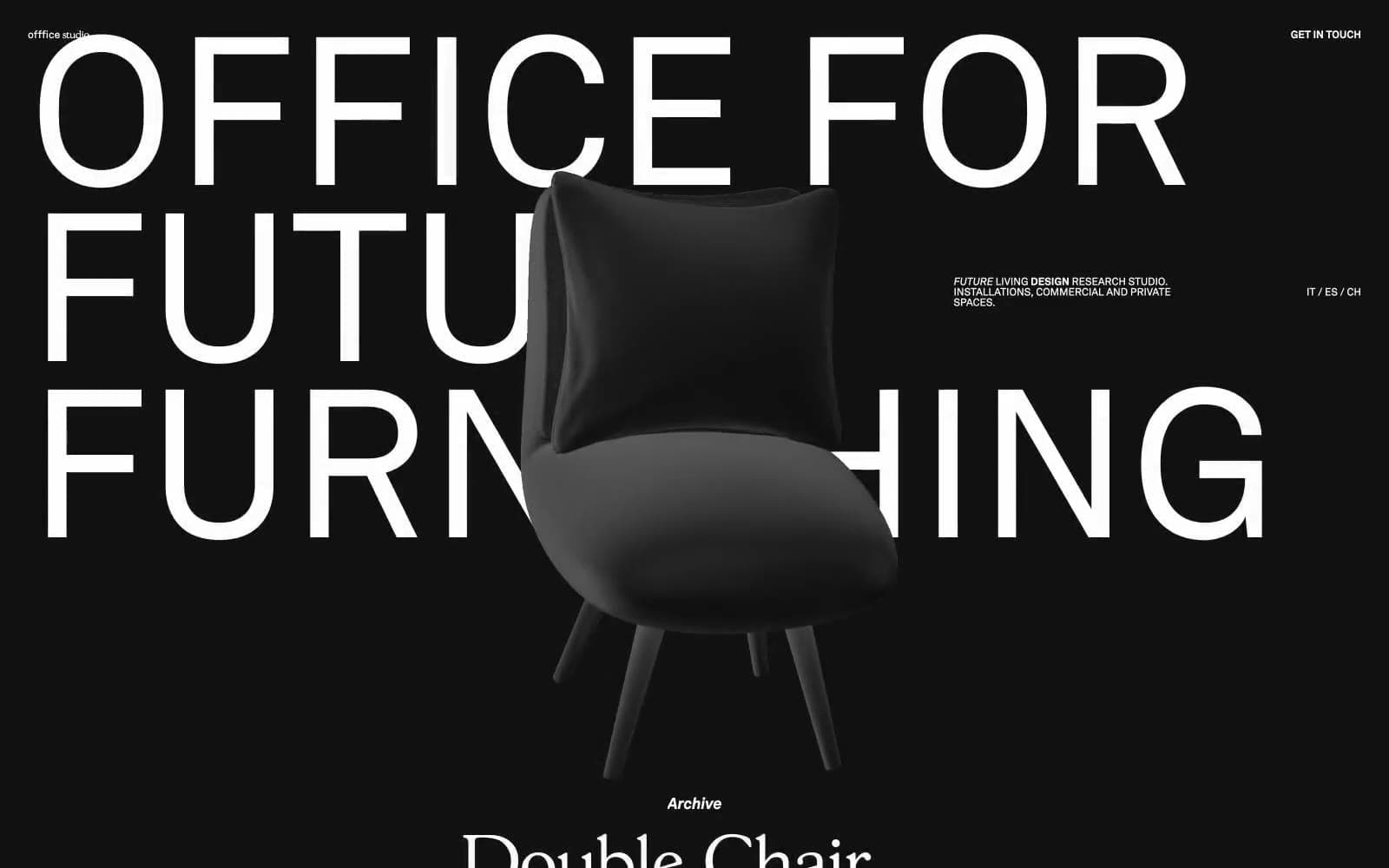
OFFFICE. Noir gallery swallowed by monolithic type.
- Design tools
- Dark theme
- 3 colors
- 2 typefaces
OFFFICE operates as a black-walled gallery where typography is architecture: a single custom sans-serif (ak) scales from 12px micro-labels to 216px display blocks that bleed off the viewport edges, with line-heights collapsing to 0.80 to stack text into wall-like slabs. The entire palette is near-black canvas against near-white ink — no accent color, no semantic hues, no gradients. A second custom serif (gs) appears only inside the project archive, bringing a subtle editorial counterpoint to the otherwise austere sans system. Product is presented as a single sculptural 3D object centered in the void, overlapping text in the scroll sequence to create depth without any shadow or elevation system. Everything is flat, full-bleed, and typographically loud.
OFFFICE design system
Neutrals3
Full-bleed page background, navigation surface, product staging void — the entire canvas is one continuous dark field
Supporting palette color for small decorative accents when the core palette needs contrast. Do not promote it to the primary CTA color
Display headlines, body text, navigation labels, archive list entries, locale switcher — the sole ink color across all UI layers
Try a pairing
Pick any two colors from the palette to check whether text stays readable on top.
Aa
Paper White on Onyx
19.25 : 1 contrast
- Body textPasses AA 4.5
- Large textPasses AA 3
- StrictPasses AAA 7
More DESIGN.md files. Same web, different personalities.
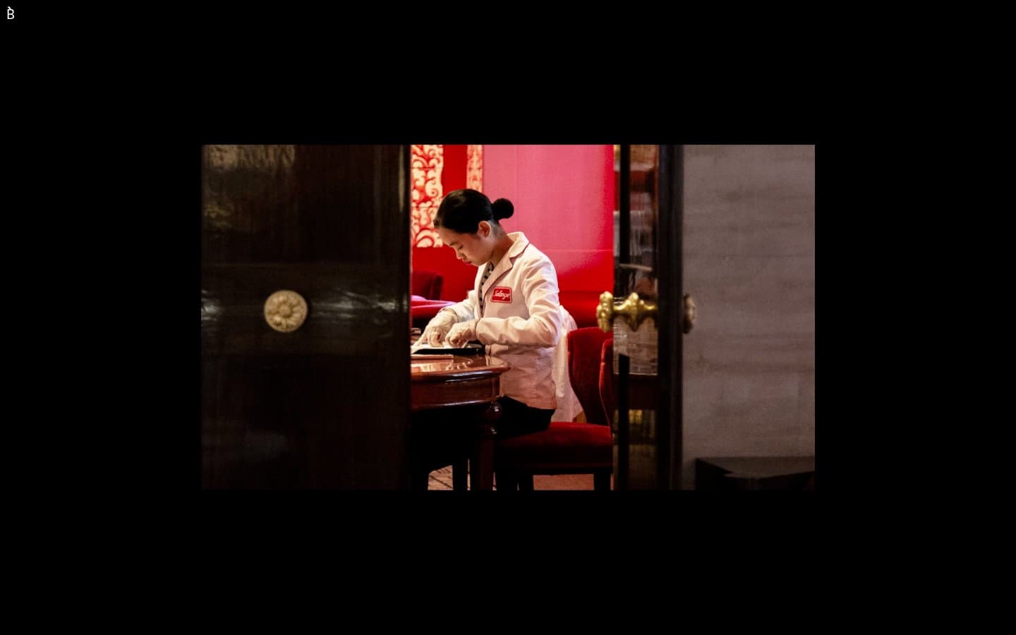
Bibliothèque
Design tools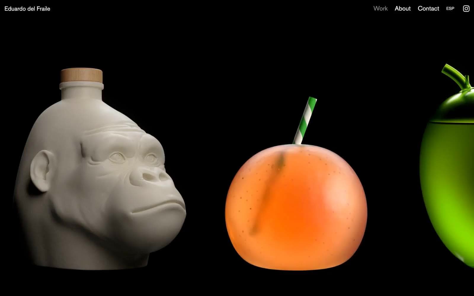
Eduardo del Fraile
Design tools
Endlesstools
Design tools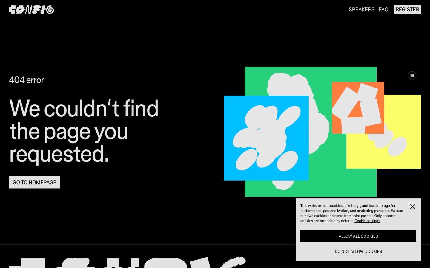
Figma Config
Design tools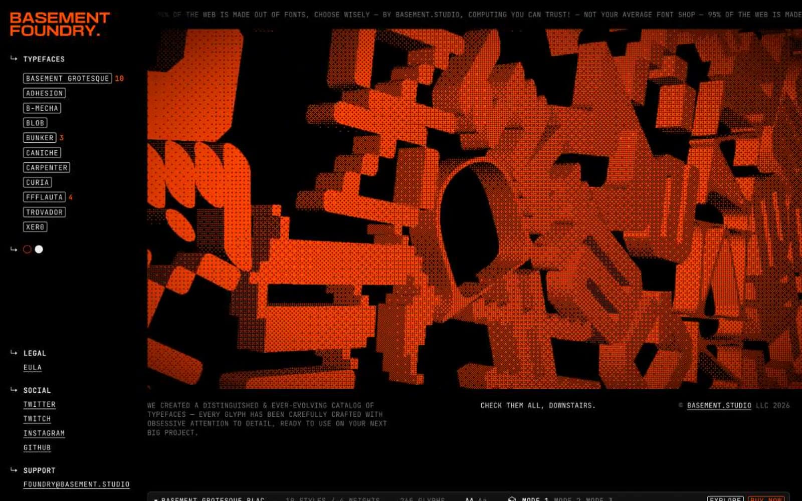
Foundry
Design tools
Frame.io
Design tools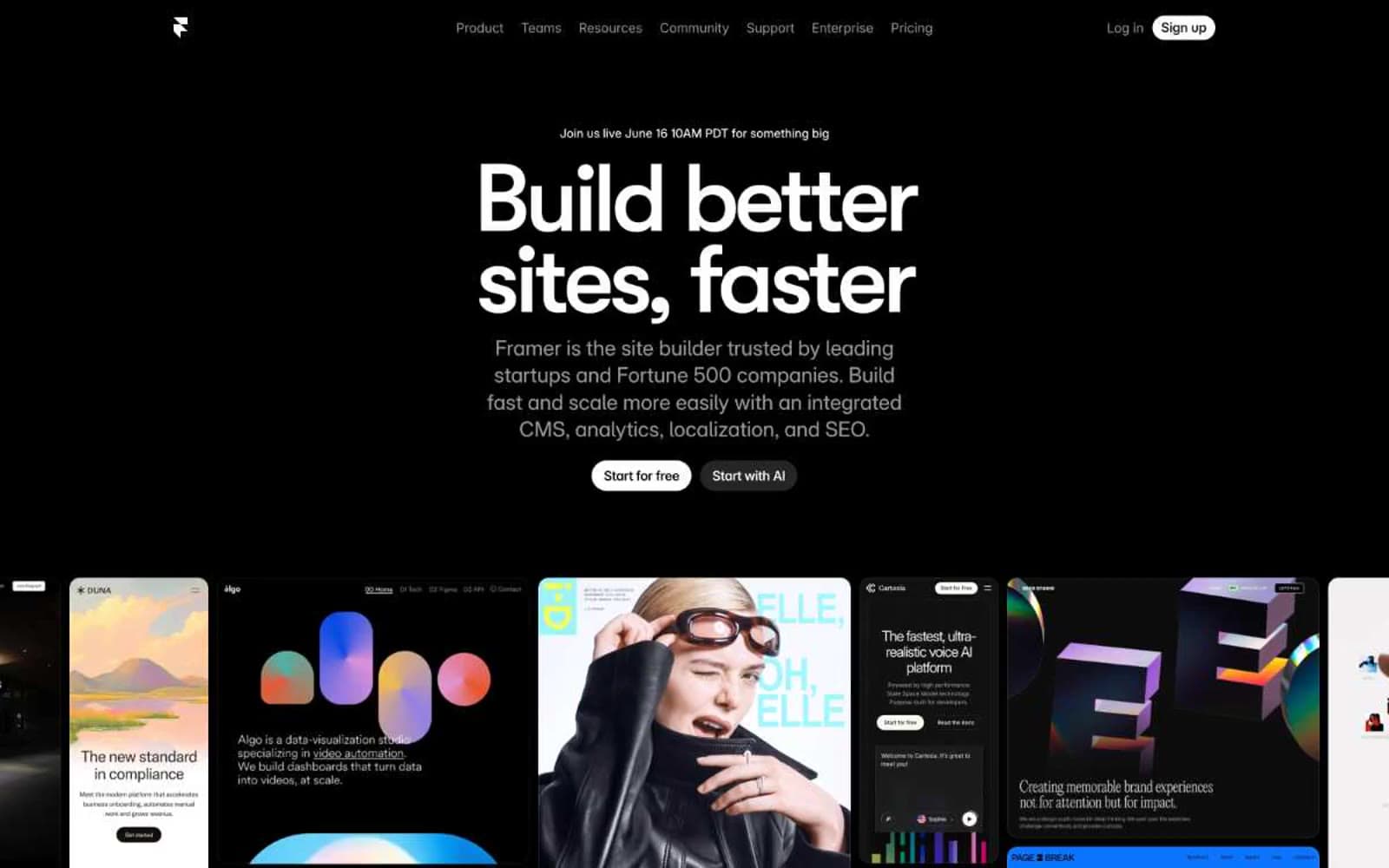
Framer
Design tools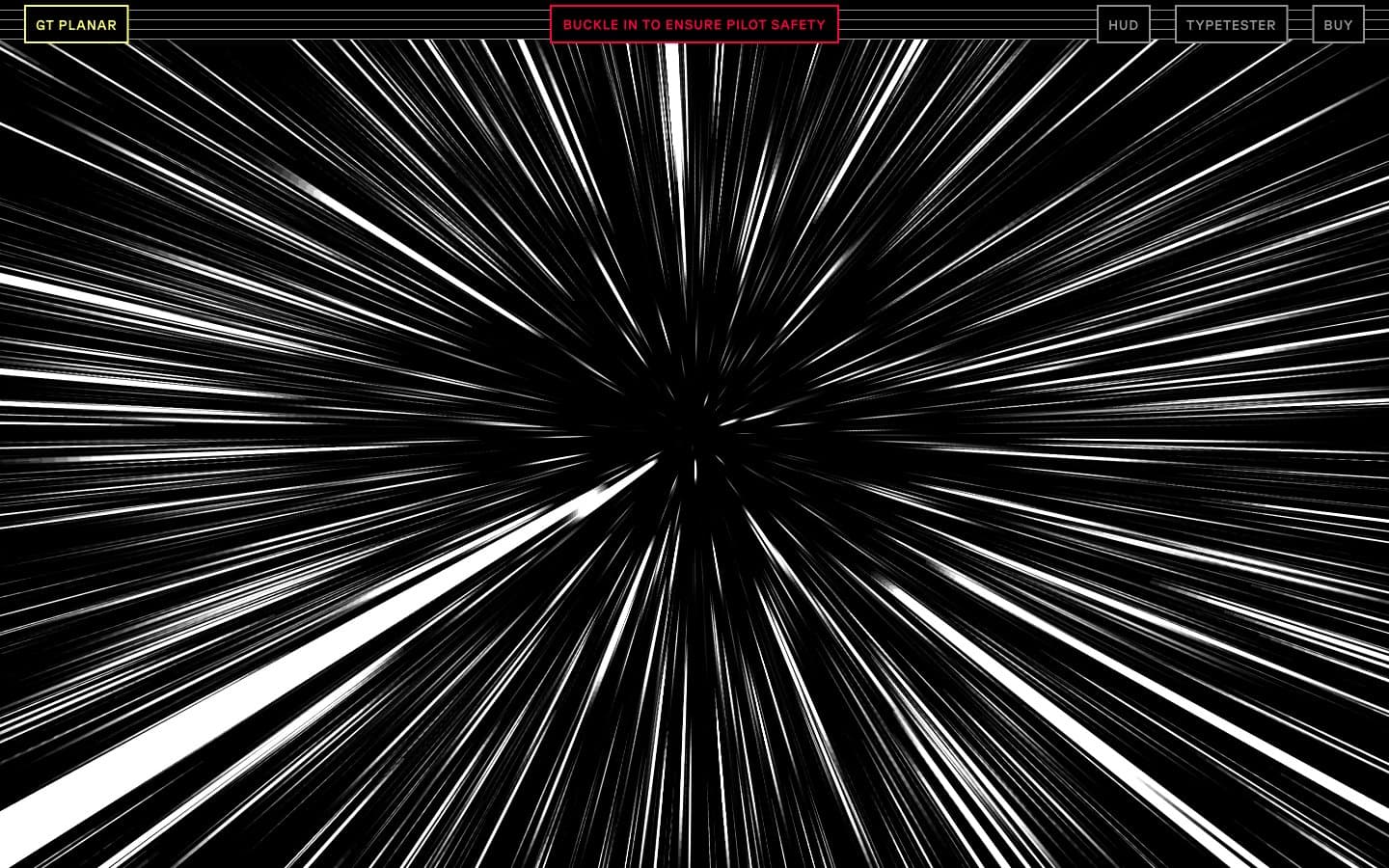
Gt-planar
Design tools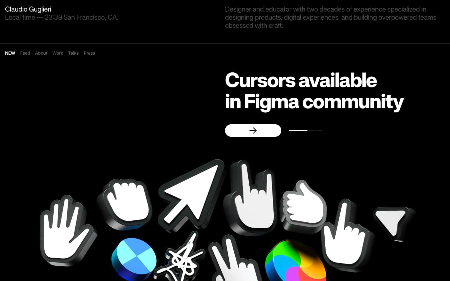
Guglieri
Design tools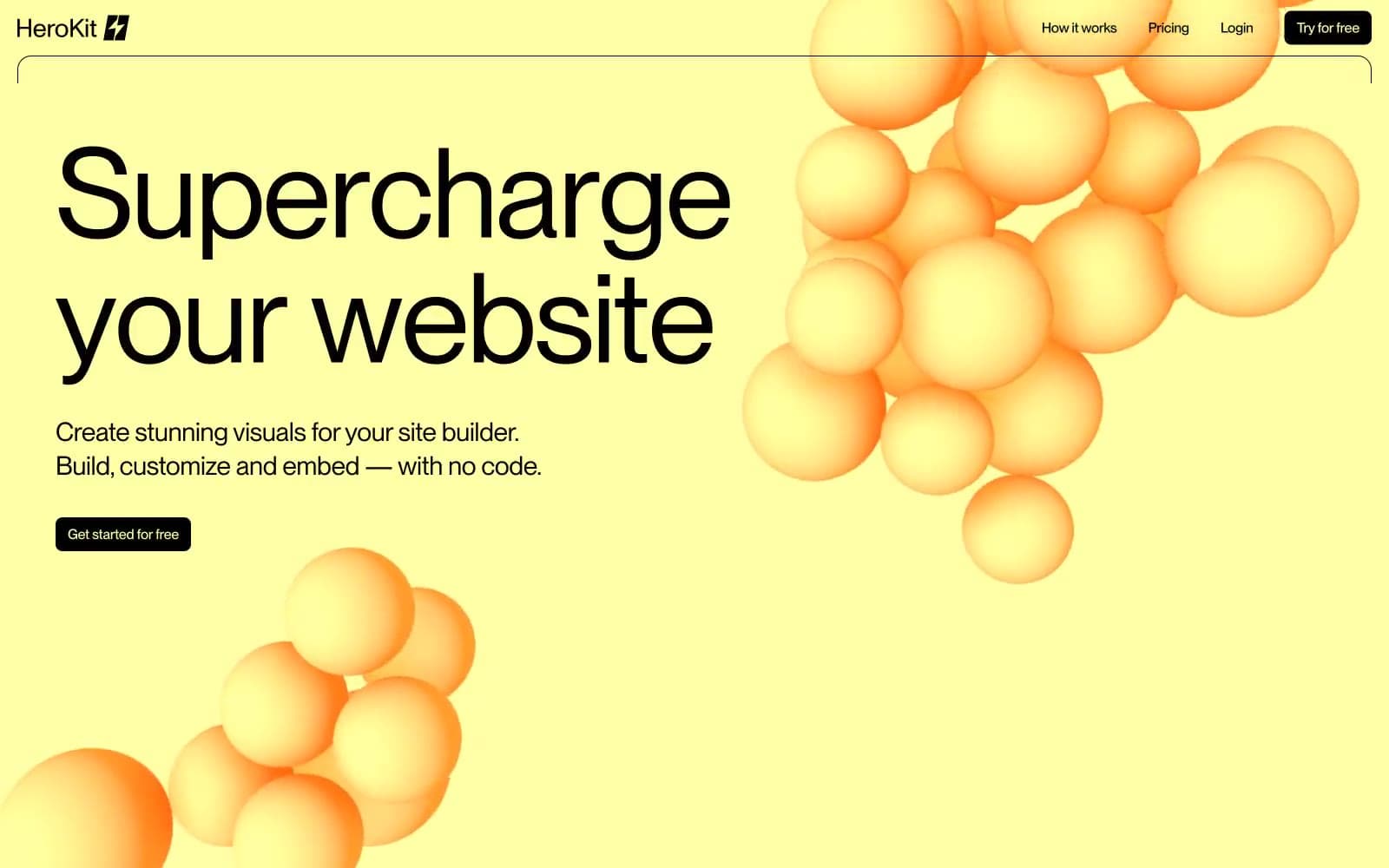
HeroKit
Design tools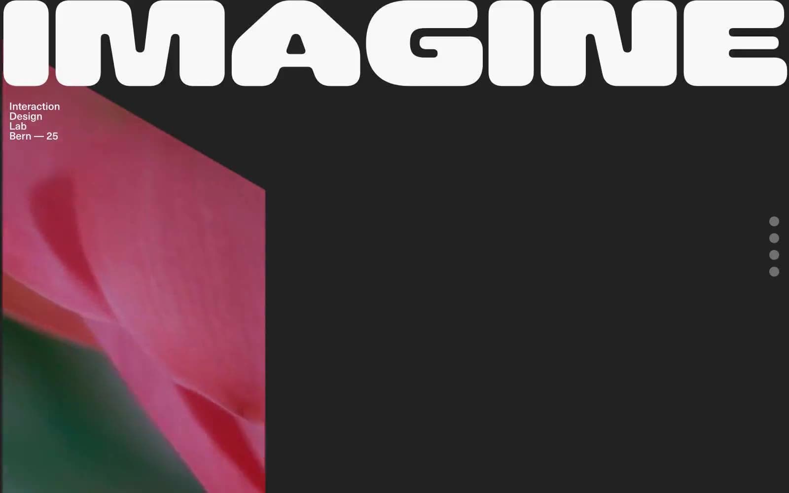
Iad-lab
Design tools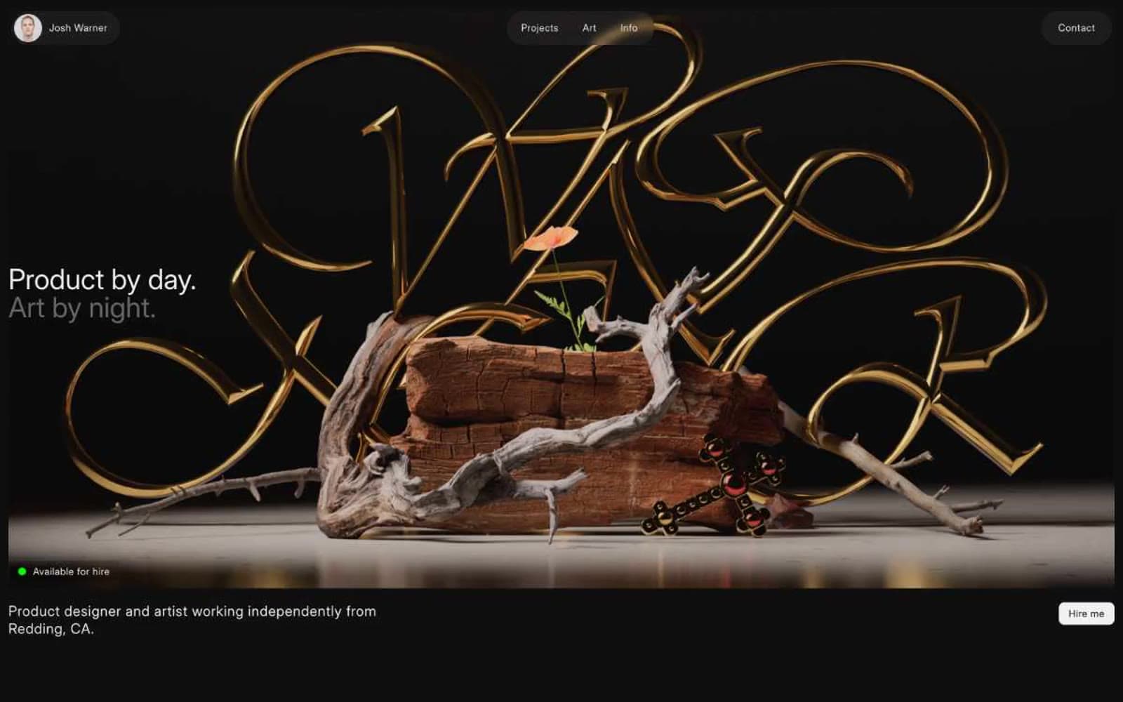
Josh Warner
Design tools


