
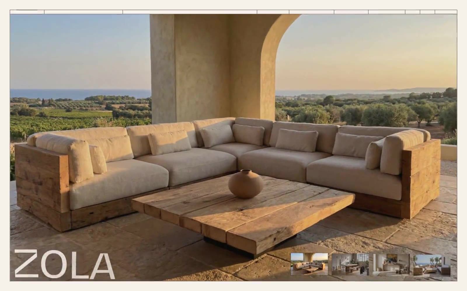
Oakâme. Sunlit Provençal atelier carved in warm stone.
- Commerce
- Light theme
- 4 colors
- 1 typeface
Oakâme operates as a sun-soaked Provençal atelier: a near-monochromatic warm-stone canvas (#f6f1eb) carrying deep walnut-brown ink (#403a34) and anchored by monumental display typography from the custom BwGradual face. The interface is deliberately quiet — no shadows, no gradients, no decorative color — letting reclaimed-oak furniture photography carry the entire visual weight. The signature rhythm comes from extreme type scale jumps: tiny tracked-out uppercase labels (10–12px) and ear-shattering display words (120–250px) share a page with almost no intermediate steps, producing a gallery-catalog tension between whisper and shout. Components stay architectural: hairline borders, pill-shaped controls, 8–20px padding, and a single 20px grid gutter. The system reads as a luxury furniture editorial — every screen is a spread.
Oakâme design system

Neutrals4
Secondary body text and subdued copy where Walnut Ink is reserved for headings and UI. Pairs at 11.3:1 against the canvas for AAA-level reading
Neutral button treatment for secondary actions and selected controls.
Tertiary helper text, metadata, and desaturated captions. The lightest readable neutral, sitting at 6.6:1 on the canvas
Page background, card surface, button fill on light controls, image overlays. Warm cream tone — not pure white — that gives the whole interface its Mediterranean-stone atmosphere
Try a pairing
Pick any two colors from the palette to check whether text stays readable on top.
Aa
Linen Canvas on Charcoal Note
11.25 : 1 contrast
- Body textPasses AA 4.5
- Large textPasses AA 3
- StrictPasses AAA 7
More DESIGN.md files. Same web, different personalities.

High Protein
Commerce
Hopper
Commerce
2.AG
Commerce
A-WARE
Commerce
AATHER
Commerce
Abel
Commerce
Acme Cups New Zealand
Commerce
Acne Studios
Commerce
Adam Lippes
Commerce
Adanola
Commerce
Advene
Commerce
Aevi Wellness
Commerce


