
Nomen Nescio. Ink on warm paper.
- Commerce
- Light theme
- 6 colors
- 1 typeface
Nomen Nescio is an editorial paper-and-ink system for a conceptual fashion label: a warm off-white canvas (#fdfdfa) holds oversized fashion photography while every interface element recedes into a single near-black ink (#2b2b2e). The entire typography stack uses one custom sans-serif at one weight (400) — no bold, no light, no italic — so hierarchy is built purely through size and negative letter-spacing rather than contrast. Components are flat rectangles, no shadows, no rounded corners, no color: identity comes from the restraint, the warm neutrals, and the photography bleeding edge-to-edge. The system feels like a printed zine reproduced as a website — whitespace is the layout grid, and every UI surface could be cut from the same sheet of paper.
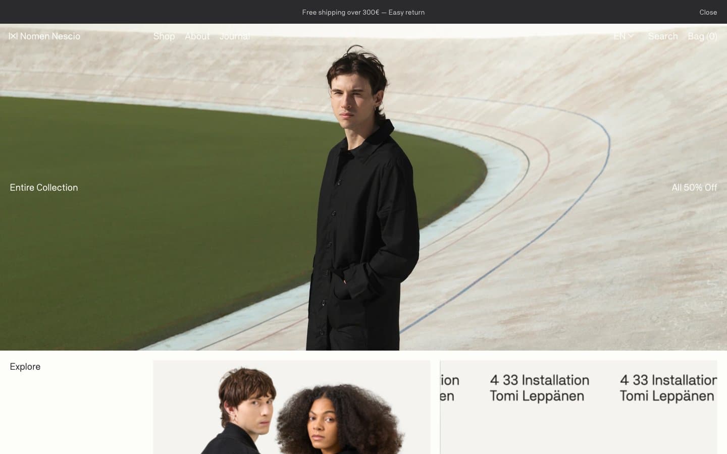
Nomen Nescio design system

Neutrals6
Primary text, navigation, borders, and outlined actions — near-black with a warm undertone, never pure #000
Muted text and secondary borders — warm gray for metadata, subtitles, and hairline dividers
Form input borders — slightly warmer than pebble to read as a distinct UI surface
Light dividers and structural borders — barely visible rules between sections
Elevated surface and subtle washes — used for card backgrounds and hover states, one step warmer than canvas
Page canvas and card surfaces — warm off-white reads as aged paper, not digital white
Try a pairing
Pick any two colors from the palette to check whether text stays readable on top.
Aa
Paper on Ink
13.85 : 1 contrast
- Body textPasses AA 4.5
- Large textPasses AA 3
- StrictPasses AAA 7
More DESIGN.md files. Same web, different personalities.

High Protein
Commerce
Hopper
Commerce
2.AG
Commerce
A-WARE
Commerce
AATHER
Commerce
Abel
Commerce
Acme Cups New Zealand
Commerce
Acne Studios
Commerce
Adam Lippes
Commerce
Adanola
Commerce
Advene
Commerce
Aevi Wellness
Commerce


