
My Brentano. Pharmacy broadsheet on cream paper.
- Commerce
- Light theme
- 3 colors
- 3 typefaces
My Brentano channels a Swiss-editorial pharmacy aesthetic: warm cream canvas, one typewriter-serif display face at monumental sizes, and a single near-black ink for almost everything. The design is radical in its restraint — no shadows, no rounded cards, no accent colors, no gradient washes. Hierarchy is built through typographic scale (60px display down to 15px body) and generous negative space, not through color or elevation. Imagery is the only chromatic moment: warm product photography with beige, mustard, and burgundy tones that bleed off-frame. Components feel like printed editorial: thin horizontal rules, circular outlined arrows, and text-aligned links with no fills. Every surface sits on the same flat plane; the design is a typographic object, not a digital interface.
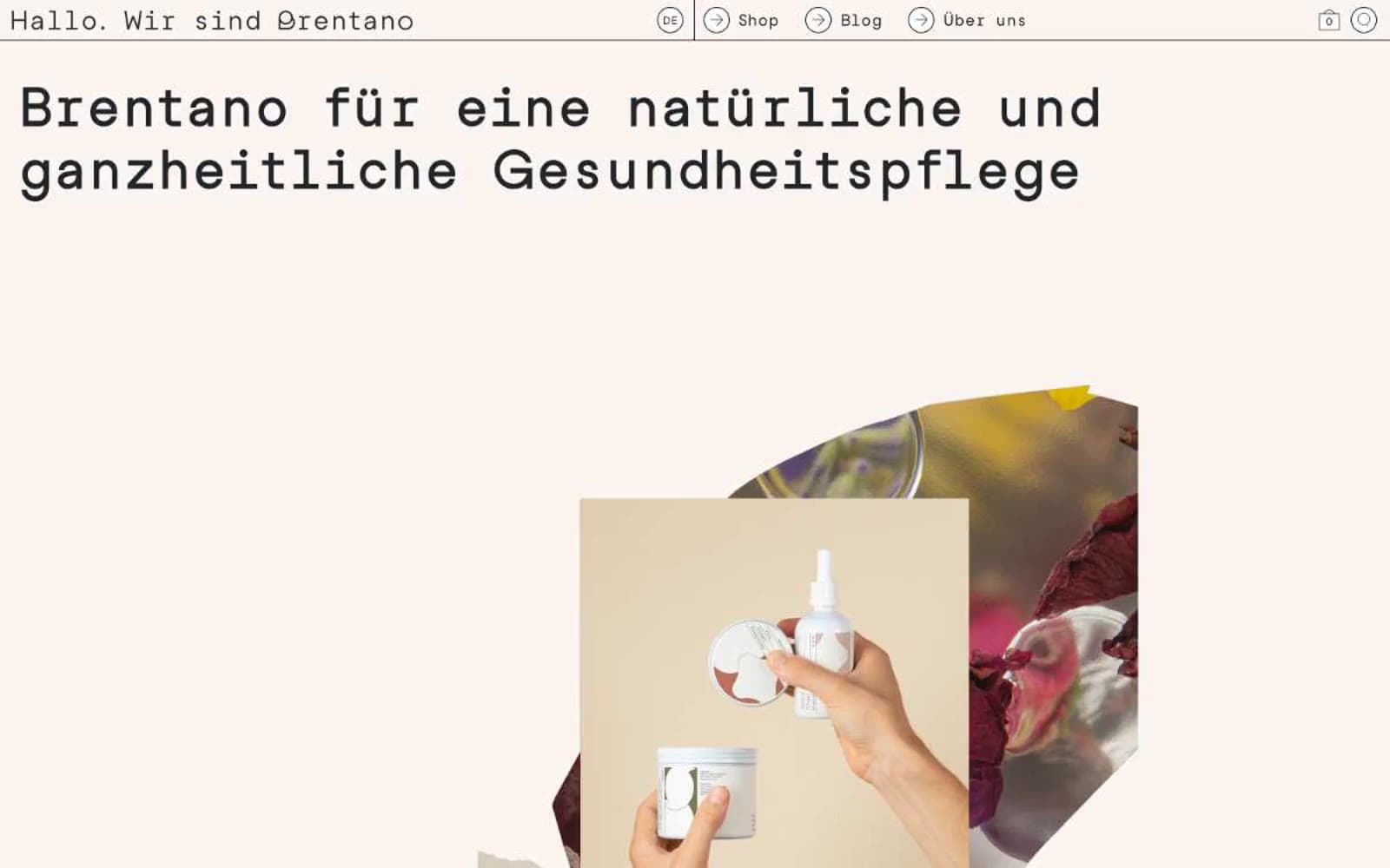
My Brentano design system

Neutrals3
Secondary text, button borders, link borders, input outlines, nav separators — true black for maximum contrast on outlined elements
Body text, headings, nav text, footer text, most borders — the dominant text and structural color, slightly softer than pure black for warmth
Page canvas, card surfaces, button fills, input backgrounds — the ground that all ink sits on
Try a pairing
Pick any two colors from the palette to check whether text stays readable on top.
Aa
Bone White on Pure Press
21.00 : 1 contrast
- Body textPasses AA 4.5
- Large textPasses AA 3
- StrictPasses AAA 7
More DESIGN.md files. Same web, different personalities.

High Protein
Commerce
Hopper
Commerce
2.AG
Commerce
A-WARE
Commerce
AATHER
Commerce
Abel
Commerce
Acme Cups New Zealand
Commerce
Acne Studios
Commerce
Adam Lippes
Commerce
Adanola
Commerce
Advene
Commerce
Aevi Wellness
Commerce


