
Mr. Pops. Retro ice cream parlor on cream paper.
- Commerce
- Light theme
- 5 colors
- 2 typefaces
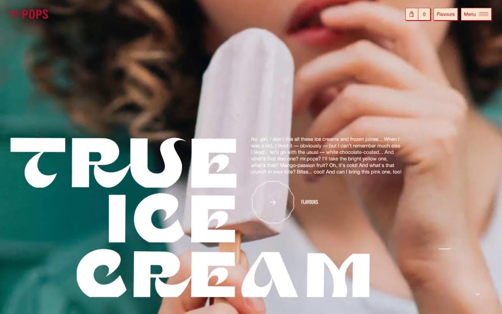
Mr. Pops reads like a sunlit ice cream parlor printed on cream cardstock: warm white canvas, massive condensed display type set tight over full-bleed lifestyle photography, and a single cherry-red used almost exclusively as outline and stroke. The dominant gesture is bold — Cervo display hits 144px with 0.75 line-height and 0.05em positive tracking, stacked four lines deep — but the chrome stays airy: thin red borders, pill buttons, 40px corners, and cream-tinted secondary surfaces instead of gray. Neutrals (black, white, warm cream) carry the structure while the red punctuates. Components should feel like a hand-stamped menu card: generous whitespace, confident borders, no drop shadows, and photography that bleeds to the edge of the screen.
Mr. Pops design system

Brand1
Brand accent, heading text, link color, icon stroke, outlined button border, footer headline — vivid warm red used as the single chromatic signal across an otherwise cream-and-white interface
Neutrals4
Primary body text, icon fills, heavy borders, SVG fill — the only true dark
Muted secondary text, disabled placeholders, low-emphasis dividers
Secondary surface for cards, callout panels, and the cart/bag detail button — warm near-white that reads as paper, not gray
Page background, card surface, input fill, button text on dark
Try a pairing
Pick any two colors from the palette to check whether text stays readable on top.
Aa
Canvas White on Cherry Marquee
7.12 : 1 contrast
- Body textPasses AA 4.5
- Large textPasses AA 3
- StrictPasses AAA 7
More DESIGN.md files. Same web, different personalities.

High Protein
Commerce
Hopper
Commerce
2.AG
Commerce
A-WARE
Commerce
AATHER
Commerce
Abel
Commerce
Acme Cups New Zealand
Commerce
Acne Studios
Commerce
Adam Lippes
Commerce
Adanola
Commerce
Advene
Commerce
Aevi Wellness
Commerce


