
mishmash®. Paper boutique, black frame, vivid contents.
- Commerce
- Light theme
- 10 colors
- 1 typeface
mishmash® operates as a paper goods gallery: the chrome (type, borders, buttons, cards) is almost entirely achromatic, letting the saturated product photography carry every color moment. The layout is a compact, image-led grid where large editorial photos do the heavy lifting and UI elements stay quiet, small, and confident. Only two chromatic tokens exist in the interface — a soft butter yellow and a warmer amber — and both appear as small floating punctuation (sale badges, the persistent discount chip) rather than as filled buttons or backgrounds. Type is the only place warmth enters the system: Circular at modest sizes with comfortable line-height, set tight to the grid. The result feels like a curated stationery boutique — restrained shell, vivid contents.
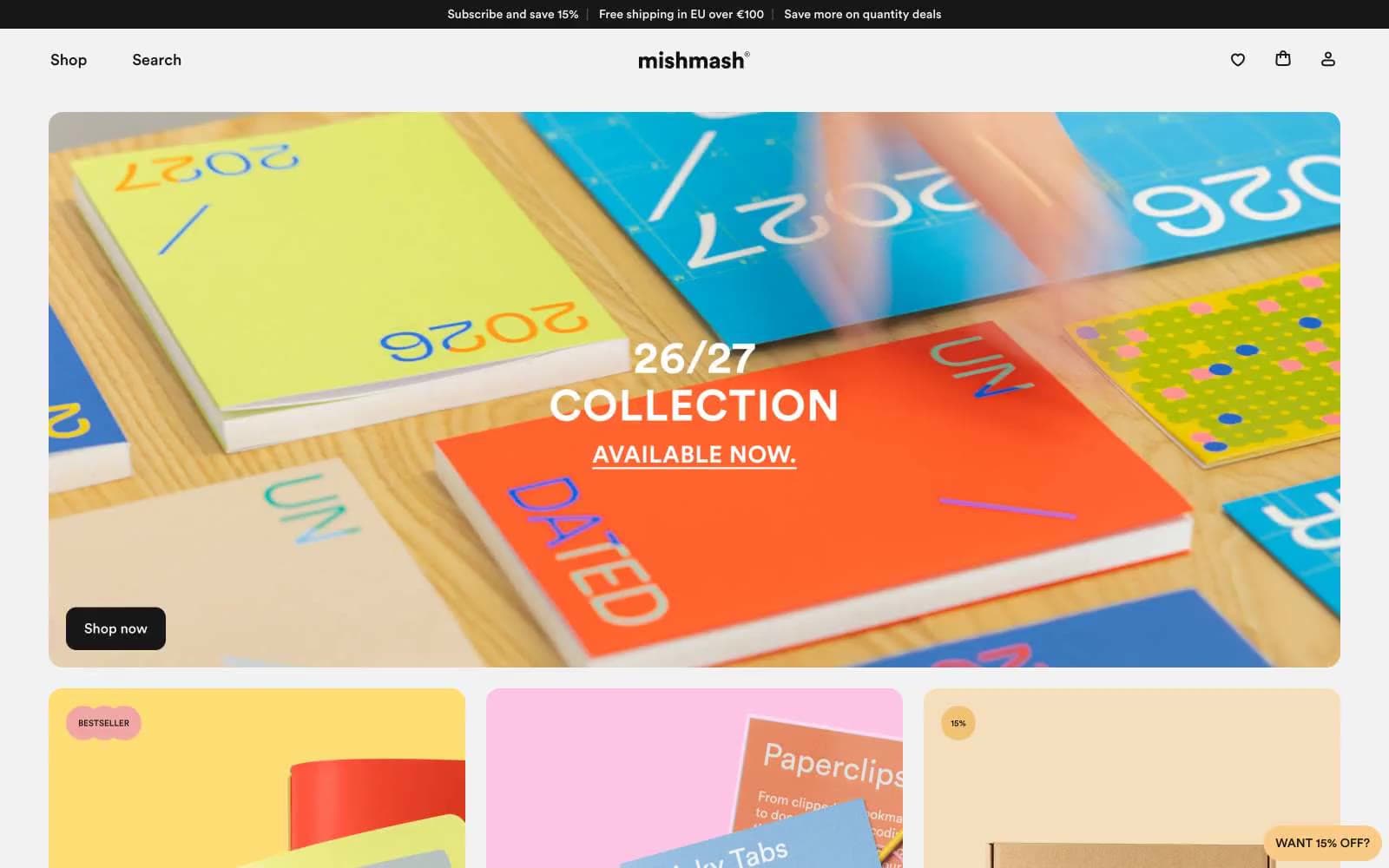
mishmash® design system

Accent2
Soft category card surface (kraft-adjacent pastel), gentle highlight wash behind editorial text
Yellow action color for filled buttons, selected navigation states, and focused conversion moments.
Neutrals8
Primary text, nav links, button text, card borders, footer dividers — near-black with a hint of warmth, not pure #000
Body helper text, captions, subtle annotations
Tertiary headings, less prominent metadata
Secondary heading text, subdued body copy, inactive state labels
Muted helper text, disabled borders, de-emphasized labels
Button borders, card surface variant, footer separator lines — slightly darker than Bone for elevated borders
Subtle body borders, secondary text, input borders, hairline dividers between sections
Page canvas, card surface, product card background
Try a pairing
Pick any two colors from the palette to check whether text stays readable on top.
Aa
Ink on Buttercream
13.67 : 1 contrast
- Body textPasses AA 4.5
- Large textPasses AA 3
- StrictPasses AAA 7
More DESIGN.md files. Same web, different personalities.

High Protein
Commerce
Hopper
Commerce
2.AG
Commerce
A-WARE
Commerce
AATHER
Commerce
Abel
Commerce
Acme Cups New Zealand
Commerce
Acne Studios
Commerce
Adam Lippes
Commerce
Adanola
Commerce
Advene
Commerce
Aevi Wellness
Commerce


