
Maisonmargiela. Gallery wall with a whisper.
- Commerce
- Light theme
- 10 colors
- 2 typefaces
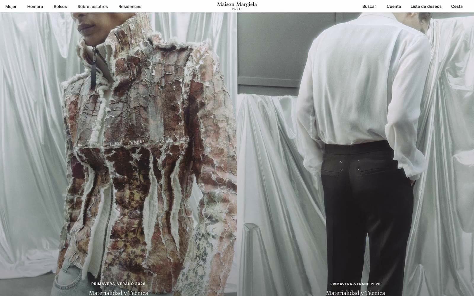
Maison Margiela operates on a radical editorial restraint: the interface is nearly invisible so that photography and product carry the entire experience. The palette is 100% achromatic — no chromatic accent exists anywhere in the system — using a near-black ink (#121212) against warm off-whites (#f7f7f2, #eaeae6) and pure white (#ffffff) to evoke gallery walls and atelier surfaces. Typography is custom and whispered, never shouted: Margiela Sans at low weights with extreme letter-spacing on small uppercase labels, and Margiela Serif with hairline negative tracking for the wordmark and editorial captions. Surfaces are flat, shadowless, and borderless; hierarchy is created by typographic scale and whitespace, not chrome. Components feel like printed matter — announcement strips, centered nav, full-bleed image plates, and tiny ghost text-links — not software.
Maisonmargiela design system

Neutrals10
SVG icon fills, logo lockup, strict black-tone elements where maximum contrast is required
Primary text, nav links, button labels, footer copy — the near-black (not pure) gives the page a slightly warmer, printed feel rather than a screen feel
Long-form body text in editorial blocks where the slightly lighter tone than Ink reduces visual weight over long reads
Supporting neutral for secondary UI, dividers, and muted labels. Do not promote it to the primary CTA color
Disabled button text and inactive state labels
Supporting neutral for secondary UI, dividers, and muted labels.
Input field borders, form field outlines, subtle structural dividers
Deeper warm neutral for tertiary sections, input borders, subtle dividers — sits one step below Atelier White in the surface stack
Light supporting surface for subtle backgrounds and section separation.
Page canvas, input fills, button text on dark — the clean base against which warm off-white sections layer
Try a pairing
Pick any two colors from the palette to check whether text stays readable on top.
Aa
Paper on Pure Black
21.00 : 1 contrast
- Body textPasses AA 4.5
- Large textPasses AA 3
- StrictPasses AAA 7
More DESIGN.md files. Same web, different personalities.

High Protein
Commerce
Hopper
Commerce
2.AG
Commerce
A-WARE
Commerce
AATHER
Commerce
Abel
Commerce
Acme Cups New Zealand
Commerce
Acne Studios
Commerce
Adam Lippes
Commerce
Adanola
Commerce
Advene
Commerce
Aevi Wellness
Commerce


