
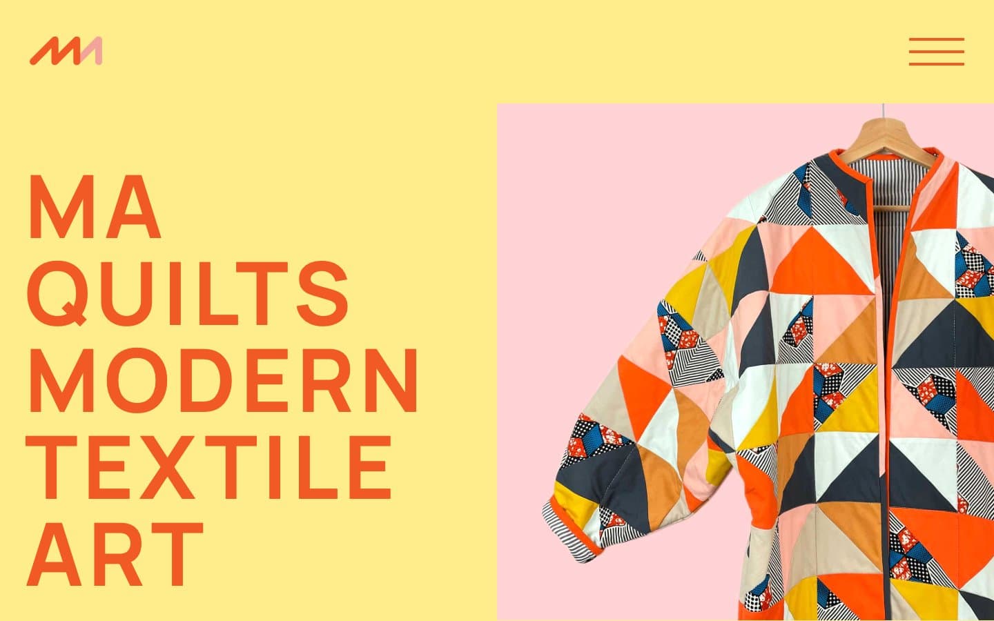
MA Quilts. Crayon-bright quilt workshop pinned to sunlit wall.
- Commerce
- Light theme
- 9 colors
- 2 typefaces
MA Quilts is a crayon-bright textile-art studio: a flat, poster-like canvas where oversize Manrope headlines shout in tangerine against wash-yellow and blush-pink full-bleed blocks. The entire interface stays two-dimensional — no shadows, no gradients, no filled buttons — relying on thick chromatic borders, enormous letter-spaced type, and full-bleed color blocks to do all the visual work. Layout is spacious and gallery-like, with product imagery given room to breathe and labels in monospace caps. The system reads more like a zine or museum wall text than a SaaS dashboard, and any new page should preserve that paper-poster logic: chromatic borders instead of fills, type as ornament, and backgrounds that change like colored paper sheets rather than cards on a neutral surface.
MA Quilts design system

Brand3
Headlines, body text accents, and outlined button borders — the single loud color that carries the whole brand. Used as a 1-2px border on buttons and links, and as fill for all display and heading text. Never appears as a filled button background; the system speaks in outlines
Yellow wash for highlight backgrounds, decorative bands, and soft emphasis behind content.
Secondary text and link borders — a near-black with a violet bias that softens the page's high-contrast black on white. Used for body copy and as an alternate outlined-action border
Accent2
Secondary full-bleed background block, often paired with product photography to make fabric colors pop. Used as a flat color field, never as a tint or gradient
Soft warm surface for transitional sections — a diluted cousin of Tangerine used when a page needs a quieter colored block
Neutrals4
SVG fills, occasional body text, and the darkest neutral when Midnight Navy reads too colored. Pure black only where the page demands the most weight
Secondary text, image captions, and subtle borders. Sits between Ink Black and Paper White for muted helper copy
Decorative SVG fill and soft wash — a near-gray with a cool cast used inside illustrations and as a quiet background tint
Default page canvas and content section background. The neutral ground between colored blocks
Try a pairing
Pick any two colors from the palette to check whether text stays readable on top.
Aa
Ink Black on Tangerine
6.23 : 1 contrast
- Body textPasses AA 4.5
- Large textPasses AA 3
- StrictFails AAA 7
More DESIGN.md files. Same web, different personalities.

High Protein
Commerce
Hopper
Commerce
2.AG
Commerce
A-WARE
Commerce
AATHER
Commerce
Abel
Commerce
Acme Cups New Zealand
Commerce
Acne Studios
Commerce
Adam Lippes
Commerce
Adanola
Commerce
Advene
Commerce
Aevi Wellness
Commerce


