
LogoArchive. Midnight gallery of iconic marks.
- Design tools
- Dark theme
- 10 colors
- 2 typefaces
LogoArchive uses a midnight-gallery language: a near-black canvas, hairline white borders, and Swiss-precision typography (Suisse International) that alternates upright and italic weights to mark emphasis. The entire interface is monochromatic — black, three shades of charcoal, and white — with a single vivid yellow (#fde533) used as functional punctuation for primary actions, badges, and the logo book mark. Surfaces are flat with no shadows; depth comes from tonal layering between #18181b, #27272a, and #343538. Components are pill-shaped or generously rounded, compactly spaced, and always low-weight. The aesthetic reads as a curated archive or design museum after hours — quiet, authoritative, slightly editorial.
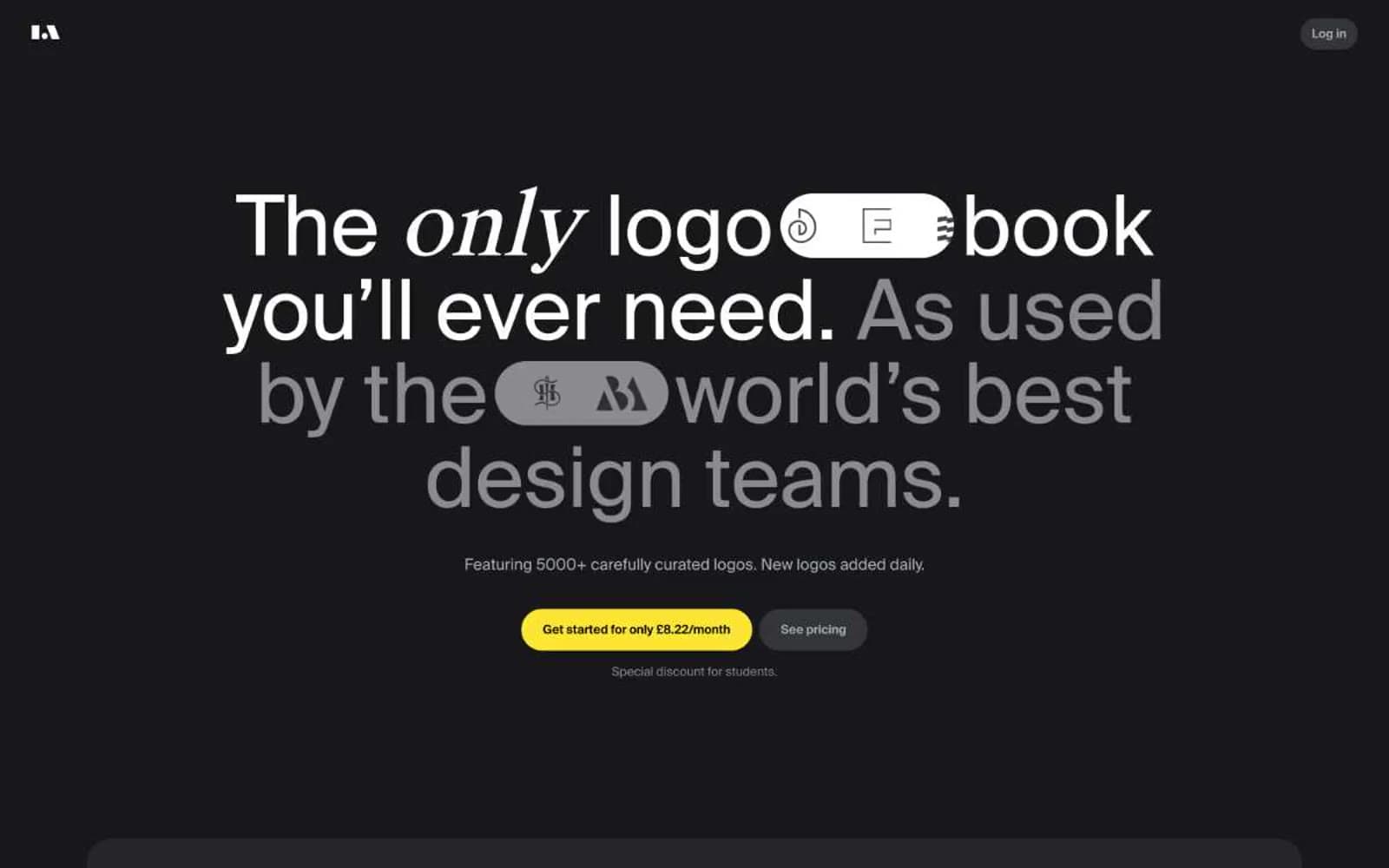
LogoArchive design system

Accent1
Yellow outline accent for tags, dividers, and focused UI edges. Do not promote it to the primary CTA color
Neutrals9
Nav fills, deepest surface tone, pure black accents
List borders, hairline dividers, subtle structural edges
Card surfaces, product window backgrounds, logo tiles — one step deeper than canvas for contrast
Page background, primary canvas surface
Dark borders and separators for elevated surfaces and inverted UI. Do not promote it to the primary CTA color
Placeholder/disabled surfaces, inactive list backgrounds
Muted body text, secondary headings, subtle borders — readable but recessive
Light borders, disabled-state text, very subtle dividers
Primary text, icons, borders, high-contrast elements — the dominant interface color
Try a pairing
Pick any two colors from the palette to check whether text stays readable on top.
Aa
Deep Void on Signal Yellow
16.43 : 1 contrast
- Body textPasses AA 4.5
- Large textPasses AA 3
- StrictPasses AAA 7
More DESIGN.md files. Same web, different personalities.
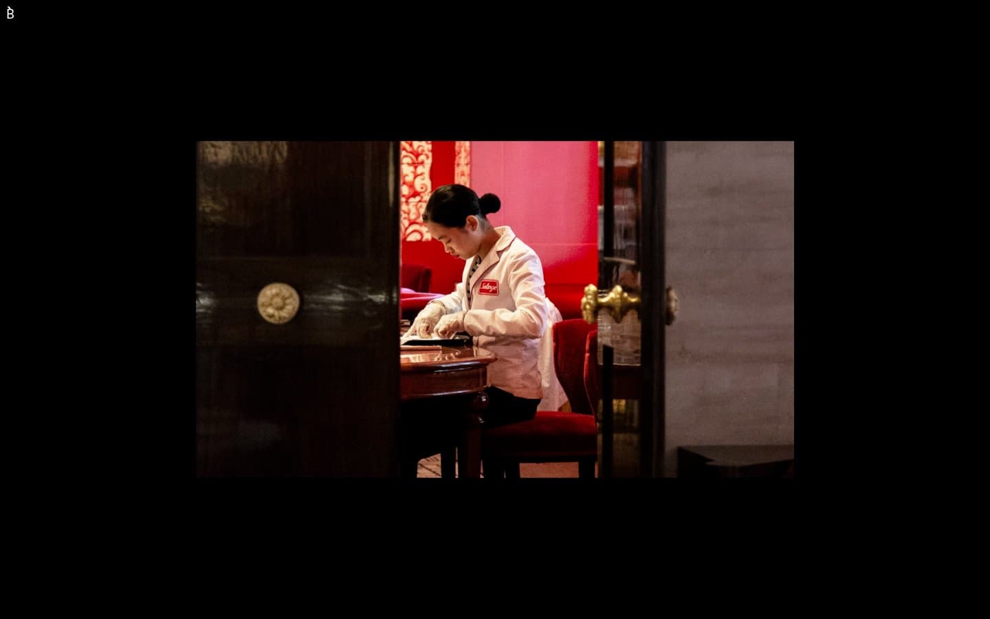
Bibliothèque
Design tools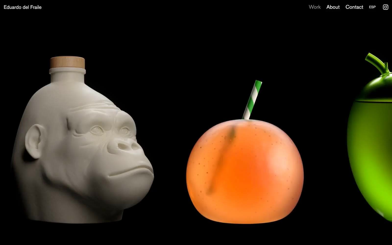
Eduardo del Fraile
Design tools
Endlesstools
Design tools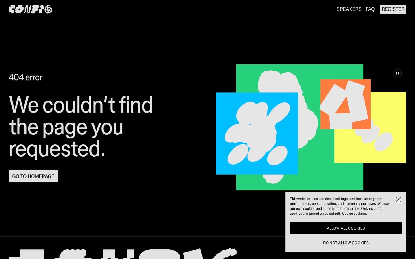
Figma Config
Design tools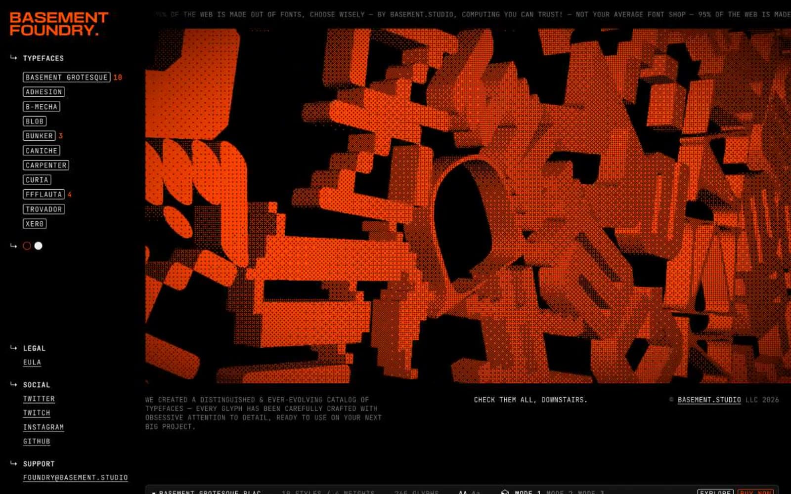
Foundry
Design tools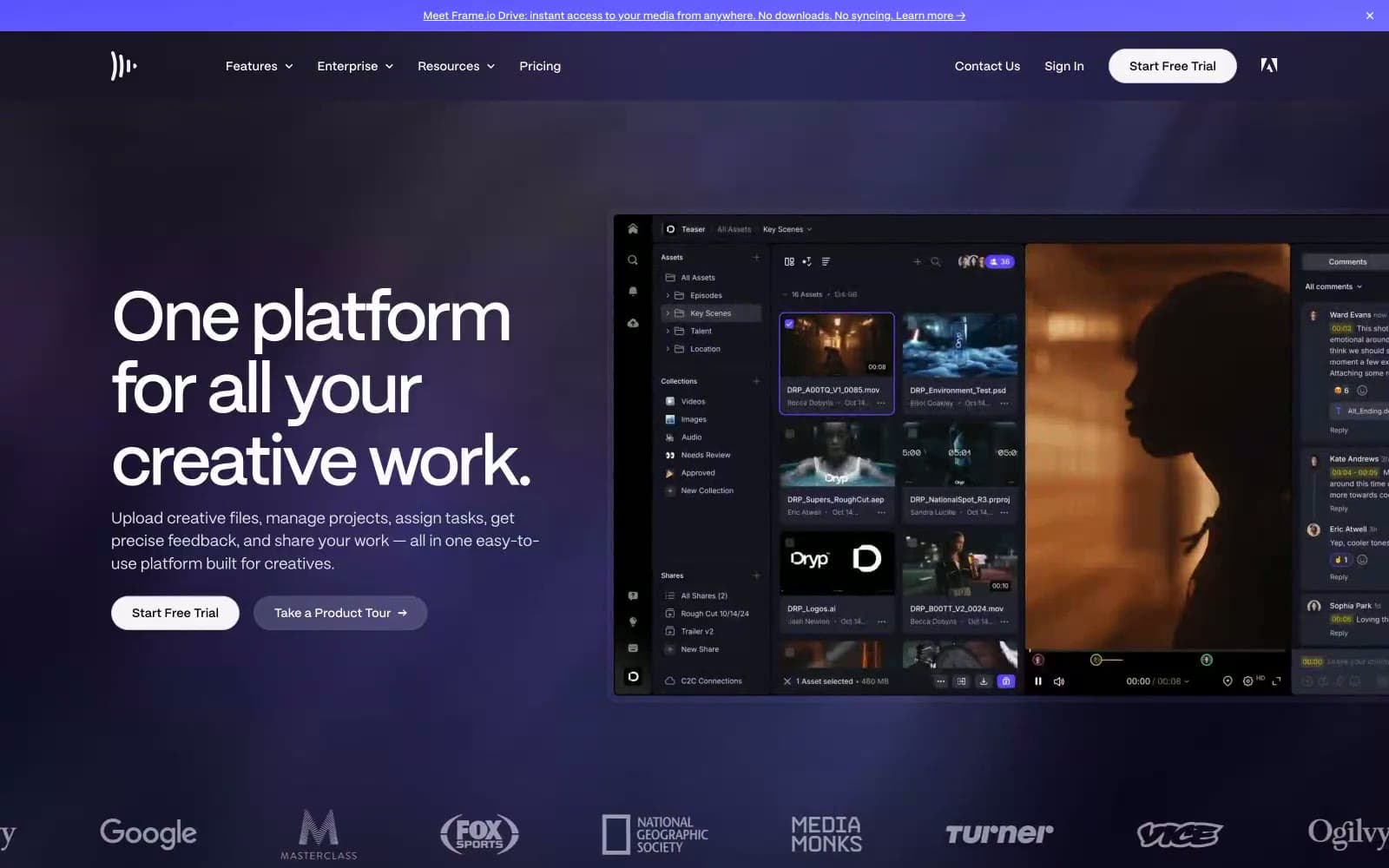
Frame.io
Design tools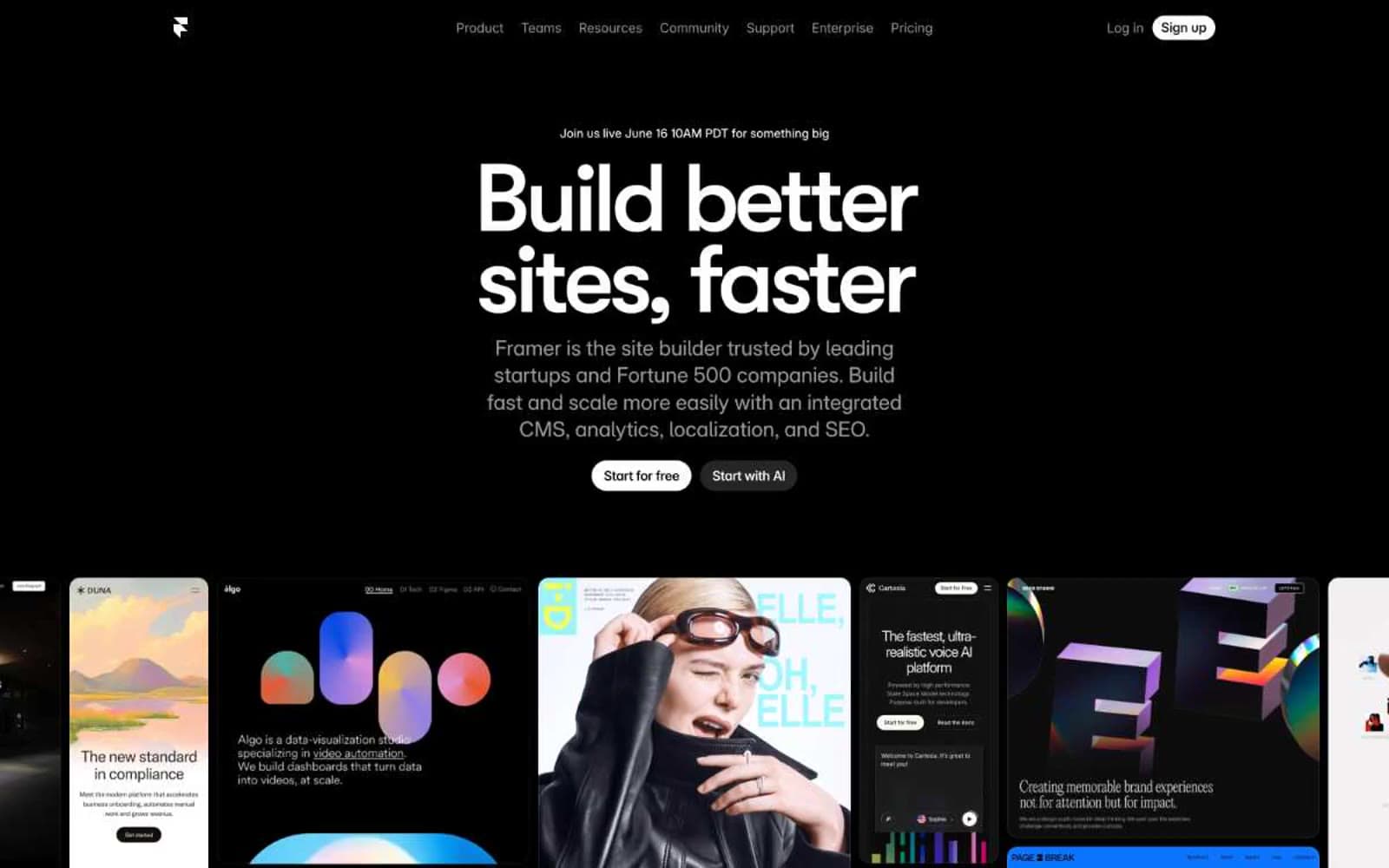
Framer
Design tools
Gt-planar
Design tools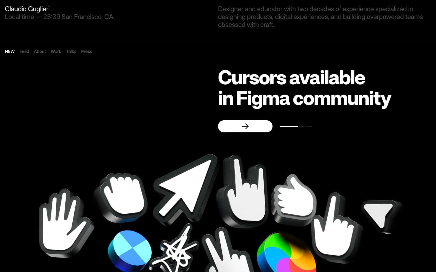
Guglieri
Design tools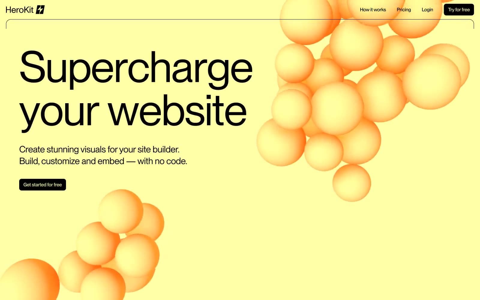
HeroKit
Design tools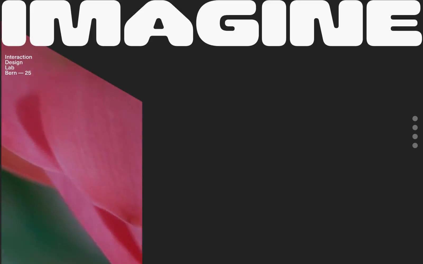
Iad-lab
Design tools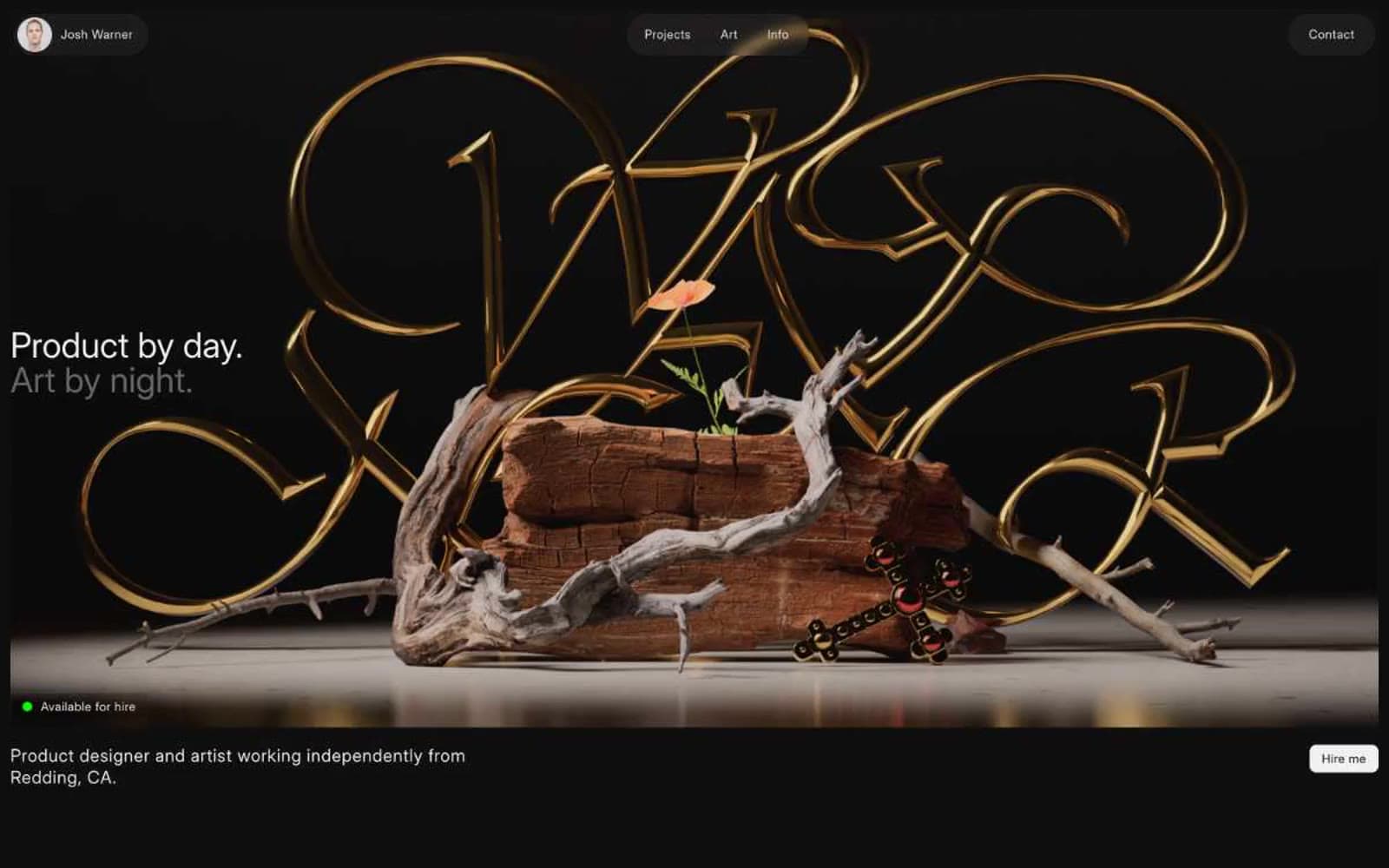
Josh Warner
Design tools


