
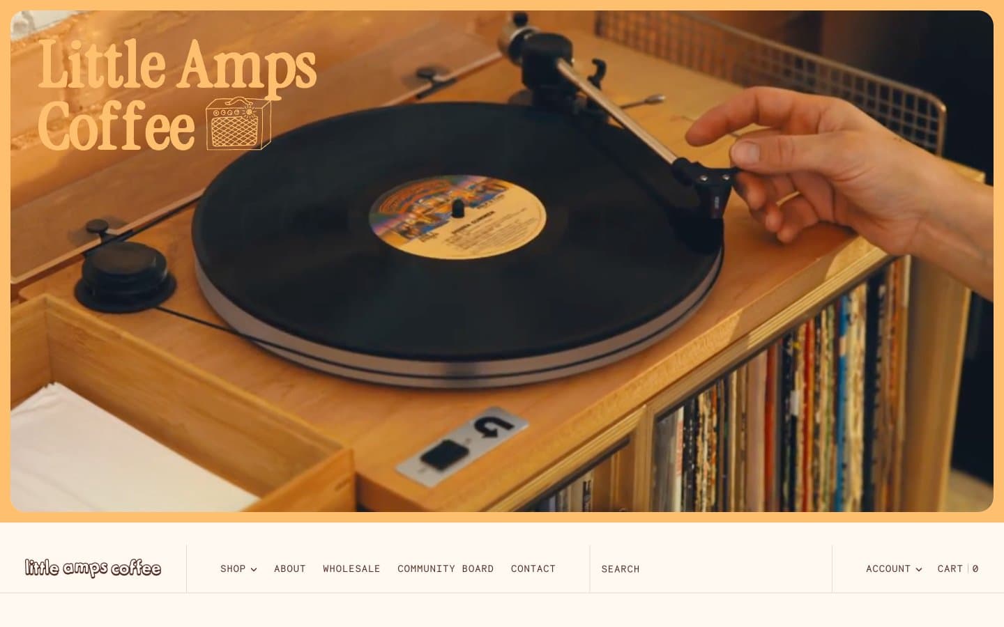
Little Amps. Vinyl record sleeve in afternoon sun.
- Commerce
- Light theme
- 10 colors
- 5 typefaces
Little Amps is a warm analog coffee-shop world: cream-paper canvas, rich espresso-brown type, and burnt-orange accents that feel like sun-faded label ink. The interface reads like a printed zine or vinyl insert — a custom chunky display serif handles headlines while monospaced type (Necto Mono, Roboto Mono) labels everything that is structural: nav, buttons, prices, dates, callouts. Photography is documentary and tactile (hands on records, café counters, coffee cherries) and anchors every section. Color is sparse but decisive: a single vivid red-orange does the work of links and highlights, a dusty blue and marigold yellow appear as quiet secondary signals. Surfaces are flat, borders are hairline warm-taupe lines, and radius stays small (3–8px) — the aesthetic is curated and editorial, not soft or rounded.
Little Amps design system

Brand2
Primary text, icons, card borders, nav, footer, input fields — the structural dark that holds every screen together, warm rather than black to stay on-brand with roasted coffee
Filled action buttons, active links, key highlights, badge fills — the single vivid accent that makes interactive elements feel switched on against the cream canvas
Accent3
Secondary accent for emphasized text, hover states, and warm callouts — a slightly darker orange that pairs with Burnt Orange for tonal depth
Soft highlight backgrounds, tag fills, and decorative washes — used sparingly to add warm sunlight moments inside otherwise neutral layouts
Cool counter-accent for secondary buttons, link backgrounds, and color variety — the only blue in the system, it reads as a quiet companion to the warm palette
Neutrals5
Muted body text, helper text, low-emphasis copy — warm brown-gray that fades into the cream without disappearing
Muted card backgrounds, soft surface fills, disabled surface states — a warm gray-taupe for low-emphasis panels
Hairline dividers, card borders, nav separators, subtle structural lines — the only border color most components need
Card backgrounds, section surfaces, image borders, body borders — one step deeper than canvas, creates gentle layered surfaces without elevation
Page canvas, card surfaces, button fills, input backgrounds — the base layer of every screen, warm off-white that replaces pure white
Try a pairing
Pick any two colors from the palette to check whether text stays readable on top.
Aa
Cream Paper on Espresso
11.50 : 1 contrast
- Body textPasses AA 4.5
- Large textPasses AA 3
- StrictPasses AAA 7
More DESIGN.md files. Same web, different personalities.

High Protein
Commerce
Hopper
Commerce
2.AG
Commerce
A-WARE
Commerce
AATHER
Commerce
Abel
Commerce
Acme Cups New Zealand
Commerce
Acne Studios
Commerce
Adam Lippes
Commerce
Adanola
Commerce
Advene
Commerce
Aevi Wellness
Commerce


