
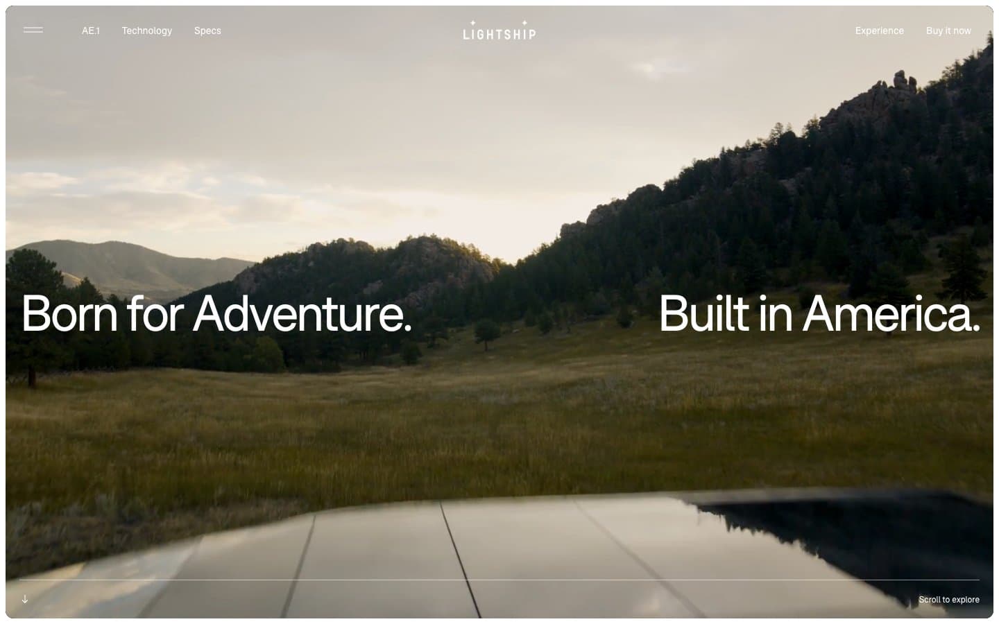
Lightship. Cinematic open-road diorama.
- Commerce
- Light theme
- 7 colors
- 1 typeface
Lightship is a photography-first editorial system built on a warm cream canvas (#faf6ef) with full-bleed cinematic imagery doing all the storytelling. The UI is deliberately invisible: a single custom geometric sans (F37Bolton) with tight negative tracking, hairline borders, 20px rounded photo cards, and pill-shaped navigation chips. The entire palette is near-monochrome with one warm orange (#fa5c40) reserved as a rare surface accent. Density is generous — large breathing room around elements, 100px section gaps — letting landscape photography and short editorial headlines command attention. No shadows, no gradients, no decorative chrome: the product and the places it goes are the interface.
Lightship design system

Accent1
Orange wash for highlight backgrounds, decorative bands, and soft emphasis behind content. Do not promote it to the primary CTA color
Neutrals6
Primary text, hairline borders, icon strokes, navigation typography — the structural anchor of the entire system
Muted body text, secondary borders, disabled states — the one step above placeholder gray
Helper text, low-emphasis captions, subtle dividers
Light hairline dividers, nav separators, input borders in resting state
Primary page canvas, card surfaces — warm off-white replaces stark white to soften the photography-first layout and avoid the cold SaaS feel
Image borders, elevated card surfaces, contrast panel behind embedded media
Try a pairing
Pick any two colors from the palette to check whether text stays readable on top.
Aa
Obsidian on Ember Orange
6.67 : 1 contrast
- Body textPasses AA 4.5
- Large textPasses AA 3
- StrictFails AAA 7
More DESIGN.md files. Same web, different personalities.

High Protein
Commerce
Hopper
Commerce
2.AG
Commerce
A-WARE
Commerce
AATHER
Commerce
Abel
Commerce
Acme Cups New Zealand
Commerce
Acne Studios
Commerce
Adam Lippes
Commerce
Adanola
Commerce
Advene
Commerce
Aevi Wellness
Commerce


