
Leif Products. Apothecary on raw linen.
- Commerce
- Light theme
- 8 colors
- 3 typefaces
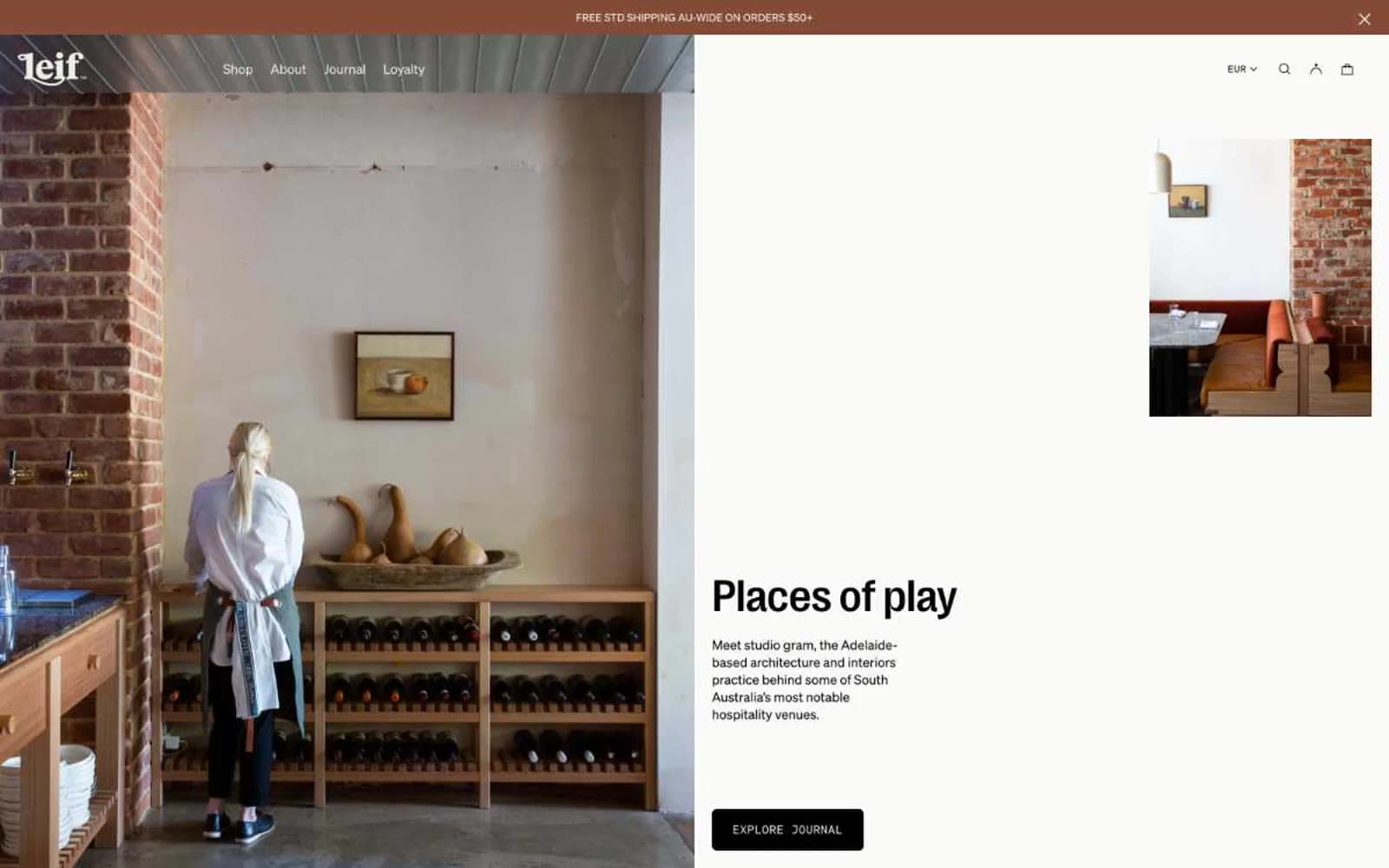
Leif is an editorial apothecary: warm cream canvas, botanical product photography, and whisper-thin display type that treats body care like a fashion magazine spread. The palette is almost entirely warm neutrals — stone, bone, ink, a dusty rose blush, and a pale chartreuse for accent — so the only color in the interface comes from the products and botanicals themselves. Layout breathes through generous product photography, split editorial compositions, and minimal chrome. Type does the heavy lifting: PP Right Grotesk at weight 200 for headlines creates a calligraphic lightness uncommon in commerce, while Söhne Mono small caps label scent families like museum tags. Components stay quiet — hairline borders, near-zero radii, no shadows — letting the imagery and typography carry the brand.
Leif Products design system

Accent2
Decorative accent surface, soft wash behind editorial text blocks, occasional section tints — the dusty rose that nods to botanical petals without becoming saccharine
Promotional highlight surface — used sparingly as a wash behind sale tags, value bundle badges, or limited-edition callouts; pale enough to never compete with product photography
Neutrals6
All body type, primary action border, all interactive strokes — the only dark in the system, pure black rather than warm charcoal to create maximum contrast against the cream canvas
Card secondary text, muted metadata, price-adjacent labels — the mid-gray that recedes behind the primary ink-black headlines
Neutral form states, badge text, and quiet UI feedback where color should stay understated. Do not promote it to the primary CTA color
Card borders, hairline dividers, subtle section breaks — the warm gray-beige that separates elements without drawing attention
Hairline borders, dividers, input outlines, and card edges on light surfaces. Do not promote it to the primary CTA color
Page canvas, primary card surface — the off-white paper tone the entire interface sits on, warm enough to feel linen, not bright enough to feel clinical
Try a pairing
Pick any two colors from the palette to check whether text stays readable on top.
Aa
Ink on Blush
14.53 : 1 contrast
- Body textPasses AA 4.5
- Large textPasses AA 3
- StrictPasses AAA 7
More DESIGN.md files. Same web, different personalities.

High Protein
Commerce
Hopper
Commerce
2.AG
Commerce
A-WARE
Commerce
AATHER
Commerce
Abel
Commerce
Acme Cups New Zealand
Commerce
Acne Studios
Commerce
Adam Lippes
Commerce
Adanola
Commerce
Advene
Commerce
Aevi Wellness
Commerce


