Koox. White tile, sticker print, stencil voice.
- Commerce
- Light theme
- 11 colors
- 1 typeface
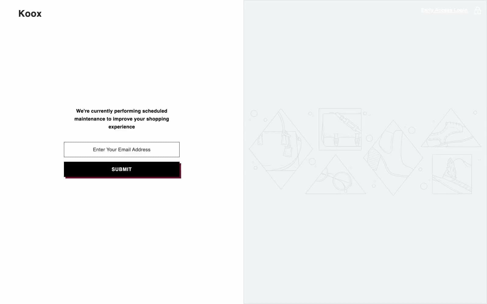
Koox is a brutalist cold-press lab where white subway tile meets product photography and shouty stencil typography. The brand trades in confident all-caps headlines tracked wide across the page, orange grout-line borders that frame every surface like a tiled wall, and a dark-green apothecary palette anchored by a single hard-offset burgundy shadow that makes every button feel like a screen-printed sticker. Pages stay clinical and bright — white canvas, near-black text, thin hairlines — with color reserved for functional punctuation: the orange frame, the dark-green CTA, the burgundy shadow. The result is loud but disciplined, like a juice bar designed by a printmaker.
Koox design system
Brand2
Signature brand border and link accent — orange tile-line strokes that frame cards, links, and section edges with the warmth of fired clay against the clinical white canvas
Primary action fill — the dark botanical green of filled CTA buttons, footer band, and category button backgrounds, signaling the product inside without resorting to food-photo greens
Accent1
Hard-offset shadow accent — deep burgundy that throws a zero-blur 5px shadow under stickers and emphasized buttons, turning flat elements into screen-print layers peeled onto the page
Neutrals8
Navigation, body text, and default border color — the unyielding black that carries every paragraph, icon stroke, and card hairline
Heading color and deep-surface accent — nearly-black tone for the heaviest display text and occasional dark bands
Input text and icon fill — secondary legibility gray for form labels and small icon detail
Decorative low-emphasis border and text — rarely used, appears on tertiary UI marks
Mid-gray utility border and muted body text — quieter dividers where full black would be too loud
Input field border — neutral resting-state outline for form fields
Soft card border and subtle fill — the gray grout between white surfaces, used for hairline dividers and recessed card frames
Page canvas, card surface, and reverse text on dark nav and green CTAs — the clinical white tile of the entire system
Try a pairing
Pick any two colors from the palette to check whether text stays readable on top.
Aa
Noir on Tile Grout
5.23 : 1 contrast
- Body textPasses AA 4.5
- Large textPasses AA 3
- StrictFails AAA 7
More DESIGN.md files. Same web, different personalities.

High Protein
Commerce
Hopper
Commerce
2.AG
Commerce
A-WARE
Commerce
AATHER
Commerce
Abel
Commerce
Acme Cups New Zealand
Commerce
Acne Studios
Commerce
Adam Lippes
Commerce
Adanola
Commerce
Advene
Commerce
Aevi Wellness
Commerce


