
Kalstore®. Paper atelier on a quiet morning.
- Commerce
- Light theme
- 16 colors
- 2 typefaces
Kalstore is a paper atelier rendered as a quiet editorial spread: warm off-white canvas, sparse generous breathing room, large-scale lifestyle photography, and one warm mustard accent that interrupts the monochrome calm like a sticky note on a drafting table. Typography is the loudest element — a single editorial sans at multiple registers, from whisper-thin 19px body copy to 140px display treatments with aggressively tight tracking. Chromatic color appears almost entirely as editorial art (the ALESAL typographic block uses a palette of terracotta, sage, cobalt, and rust) rather than functional UI, keeping the interface itself disciplined. Components are small, flat, and almost unstyled — thin hairline borders, 8px corners, 6px button padding, barely-there shadows. The overall feel is less e-commerce and more independent magazine.
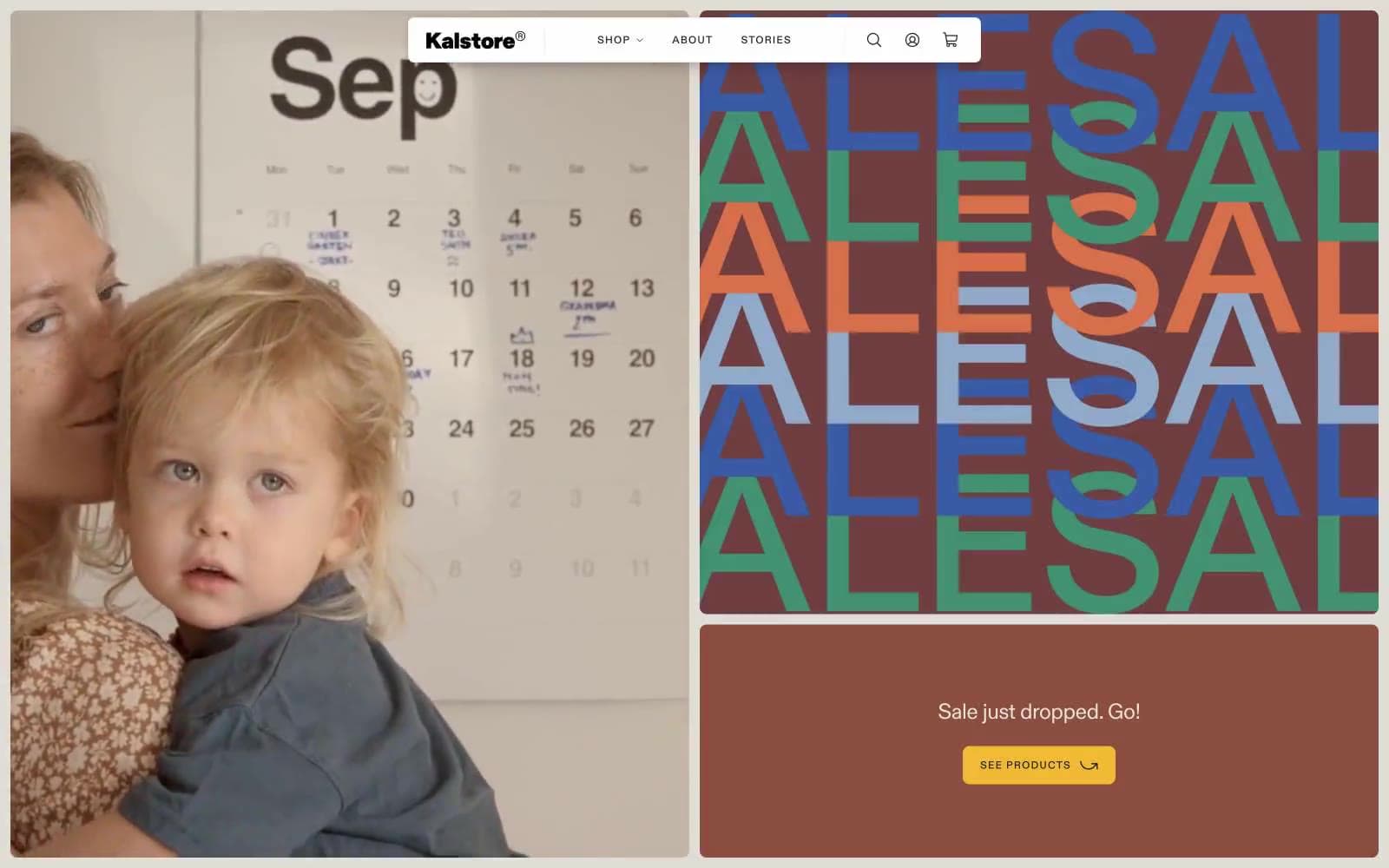
Kalstore® design system

Brand1
Primary action color — CTA buttons, nav accents, and badge highlights. A warm sunlit yellow that reads as a sticky-note moment against the monochrome layout
Accent6
Dark accent paired with Mustard on badges and nav — provides a near-black complement that makes the yellow pop without using pure black
Editorial accent — appears in the typographic art palette and decorative product imagery. Rust-orange warmth that belongs in illustrations, not buttons
Editorial accent — a muted forest green used in the typographic art palette. Decorative, not functional
Editorial accent — deep ultramarine from the typographic art palette. The strongest chromatic statement in the decorative system
Editorial accent — dark brick red from the typographic art palette, echoing the warmth of Terracotta but grounded
Editorial accent — a washed, chalky blue used in the typographic art palette. The lightest chromatic in the decorative system
Neutrals9
Primary text, icon strokes, and dominant border color. Slightly softened from pure black to sit comfortably on the warm canvas
Navigation borders and medium-emphasis UI structure; a bridge between the near-black Ink and the mid-grays
Muted secondary text and subdued borders for de-emphasized content like timestamps and helper labels
Tertiary text and disabled-state borders; sits between Slate and Felt Gray in the neutral ladder
Hairline dividers, card borders, list separators — the structural neutral that holds the layout together without drawing attention
Warm-toned surface for body sections and secondary cards; introduces a faint paper-fiber warmth against the cooler Linen
Subtle surface elevation for nav backgrounds and hover states; slightly cooler than Paper White to create depth without contrast
Page canvas — warm off-white that mimics uncoated paper stock; the default surface behind everything
Badge fills, icon backgrounds, and the highest surface elevation — used sparingly to lift elements above Linen and Parchment
Try a pairing
Pick any two colors from the palette to check whether text stays readable on top.
Aa
Ink on Mustard
8.73 : 1 contrast
- Body textPasses AA 4.5
- Large textPasses AA 3
- StrictPasses AAA 7
More DESIGN.md files. Same web, different personalities.

High Protein
Commerce
Hopper
Commerce
2.AG
Commerce
A-WARE
Commerce
AATHER
Commerce
Abel
Commerce
Acme Cups New Zealand
Commerce
Acne Studios
Commerce
Adam Lippes
Commerce
Adanola
Commerce
Advene
Commerce
Aevi Wellness
Commerce


