
Isla Beauty. Think warm parchment walls, amber bottles, and a single red seal on every label.
- Commerce
- Light theme
- 12 colors
- 6 typefaces
Isla is a warm editorial apothecary: a cream-paper canvas, a single vivid red that does the work of an alarm clock, and a typographic mix of geometric sans (Soehne/Nimbus) paired with Garamond italic for emotional moments. The palette stays close to skin and paper — off-white, warm sand, blush, deep ink — with red appearing only as a small functional burst: CTAs, section eyebrows, add-to-cart fills, inline accents. Components are flat and quiet: 3px corners, hairline borders, no shadows, no gradients. Layout breathes; product photography carries the visual weight while type remains a composed voice — uppercase tracked labels over serif italics over sans body.
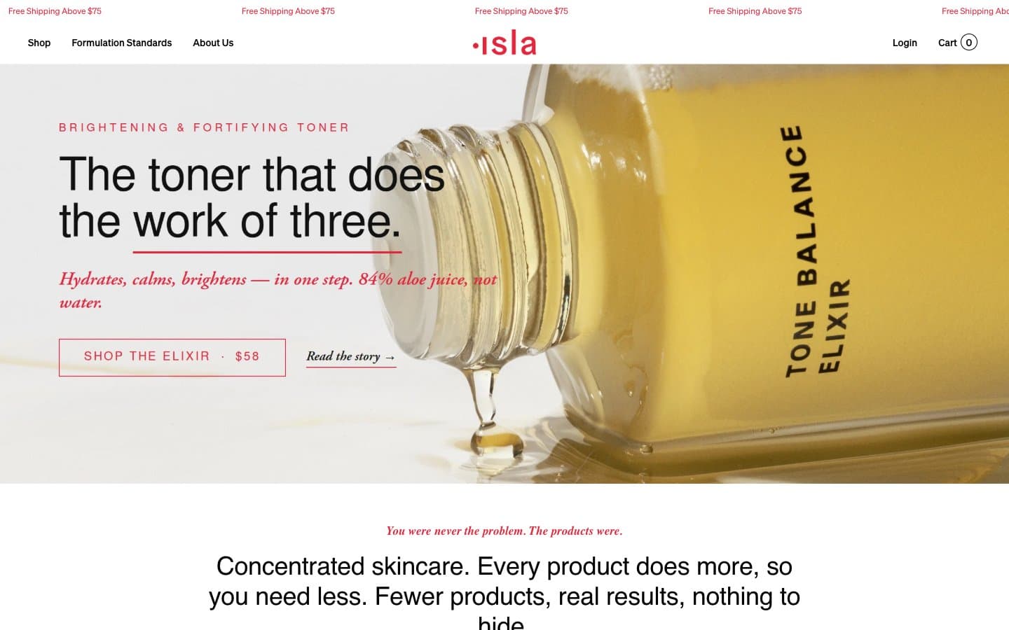
Isla Beauty design system

Brand2
Primary action — filled add-to-cart buttons, CTA borders, section eyebrows, price accents, link underlines, and all brand punctuation against the cream canvas. The red carries the entire chromatic load; it must read as deliberate and small, never as decoration
Secondary red accent — link borders, icon strokes, and outline-only controls. Slightly deeper than Crimson Seal; use when a quieter red moment is needed alongside the primary
Accent1
Soft accent badge fills, warm callout backgrounds — a desaturated peach that gives badge states a skin-like warmth
Neutrals9
Primary text, primary borders, navigation rules, body hairlines. The structural anchor of the entire interface
Badge borders, heading text, list markers, card text on cream — a near-black used where pure black would feel clinical against the warm canvas
Navigation borders, secondary structural lines — sits between Ink Black and the warm cream as a third depth
Body text and borders for muted but still-readable paragraphs
Badge borders, helper text, muted body copy — the first true mid-gray in the scale
Warm-leaning gray for tags, secondary body text, and quiet fills where neutrality needs to harmonize with the cream
Warm button borders, subtle section dividers — the border color that ties the warm palette together instead of fighting it with cool gray
Page canvas, badge fills, soft card surfaces — the dominant background. Slightly warm to harmonize with product photography of amber liquids
Card surfaces, button text on red, elevated product panels — the brightest surface that sits one step above the cream canvas
Try a pairing
Pick any two colors from the palette to check whether text stays readable on top.
Aa
Ink Black on Crimson Seal
4.64 : 1 contrast
- Body textPasses AA 4.5
- Large textPasses AA 3
- StrictFails AAA 7
More DESIGN.md files. Same web, different personalities.

High Protein
Commerce
Hopper
Commerce
2.AG
Commerce
A-WARE
Commerce
AATHER
Commerce
Abel
Commerce
Acme Cups New Zealand
Commerce
Acne Studios
Commerce
Adam Lippes
Commerce
Adanola
Commerce
Advene
Commerce
Aevi Wellness
Commerce


