
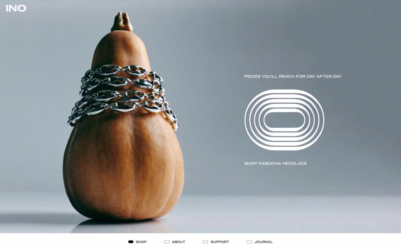
INO. Every piece floats in white space like a single object behind glass, framed by near-black whisper type.
- Commerce
- Light theme
- 5 colors
- 2 typefaces
INO operates as a near-monochrome jewelry gallery: bone-white canvas, one warm near-black ink, and almost no chromatic expression at all. The visual system treats every ring like a museum object — clinical product photography floating in generous negative space, with hierarchy built through position, letter-spacing, and white volume rather than through type scale or color. Navigation lives at the foot of the page as four labeled dots (filled or hollow), a deliberate inversion of the ecommerce top-bar convention. The brand mark itself is a set of concentric ring outlines, echoing the product form and acting as a typographic sculpture rather than a logotype.
INO design system

Neutrals5
Icon fills, decorative graphic strokes, active state fills for the navigation dot indicator. Used sparingly for maximum tonal contrast against Bone
Neutral form states, badge text, and quiet UI feedback where color should stay understated.
Medium-contrast borders, control outlines, and structural separators.
Muted helper text, fine body dividers, secondary metadata. The lightest functional gray — used for price labels and supporting copy that must recede
Page canvas, card surfaces, inverse text on dark fills. The dominant surface; almost the entire site lives here
Try a pairing
Pick any two colors from the palette to check whether text stays readable on top.
Aa
Bone on Carbon
21.00 : 1 contrast
- Body textPasses AA 4.5
- Large textPasses AA 3
- StrictPasses AAA 7
More DESIGN.md files. Same web, different personalities.

High Protein
Commerce
Hopper
Commerce
2.AG
Commerce
A-WARE
Commerce
AATHER
Commerce
Abel
Commerce
Acme Cups New Zealand
Commerce
Acne Studios
Commerce
Adam Lippes
Commerce
Adanola
Commerce
Advene
Commerce
Aevi Wellness
Commerce


