
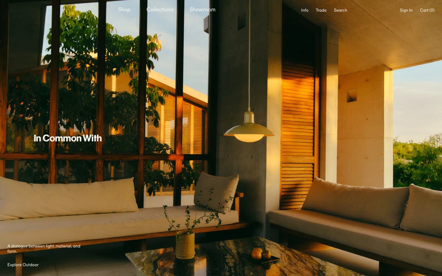
Incommonwith. Warm cream pages, sunlit interior photography, and a single deep burgundy ink that carries every word, border, and link like fine letterpress.
- Commerce
- Light theme
- 5 colors
- 2 typefaces
In Common With operates as a printed design quarterly, not a storefront: warm cream-white paper (#fafaf9) is the canvas, full-bleed golden-hour interior photography carries visual weight, and a single deep oxblood ink (#4a0a05) serves as every text element, border, and link. The type system pairs a classical Caslon Ionic serif at 24px for headlines with a neo-grotesque Mier A sans for body, navigation, and UI — a literary tension that recurs across hero overlays, category names, and journal titles. Layout is unhurried: full-bleed hero, sidebar date stamps, horizontal product carousels, and generous negative space let the photography lead. Surfaces are flat, corners are sharp, shadows are absent — depth comes from photography and warm color temperature, never from elevation.
Incommonwith design system

Brand1
All body text, headings, links, borders, outlined actions, and footer type — the singular chromatic voice; warmth and gravity without aggression
Neutrals4
Muted captions, helper text, and de-emphasized UI labels. Do not promote it to the primary CTA color
Muted background wash and tertiary surface — the only mid-tone neutral, used sparingly for section backgrounds
Secondary surface, subtle card backgrounds, and pill-tag fills — slightly greener/warmer than the page, used for soft differentiation
Primary page background; the warm off-white that gives the site its paper-stock feel
Try a pairing
Pick any two colors from the palette to check whether text stays readable on top.
Aa
Cream Paper on Oxblood Ink
15.04 : 1 contrast
- Body textPasses AA 4.5
- Large textPasses AA 3
- StrictPasses AAA 7
More DESIGN.md files. Same web, different personalities.

High Protein
Commerce
Hopper
Commerce
2.AG
Commerce
A-WARE
Commerce
AATHER
Commerce
Abel
Commerce
Acme Cups New Zealand
Commerce
Acne Studios
Commerce
Adam Lippes
Commerce
Adanola
Commerce
Advene
Commerce
Aevi Wellness
Commerce


