
IKEA. Sunlit Swedish flat-pack showroom.
- Commerce
- Light theme
- 8 colors
- 1 typeface
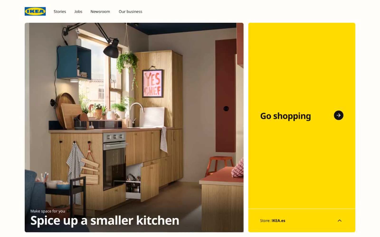
IKEA's interface reads as a high-contrast editorial spread: near-black type on warm white, punctuated by flat yellow panels that function as built-in call-to-action zones. The system is deliberately sparse — one custom sans-serif (Noto IKEA) at just two weights (400 and 700), one 8px corner radius across every component, zero shadows, no gradients. The tightness is structural, not minimalism-as-trend: the negative letter-spacing (-0.029em at display, -0.027em at body) makes even 13px captions feel architectural. Cards are large and media-led, arranged in generous two-column blocks with gradient-to-black text overlays for legibility. The yellow #ffdb00 does all the interface work — it never decorates, it only activates.
IKEA design system

Brand1
Primary CTA fills, featured card backgrounds, hero accent panels, the singular chromatic workhorse of the system
Accent2
Text link color, used extensively across navigation and body links — the only blue in the system
Occasional decorative highlight, used sparingly on select link elements or promotional accents
Neutrals5
SVG icon fills, input borders, true-black accents where maximum contrast is needed
Primary text, body copy, headings, dominant borders (851 occurrences), icon strokes
Secondary text, muted borders, disabled icon states
Slightly off-white surface variant for buttons and cards — barely warmer than pure white, breaks digital coldness
Page background, card surfaces, nav background, button text on dark fills
Try a pairing
Pick any two colors from the palette to check whether text stays readable on top.
Aa
True Black on IKEA Yellow
15.38 : 1 contrast
- Body textPasses AA 4.5
- Large textPasses AA 3
- StrictPasses AAA 7
More DESIGN.md files. Same web, different personalities.

High Protein
Commerce
Hopper
Commerce
2.AG
Commerce
A-WARE
Commerce
AATHER
Commerce
Abel
Commerce
Acme Cups New Zealand
Commerce
Acne Studios
Commerce
Adam Lippes
Commerce
Adanola
Commerce
Advene
Commerce
Aevi Wellness
Commerce


