
HOUSEPLANT. Walnut bookstore on linen paper.
- Commerce
- Light theme
- 6 colors
- 4 typefaces
Houseplant operates in a warm, earthy monochrome — deep walnut brown on aged cream, with the product photography doing all the chromatic work. The system reads like a vintage housewares catalog: tight custom typography, generous breathing room, no decorative gradients, and almost no accent color. The dark brown #321e1 is both text and surface, flipping between background and foreground depending on context, while the cream #f4f1e1 plays canvas. Components are minimal — solid filled buttons, hairline dividers, soft cards with a single subtle shadow. The signature move is the oversized custom wordmark that anchors the page footer, treating the brand name as a graphic element rather than a logo.
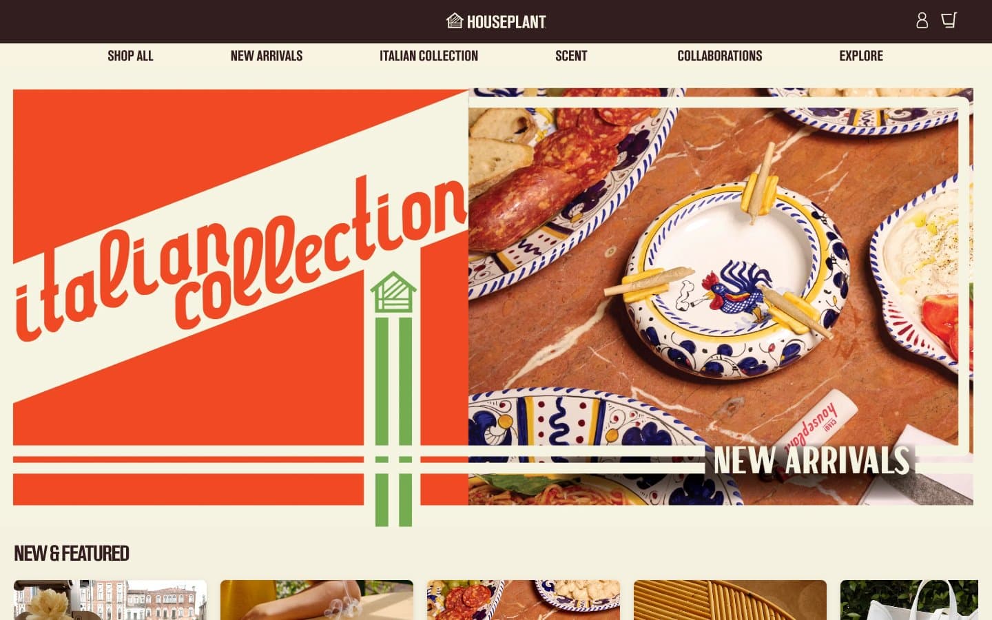
HOUSEPLANT design system

Brand1
Primary text color, filled action buttons, dark hero sections, footer wordmark. Deep warm brown that reads as near-black while carrying the brand's earthy warmth — used as both foreground and background surface
Neutrals5
Icon strokes, true-black accents on borders. Used sparingly where absolute contrast is needed
Button text on light surfaces, alternate dark fill. Slightly lighter brown variant for typographic contrast within the dark family
Secondary borders, muted helper text, subtle dividers. Neutral medium gray providing quiet separation without competing with the Walnut/Linen pair
Page canvas, card surfaces, light text on dark backgrounds. Warm aged-cream that gives the entire system its paper-like, vintage quality
Alternate light surface, hover-state wash. Neutral off-white for slight tonal shifts away from the cream canvas
Try a pairing
Pick any two colors from the palette to check whether text stays readable on top.
Aa
Soft Sand on Walnut
14.25 : 1 contrast
- Body textPasses AA 4.5
- Large textPasses AA 3
- StrictPasses AAA 7
More DESIGN.md files. Same web, different personalities.

High Protein
Commerce
Hopper
Commerce
2.AG
Commerce
A-WARE
Commerce
AATHER
Commerce
Abel
Commerce
Acme Cups New Zealand
Commerce
Acne Studios
Commerce
Adam Lippes
Commerce
Adanola
Commerce
Advene
Commerce
Aevi Wellness
Commerce


