
Agronomy Workshop. Newsprint zine taped to a workshop wall.
- Commerce
- Light theme
- 9 colors
- 5 typefaces
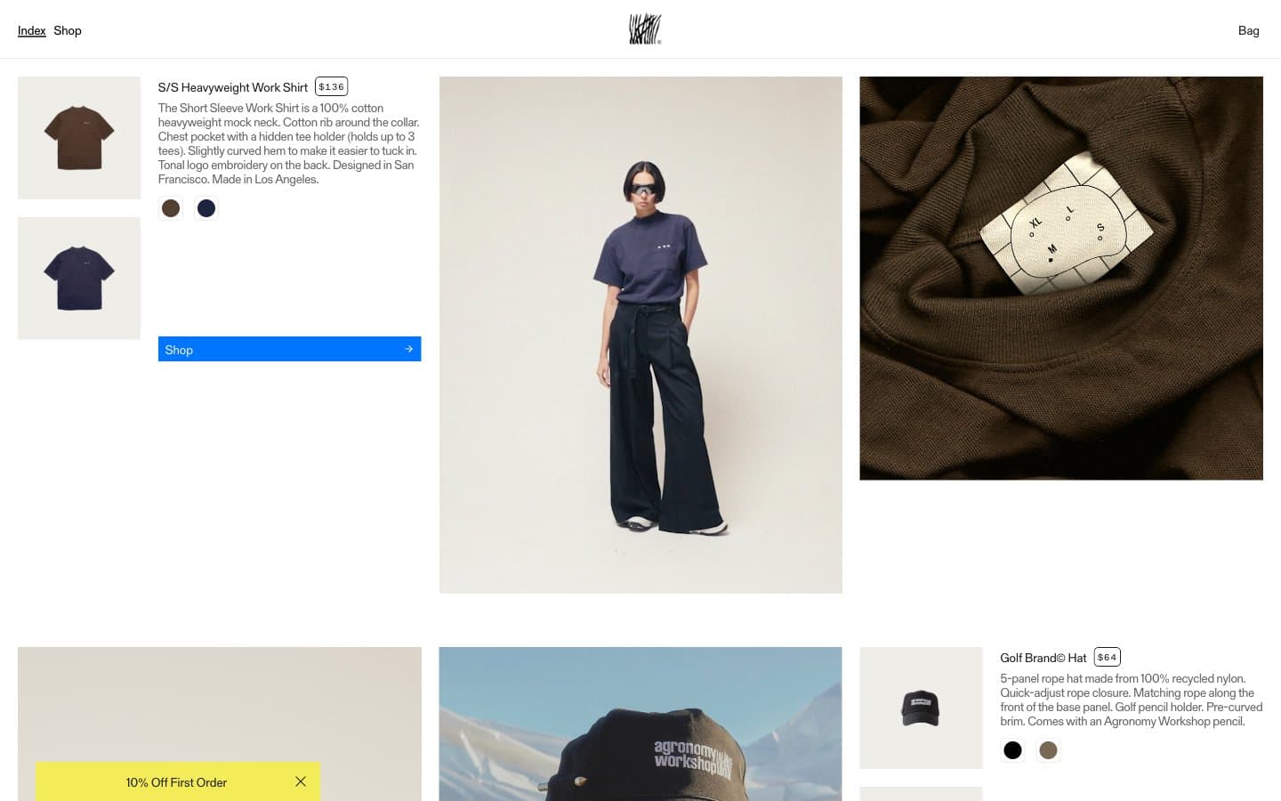
Agronomy Workshop reads as a print-meets-product catalog: a warm, slightly yellowed white canvas, oversized editorial photography, and copy typeset in a quirky serif that feels stamped rather than set. The layout is asymmetric and dense — product metadata (name, price, description, color swatches) is crammed into a narrow column beside full-bleed lookbook imagery, more like flipping through a zine than browsing a store. A single saturated blue and a mustard-yellow promotional wash are the only chromatic notes; everything else is black, white, and warm gray, which makes the color swatches and blue 'Shop' buttons feel switched on. The compressed display headings, typewriter serif body, and tracked uppercase mono labels give the system a deliberate analog/maker voice — utilitarian, unfussy, slightly rough around the edges.
Agronomy Workshop design system

Brand1
Blue action color for filled buttons, selected navigation states, and focused conversion moments.
Accent2
Promotional banners, first-order discount strip — a single warm yellow used sparingly to draw the eye without competing with photography
Soft blue surface for secondary panels or callout backgrounds — a desaturated companion to Workshop Blue
Neutrals6
Primary text, hairline borders, icon strokes — used aggressively for borders (1000+ instances) to create the dense grid of dividers
Body and heading text, form borders — slightly softer than pure black, the main reading text color
Helper text, tertiary metadata, muted labels
Muted body text, secondary descriptions
Warm off-white for product detail panels, card surfaces, and secondary backgrounds — slight yellow tint gives the whole site its paper-like cast
Page background, base surface
Try a pairing
Pick any two colors from the palette to check whether text stays readable on top.
Aa
Ink on Workshop Blue
5.04 : 1 contrast
- Body textPasses AA 4.5
- Large textPasses AA 3
- StrictFails AAA 7
More DESIGN.md files. Same web, different personalities.

High Protein
Commerce
Hopper
Commerce
2.AG
Commerce
A-WARE
Commerce
AATHER
Commerce
Abel
Commerce
Acme Cups New Zealand
Commerce
Acne Studios
Commerce
Adam Lippes
Commerce
Adanola
Commerce
Advene
Commerce
Aevi Wellness
Commerce


