
Graf Lantz. One violet stroke of urgency inside an otherwise bone-white room.
- Commerce
- Light theme
- 9 colors
- 4 typefaces
Graf Lantz reads as a Scandinavian atelier on raw linen: bone-white canvas, a single brand violet used almost as punctuation, and product photography that is cropped so close the felt texture becomes the atmosphere. The page is overwhelmingly typographic and whitespace-driven, with 99% achromatic surfaces and one accent surface reserved for actions. Type stays in a tight, slightly condensed grotesque (NeueHaasUnica) for utility, while a softer, almost humanist display face (accessibly) is reserved for the wordmark and key CTAs — the contrast is between machine-crish utility text and warm display moments. Components are paper-thin: no shadows, no elevation stacks, hairline borders in the #474747–#212121 range, and pill-shaped controls with ~50px radius. Density is comfortable to airy; every product frame is meant to feel like an object on a gallery shelf.
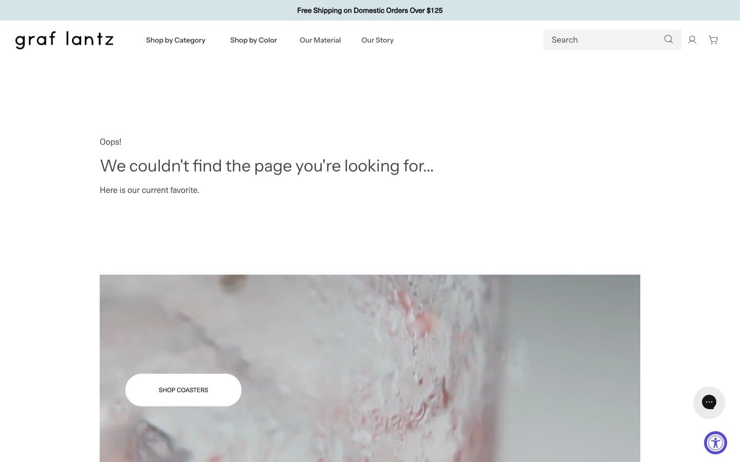
Graf Lantz design system

Brand1
Filled CTA button background, the single chromatic moment in the system. Used sparingly so the action reads as switched-on against an otherwise monochrome page
Accent1
Announcement bar and quiet informational washes — a desaturated teal that reads as utility, never as decoration
Neutrals7
Body text where maximum contrast is required, SVG icon fills, the occasional heavy border
Headings, list item dividers, emphasis borders — the darkening step when hierarchy needs weight
Navigation border accents and nav text — sits between Graphite and Onyx, reserved for chrome
Primary body text, default borders, the dominant hairline tone. The structural neutral of the system
Medium-contrast borders, control outlines, and structural separators. Do not promote it to the primary CTA color
Light neutral action fill for buttons on dark surfaces.
Page background, card surfaces, inverted text on dark washes. The neutral ground everything else is mounted on
Try a pairing
Pick any two colors from the palette to check whether text stays readable on top.
Aa
Canvas White on Indigo Pulse
6.18 : 1 contrast
- Body textPasses AA 4.5
- Large textPasses AA 3
- StrictFails AAA 7
More DESIGN.md files. Same web, different personalities.

High Protein
Commerce
Hopper
Commerce
2.AG
Commerce
A-WARE
Commerce
AATHER
Commerce
Abel
Commerce
Acme Cups New Zealand
Commerce
Acne Studios
Commerce
Adam Lippes
Commerce
Adanola
Commerce
Advene
Commerce
Aevi Wellness
Commerce


