
Glossier. Paper white, ink black, one flash of yellow.
- Commerce
- Light theme
- 10 colors
- 3 typefaces
Glossier operates as a digital beauty magazine: a near-monochrome canvas of paper-white and ink-black, disrupted by one electric yellow accent that functions as both the brand wordmark and the singular call to action. The system is editorial in restraint — huge Apercu headlines, generous breathing room, full-bleed lifestyle photography that carries most of the emotional weight — and utilitarian in execution, with flat product cards, hairline borders, and zero decorative ornament. The yellow is not a secondary brand color; it IS the brand, deployed sparingly so each appearance feels like a flashbulb. Everything else must recede: neutrals are warm grays with a faint blush undertone, borders are barely-there, type is tight and compressed. The result is a storefront that reads as confident, understated, and unapologetically modern.
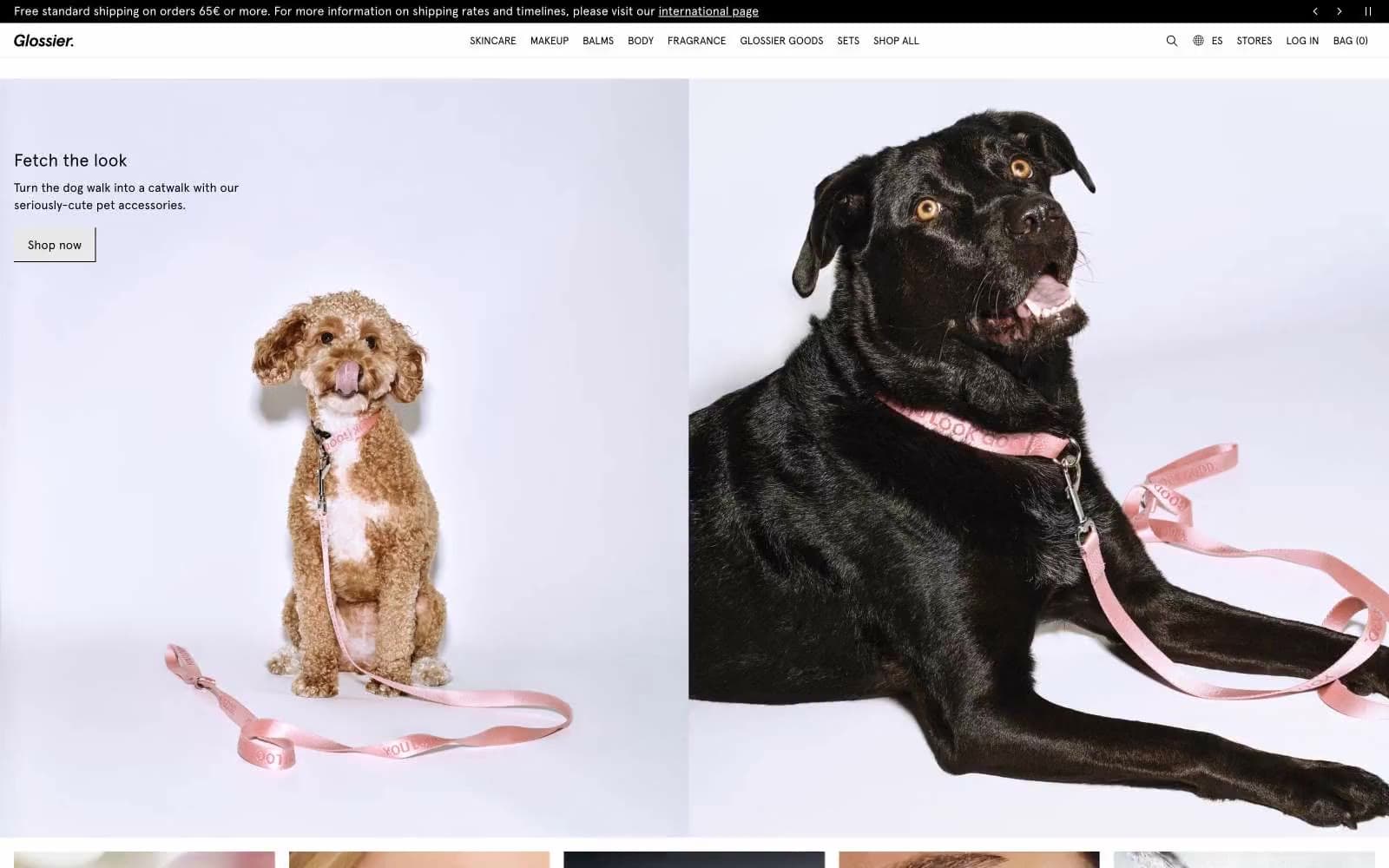
Glossier design system

Brand1
Yellow supporting accent for decorative details and low-frequency emphasis. Do not promote it to the primary CTA color
Accent1
Violet supporting accent for decorative details and low-frequency emphasis
Neutrals8
Primary text, nav links, body copy, footer text, icon strokes, hairline borders; the dominant typographic and structural color
Product list and card swatch fills; the darkest functional gray for catalog imagery placeholders
Secondary text, helper copy, muted labels, form placeholder text; the only mid-gray for typographic hierarchy
Input borders, badge backgrounds, hairline dividers; the structural border color for cards and form elements
Light supporting surface for subtle backgrounds and section separation. Do not promote it to the primary CTA color
Footer background, soft warm section breaks; a barely-perceptible pink-tinted off-white that adds warmth to the bottom of pages
Page canvas, section backgrounds, image-to-page transitions; the base surface the entire site sits on
Product card surfaces, input fills, elevated panels; the brightest surface level in the stack
Try a pairing
Pick any two colors from the palette to check whether text stays readable on top.
Aa
Ink on Glossier Yellow
17.85 : 1 contrast
- Body textPasses AA 4.5
- Large textPasses AA 3
- StrictPasses AAA 7
More DESIGN.md files. Same web, different personalities.

High Protein
Commerce
Hopper
Commerce
2.AG
Commerce
A-WARE
Commerce
AATHER
Commerce
Abel
Commerce
Acme Cups New Zealand
Commerce
Acne Studios
Commerce
Adam Lippes
Commerce
Adanola
Commerce
Advene
Commerce
Aevi Wellness
Commerce


