
Ghia. Mediterranean sunset on a vintage aperitivo label.
- Commerce
- Light theme
- 11 colors
- 2 typefaces
Ghia expresses itself as a Mediterranean aperitivo label in digital form: warm cream canvases, deep wine-burgundy sections, and coral-pink CTAs that feel like vintage packaging. The type system pairs a humanist transitional serif (Vivey) for warmth and readability with a condensed display sans (FHA Condensed) for editorial all-caps headlines — the same contrast you'd find on an Italian spirits label. Components are rounded and tactile: pill buttons, circular product frames, and full-bleed product photography. The page alternates between sun-warmed cream surfaces and dark burgundy statement blocks, with color used sparingly to make the pink CTAs and blue accent moments pop. Density is relaxed and editorial — generous margins, large display headlines, and product photography that takes visual priority over text.
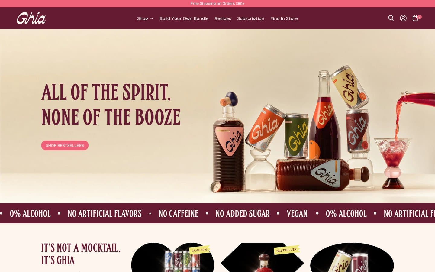
Ghia design system

Brand2
Primary brand color, header bar, statement sections, marquee bands, footer — the deep wine that grounds the whole system
Filled pill buttons (Shop Bestsellers, Add to Cart, Our Story), active tab indicators, small accent dots
Accent4
Soft accent border, tag backgrounds, muted product label echo
Blue supporting accent for decorative details and low-frequency emphasis
Highlight tags, sticker accents, energetic punctuation — the spark of citrus in the system
Muted surface accent, cool-toned badge or chip background
Neutrals5
Icons, fine details, logo strokes on light surfaces
Supporting neutral for secondary UI, dividers, and muted labels. Do not promote it to the primary CTA color
Primary page canvas and warm card surfaces
Hairline borders, dividers, subtle structural separators
Lightest surface, header text on dark, soft secondary card backgrounds
Try a pairing
Pick any two colors from the palette to check whether text stays readable on top.
Aa
Bone White on Ghia Burgundy
11.12 : 1 contrast
- Body textPasses AA 4.5
- Large textPasses AA 3
- StrictPasses AAA 7
More DESIGN.md files. Same web, different personalities.

High Protein
Commerce
Hopper
Commerce
2.AG
Commerce
A-WARE
Commerce
AATHER
Commerce
Abel
Commerce
Acme Cups New Zealand
Commerce
Acne Studios
Commerce
Adam Lippes
Commerce
Adanola
Commerce
Advene
Commerce
Aevi Wellness
Commerce


