
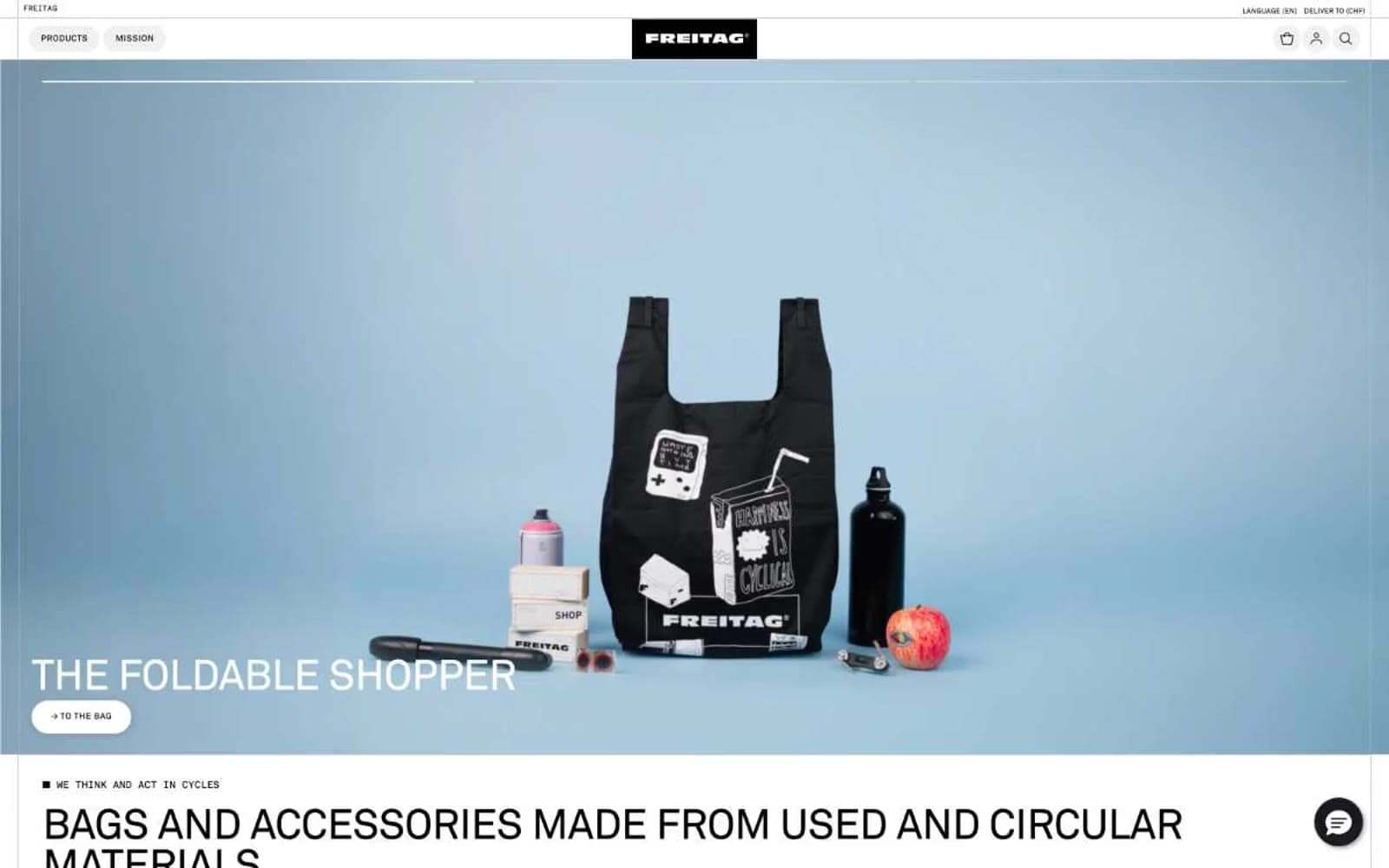
Freitag. A printed manifest of truck tarpaulins laid flat on poured concrete, where the only color is the recycled product itself.
- Commerce
- Light theme
- 8 colors
- 4 typefaces
Freitag operates as a Swiss industrial catalog in monochrome: an almost color-zero system where the only chromatic surface is the product itself (truck tarpaulin bags bleeding red, yellow, blue, green). The UI is a grid of black, white, and concrete gray, serving as a neutral stage for the circular-economy merchandise. Typography is compressed and uppercase-driven (Akkurat Standard), line-heights tight as machinery, letterspacing wide on labels, and interactive elements shaped as horizontal pills with hard-edged 1px outlines. Layout follows a strict modular grid — full-bleed 50/50 hero, then 3-column category blocks, then 6-column product matrices. The signature trick: the site reads as a technical specification sheet or shipping manifest, not a fashion storefront. Components feel like they're stamped on the page rather than designed — pill buttons, thin rules, hairline grids, and almost no shadow depth.
Freitag design system

Accent1
Yellow wash for highlight backgrounds, decorative bands, and soft emphasis behind content.
Neutrals7
Primary text, logo plate, pill-button fills, hairline borders, icon strokes — the dominant ink that carries every label, heading, and outline
Rare near-black accent for solid button fills that need a touch of warmth without drifting to pure carbon
Deep shadow tone and heavier border treatment for elevated containers and section breaks
Muted secondary text, body helpers, tertiary borders — the gray that whispers beneath the ink
Card borders, thumbnail dividers, secondary dividers between product cells — the structural neutral that frames the grid
Subtle surface tint for inactive button states and soft fill washes, never a page background
Page canvas, card surfaces, product image backdrops, button text on dark fills, inverted text on category overlays
Try a pairing
Pick any two colors from the palette to check whether text stays readable on top.
Aa
Carbon Black on Caution Yellow
15.59 : 1 contrast
- Body textPasses AA 4.5
- Large textPasses AA 3
- StrictPasses AAA 7
More DESIGN.md files. Same web, different personalities.

High Protein
Commerce
Hopper
Commerce
2.AG
Commerce
A-WARE
Commerce
AATHER
Commerce
Abel
Commerce
Acme Cups New Zealand
Commerce
Acne Studios
Commerce
Adam Lippes
Commerce
Adanola
Commerce
Advene
Commerce
Aevi Wellness
Commerce


