
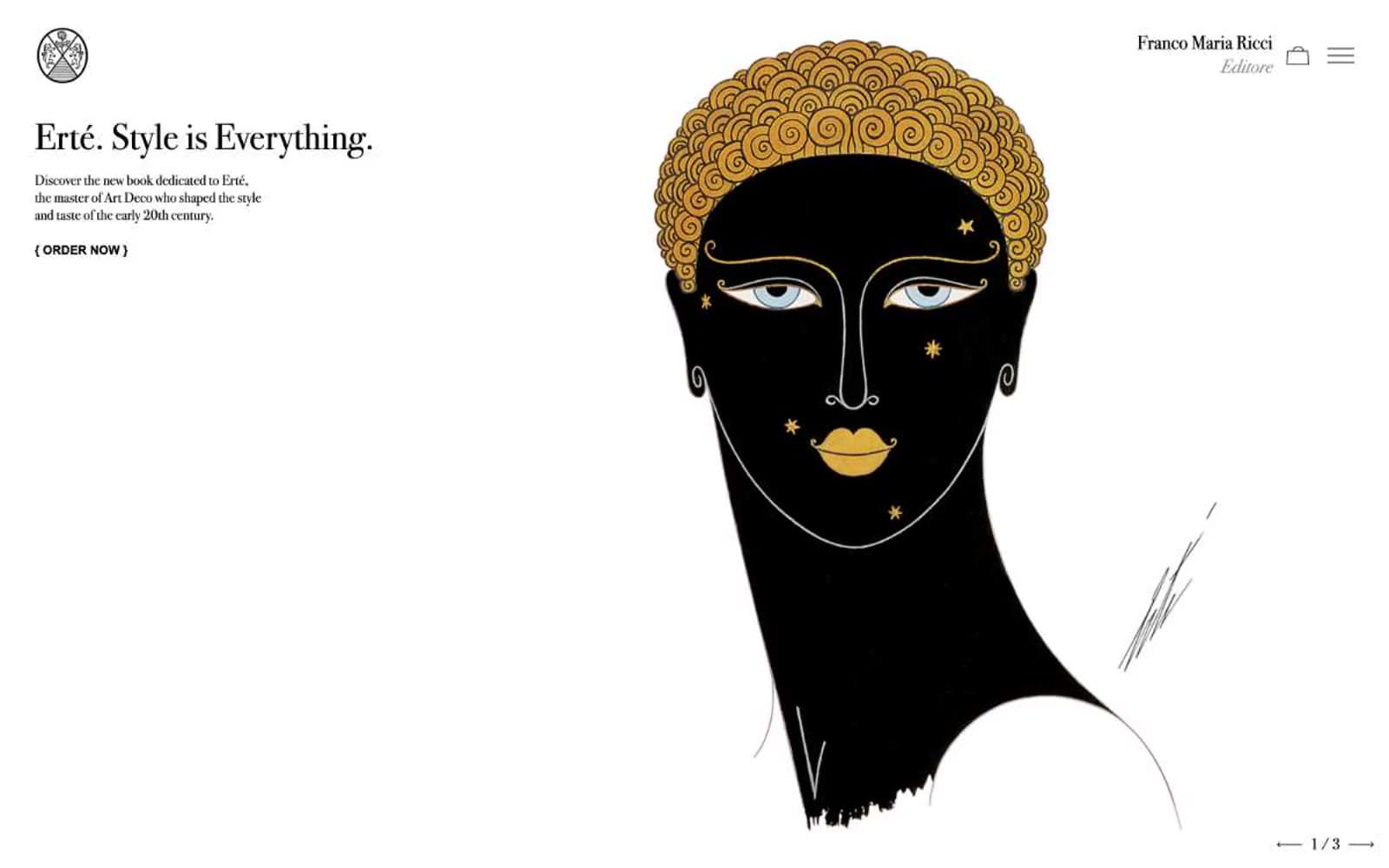
Franco Maria Ricci Editore. Burnished gold hairlines on bone-white vellum.
- Commerce
- Light theme
- 6 colors
- 3 typefaces
Franco Maria Ricci is a quiet luxury of typographic restraint: a vast off-white vellum, a single high-contrast Bodoni voice, and a thread of burnished gold that hairlines every editorial moment. The system behaves like an art-book spread — no shadows, no gradients, no rounded corners, no filled buttons — only the architecture of type, generous white space, and vertical rules dividing book objects. Color appears as gold punctuation (borders on titles, rules beneath section headers, thin lines under links) rather than as fill, and the lone dark surface (#0a0a0a) reads as a gallery wall, not as a UI mode. All interactive elements are text-driven: ghost links, bracketed call-to-action markers like `{ ORDER NOW }`, and pagination arrows at page corners. The page is a long horizontal editorial scroll divided into discrete exhibition rooms, each introduced by a serif italic section title with a gold underline.
Franco Maria Ricci Editore design system

Accent1
Section header underlines, link hover rules, decorative title borders — the only chromatic voice in the system, applied as 1px strokes and inline rules, never as fill
Neutrals5
Body copy, navigation text, icons, all hairlines and borders, pagination marks — the structural ink of the system
Dark sections (FMR Magazine block, footer band) and deepest typographic emphasis — reads as letterpress black, not screen black
Muted surface for secondary hero panels and quiet tonal breaks — used sparingly as a gallery-shadow gray
Page canvas — the warm off-white that grounds every section, never pure #ffffff so type never feels clinical
Card and section surfaces — book spreads, product panels, inset blocks sitting one shade above the vellum canvas
Try a pairing
Pick any two colors from the palette to check whether text stays readable on top.
Aa
Letterpress Black on Burnished Gold
8.05 : 1 contrast
- Body textPasses AA 4.5
- Large textPasses AA 3
- StrictPasses AAA 7
More DESIGN.md files. Same web, different personalities.

High Protein
Commerce
Hopper
Commerce
2.AG
Commerce
A-WARE
Commerce
AATHER
Commerce
Abel
Commerce
Acme Cups New Zealand
Commerce
Acne Studios
Commerce
Adam Lippes
Commerce
Adanola
Commerce
Advene
Commerce
Aevi Wellness
Commerce


