
Flowers For Society. A single deep-violet voice laid over a paper-white canvas, where the product photograph and the typography do all the talking.
- Commerce
- Light theme
- 6 colors
- 5 typefaces
Flowers For Society is a fashion house that speaks in a single, assertive voice: deep indigo (#203b90) threading through every surface — logo, headings, buttons, borders, and hero scrims — anchored by a white gallery that breathes. The product is the hero: full-bleed photography with gradient overlays for legibility, oversized pill-shaped CTAs at 41-60px radius, and centered display type that uses Integral's tight line-heights (0.92-1.0) to compress vertical space. The system is deliberately minimal — two custom typefaces, no shadows, extreme border radii, and a single chromatic color. Soehne carries the UI with wide letter-spacing (0.033-0.063em) that gives even small text a boutique, editorial cadence. The result feels like a magazine spread: confident, restrained, and unmistakably branded.
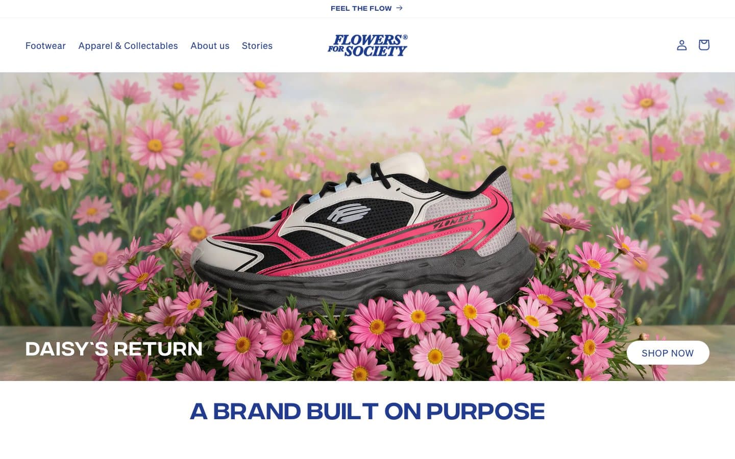
Flowers For Society design system

Brand1
Primary brand color — logo, all headings, primary action fills, action borders, and the left-side hero scrim. This is the only chromatic color in the system; it appears on roughly every surface to assert brand presence
Accent1
Tonal violet for subtle borders and secondary outlines — the softer sibling of Indigo Statement used where full saturation would feel heavy
Neutrals4
Icon strokes, sharp borders, and high-contrast text accents. Used sparingly where the indigo brand color would be too soft
Near-black for button borders and the SHOP NOW text — a softer alternative to pure black for refined edges
Footer background — the only departure from pure white, creating a quiet band at the page base
Neutral form states, badge text, and quiet UI feedback where color should stay understated. Do not promote it to the primary CTA color
Try a pairing
Pick any two colors from the palette to check whether text stays readable on top.
Aa
Paper White on Indigo Statement
10.05 : 1 contrast
- Body textPasses AA 4.5
- Large textPasses AA 3
- StrictPasses AAA 7
More DESIGN.md files. Same web, different personalities.

High Protein
Commerce
Hopper
Commerce
2.AG
Commerce
A-WARE
Commerce
AATHER
Commerce
Abel
Commerce
Acme Cups New Zealand
Commerce
Acne Studios
Commerce
Adam Lippes
Commerce
Adanola
Commerce
Advene
Commerce
Aevi Wellness
Commerce


