
Filling Pieces. Monochrome fashion editorial.
- Commerce
- Light theme
- 7 colors
- 1 typeface
Filling Pieces operates as a monochrome fashion editorial: the entire interface is grayscale, so the brand voice lives in photography and type, not color. A single custom sans-serif (favorit, weights 400/600) carries every label, headline, and product name, with a fixed -0.04em tracking that compresses every glyph into a tight editorial lockup. The 100px display weight is the hero's only punctuation — it is enormous, sitting directly over full-bleed photography with no overlay card or gradient. Surfaces stay warm and flat: hairline #e5e7eb borders at 1px, no shadows, no gradients, an 8px radius applied uniformly to inputs and buttons. Product cards are flat on a warm-gray canvas; the grid reads like a magazine spread, not a typical ecommerce tile wall. Every element earns its presence by being quiet.
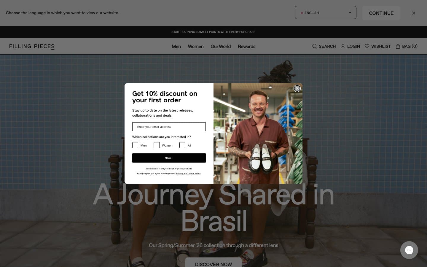
Filling Pieces design system

Neutrals7
Body text, icons, primary action button fill, footer ink — the only chromatic-feeling value, used at maximum contrast for all interactive affordances
Near-black text alternative with a warm undertone — used where pure #000000 reads too cold against the warm-gray canvas
Input border accent, muted helper text, inactive form controls
Canvas/background tone for editorial sections and product category walls — warm enough to distinguish from clinical white
1px borders, dividers, input outlines, card edges — the structural skeleton that separates every surface
Secondary surface behind product grids, checkout bands, and footer — the warm neutral that lifts the page off pure white
Primary surface for cards, input fields, product tiles, and modal backgrounds; white text on dark photographic hero backgrounds
Try a pairing
Pick any two colors from the palette to check whether text stays readable on top.
Aa
Paper White on Obsidian
21.00 : 1 contrast
- Body textPasses AA 4.5
- Large textPasses AA 3
- StrictPasses AAA 7
More DESIGN.md files. Same web, different personalities.

High Protein
Commerce
Hopper
Commerce
2.AG
Commerce
A-WARE
Commerce
AATHER
Commerce
Abel
Commerce
Acme Cups New Zealand
Commerce
Acne Studios
Commerce
Adam Lippes
Commerce
Adanola
Commerce
Advene
Commerce
Aevi Wellness
Commerce


