
Fidèle Editions. Risograph blue ink on warm cream paper.
- Commerce
- Light theme
- 7 colors
- 5 typefaces
Fidèle Editions operates as a risograph studio's web storefront: a warm cream paper canvas printed with one aggressive blue ink. The entire system is built on flatness — no shadows, no gradients, near-zero corner rounding, no decorative borders. Typography does the heavy lifting: a custom geometric sans (BaselGrotesk) at extreme size contrast, with display sizes crushed tight at 0.92 line-height and negative tracking, while small labels breathe with wide positive tracking. The vivid blue is used as a printing press uses ink — for type, nav, the announcement bar, and the massive asterisk logo — never as a subtle accent. Content lives in dense, editorial blocks: full-bleed imagery, tight product grids, photo strips. Every element feels stamped onto paper, not rendered on a screen.
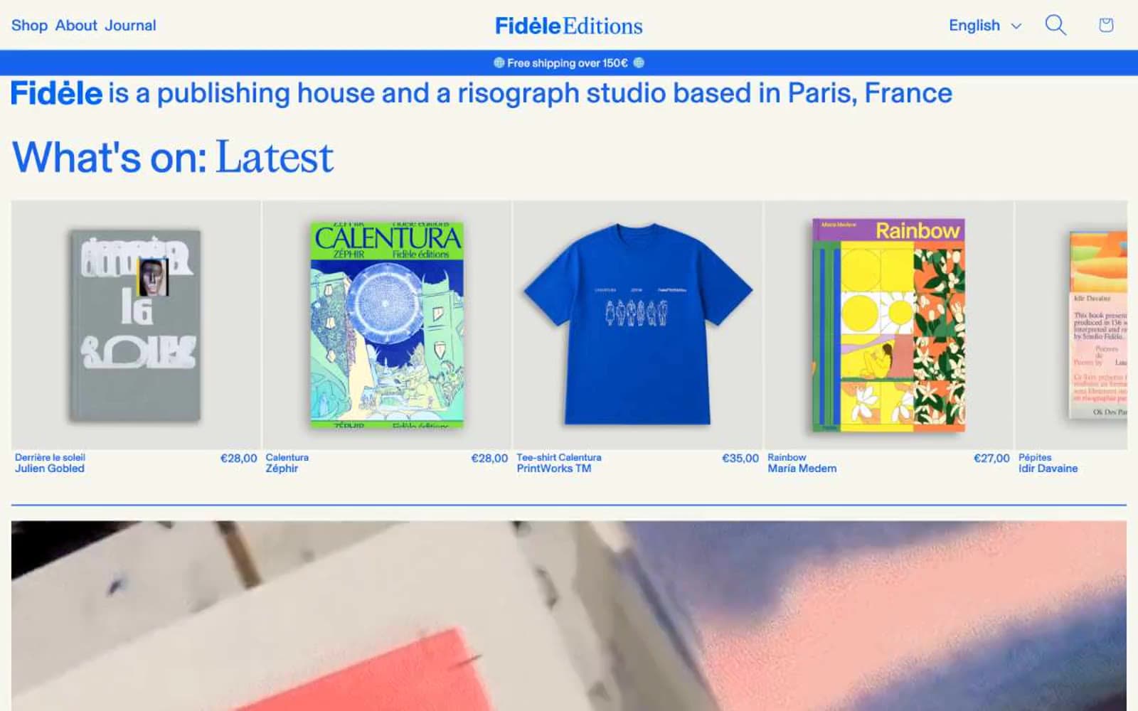
Fidèle Editions design system

Brand3
Headlines, nav links, brand asterisk, announcement bar fill, body borders — the single chromatic ink of the system; whenever color appears, this is it
Secondary blue used for subtle borders, icon tints, and decorative strokes where Fidèle Blue would dominate
Deeper blue for inline hyperlinks within running text, slightly darker than the primary to read as a separate interactive state
Neutrals4
Body text, dark backgrounds, and the rare filled button — near-black rather than pure black, softening contrast on the cream stock
Elevated surface for cards, panels, and product tiles — one step warmer/darker than Paper White for layering without shadows
Page canvas and card surfaces — a warm off-white that gives the entire system its print-stock identity; never use pure #ffffff for page background
Hairline borders, dividers, input outlines, and card edges on light surfaces. Do not promote it to the primary CTA color
Try a pairing
Pick any two colors from the palette to check whether text stays readable on top.
Aa
Pure White on Fidèle Blue
5.18 : 1 contrast
- Body textPasses AA 4.5
- Large textPasses AA 3
- StrictFails AAA 7
More DESIGN.md files. Same web, different personalities.

High Protein
Commerce
Hopper
Commerce
2.AG
Commerce
A-WARE
Commerce
AATHER
Commerce
Abel
Commerce
Acme Cups New Zealand
Commerce
Acne Studios
Commerce
Adam Lippes
Commerce
Adanola
Commerce
Advene
Commerce
Aevi Wellness
Commerce


