
Faire ES. Warm cream wholesale catalog.
- Commerce
- Light theme
- 7 colors
- 4 typefaces
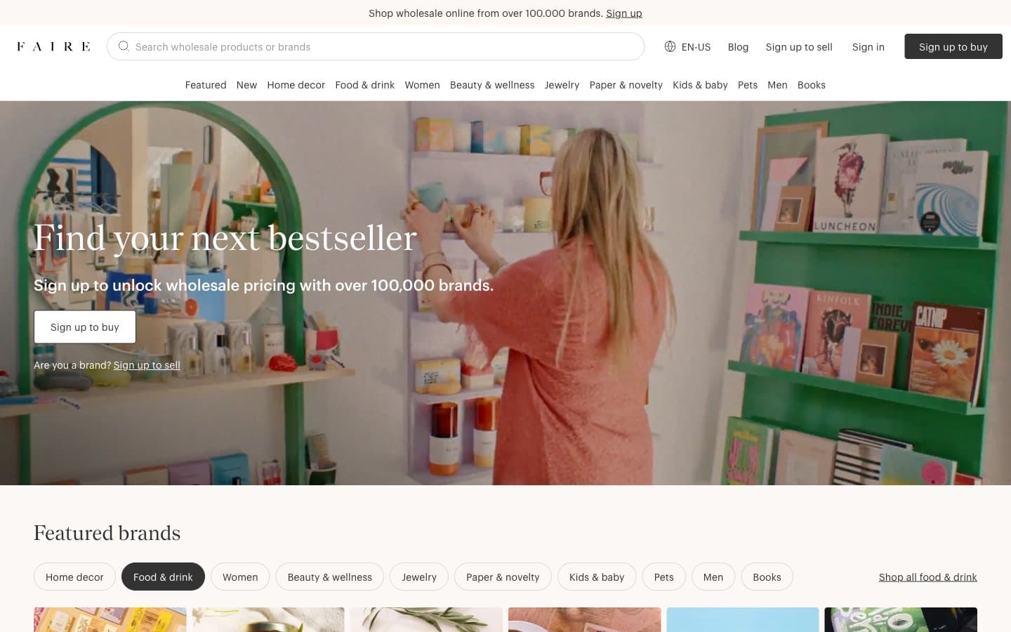
Faire reads like a printed wholesale catalog digitized — warm cream paper (#fbf8f6) as the canvas, a whisper-thin geometric sans (Graphik 100) for body and a high-contrast serif (Nantes) for editorial headlines, almost zero chromatic noise, and one pale buttery yellow (#f1f29f) used as a decorative underline accent rather than a functional call-to-action. The whole interface is achromatic: the brand 'Sign up to buy' button is matte black, the secondary 'Sign in' is ghost, category nav pills use a generous 40px radius, and the 4px button radius keeps control elements grounded and rectangular against the otherwise pill-shaped navigation. Imagery carries all the warmth — full-bleed lifestyle photography of boutiques, shelves, and product stills — while the UI stays quiet, editorial, and whitespace-driven, letting merchants' products feel curated rather than marketed.
Faire ES design system

Accent1
Yellow outline accent for tags, dividers, and focused UI edges. Do not promote it to the primary CTA color
Neutrals6
Dark borders and separators for elevated surfaces and inverted UI. Do not promote it to the primary CTA color
Secondary text, form field borders, body copy, inactive link text
Muted helper text, tertiary metadata, low-emphasis labels
Divider lines, input borders, inactive card outlines, subtle separators between rows
Page canvas, hero backgrounds, warm base layer beneath white cards
Card surfaces, search field background, raised panels, inverted text on dark buttons
Try a pairing
Pick any two colors from the palette to check whether text stays readable on top.
Aa
Ink Black on Butter Highlight
17.94 : 1 contrast
- Body textPasses AA 4.5
- Large textPasses AA 3
- StrictPasses AAA 7
More DESIGN.md files. Same web, different personalities.

High Protein
Commerce
Hopper
Commerce
2.AG
Commerce
A-WARE
Commerce
AATHER
Commerce
Abel
Commerce
Acme Cups New Zealand
Commerce
Acne Studios
Commerce
Adam Lippes
Commerce
Adanola
Commerce
Advene
Commerce
Aevi Wellness
Commerce


