
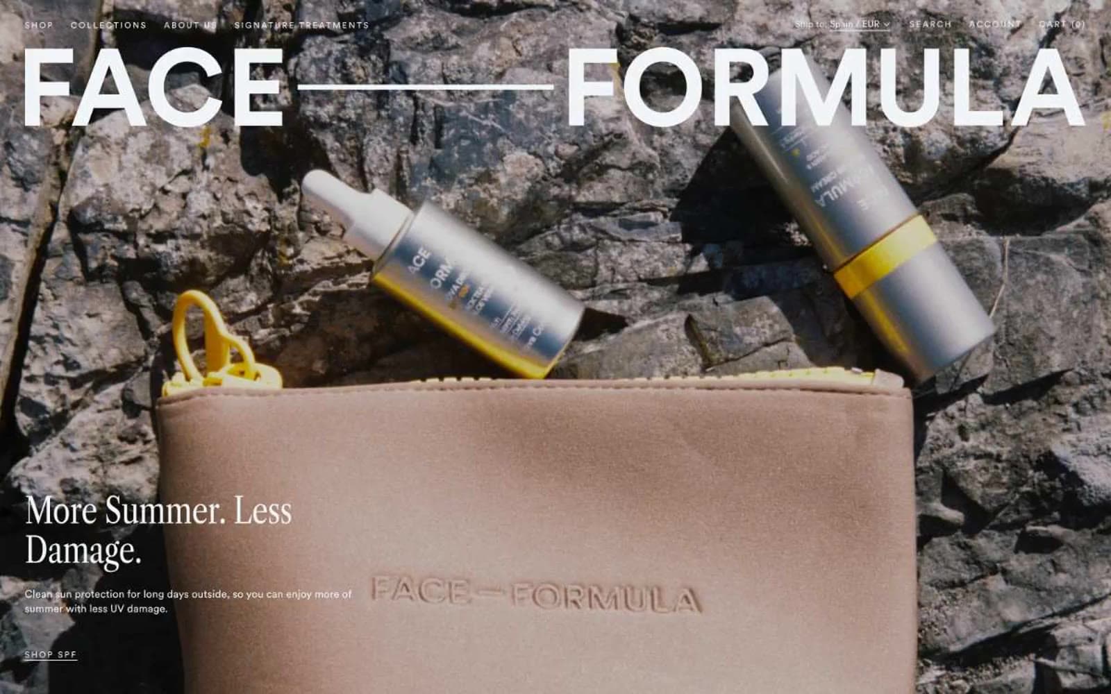
Face Formula. Nordic editorial portrait.
- Commerce
- Light theme
- 8 colors
- 2 typefaces
Face Formula reads like a Scandinavian editorial spread translated into a storefront: a near-monochromatic canvas of warm grays and cool mists, anchored by a colossal condensed-serif wordmark that makes the brand name feel like a magazine masthead rather than a logo. The palette is deliberately desaturated — 94% achromatic — so the only color the eye registers is the cool slate (#3b505a) that defines borders, navigation, and primary text against washes of mist (#f2f5f8) and white. Every interface decision whispers: ghost text links with hairline underlines instead of filled buttons, hairline 1px dividers, generous 8px-base vertical rhythm, and product surfaces that feel like gallery plinths. Two typefaces do all the work — Libre Caslon Condensed for editorial authority at display sizes, Circular Pro for every utilitarian surface — and the absence of shadows, gradients, or accent color forces the photography to carry all warmth and emotion.
Face Formula design system

Neutrals8
Icon strokes, strict-contrast text, and occasional fill — used sparingly only when absolute black is required
Heaviest heading text where maximum contrast against white is needed
The signature brand color — primary text, all hairline borders (536 nav + 304 misc border uses), nav link color, footer text, and the single dark surface tone that anchors the otherwise pale system
Secondary text, muted helper labels, subdued body copy where Deep Slate would feel too heavy
Button and navigation borders, subtle dividers, outlined-control stroke
Elevated surface layer one step above Mist for nested cards or secondary content blocks
Primary light surface for cards, product tiles, section bands, input fills, hairline borders — the most-used non-white color
Page background, product photography backdrop, hero base layer
Try a pairing
Pick any two colors from the palette to check whether text stays readable on top.
Aa
White Canvas on Carbon
21.00 : 1 contrast
- Body textPasses AA 4.5
- Large textPasses AA 3
- StrictPasses AAA 7
More DESIGN.md files. Same web, different personalities.

High Protein
Commerce
Hopper
Commerce
2.AG
Commerce
A-WARE
Commerce
AATHER
Commerce
Abel
Commerce
Acme Cups New Zealand
Commerce
Acne Studios
Commerce
Adam Lippes
Commerce
Adanola
Commerce
Advene
Commerce
Aevi Wellness
Commerce


